The November Edit: Colours of the Month
Explore our November colours, a handpicked edit of size shades to inspire and enrich your home. As winter draws near, our palette captures the essence of the final harvest; where the earth's last warmth gives way to the gentle stillness of the season ahead.

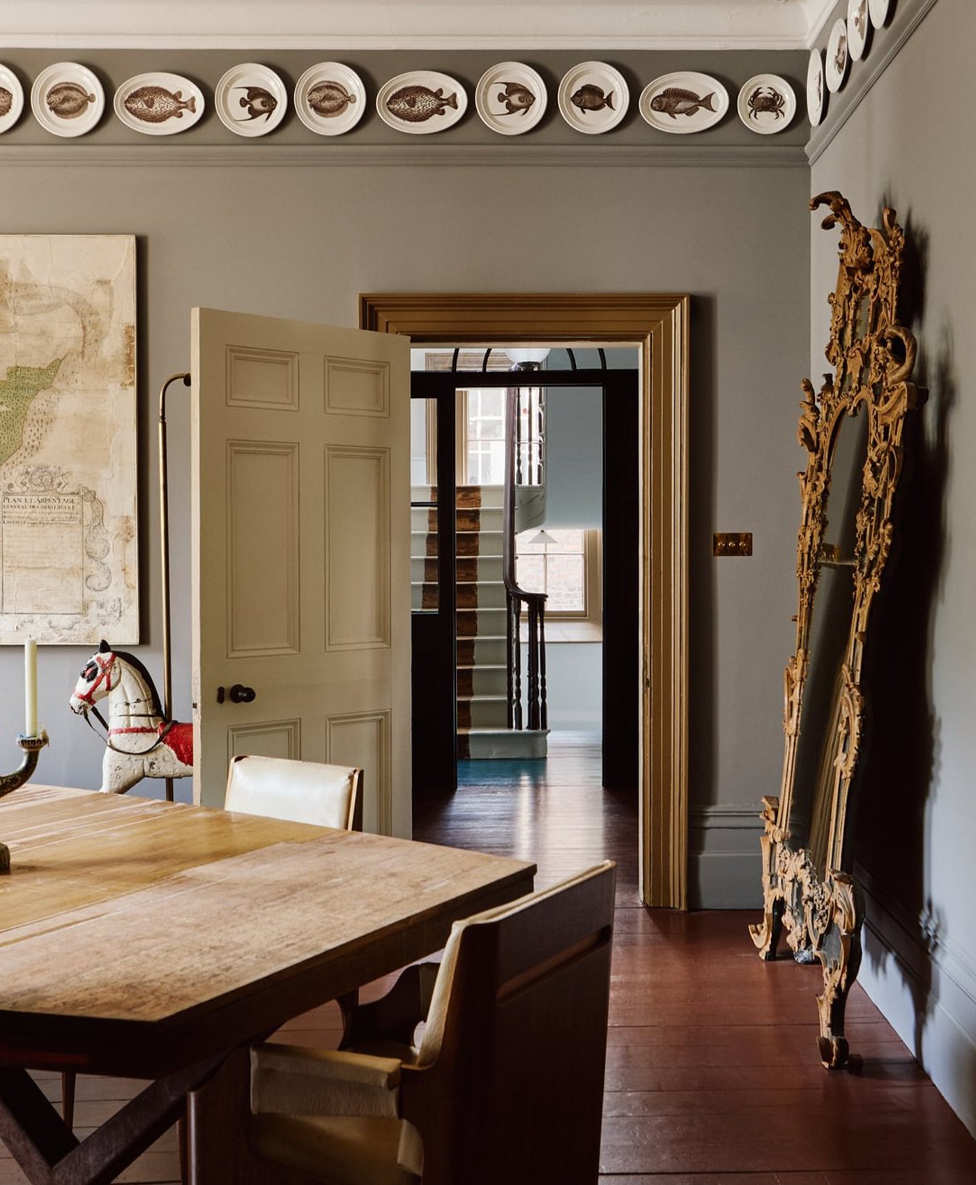
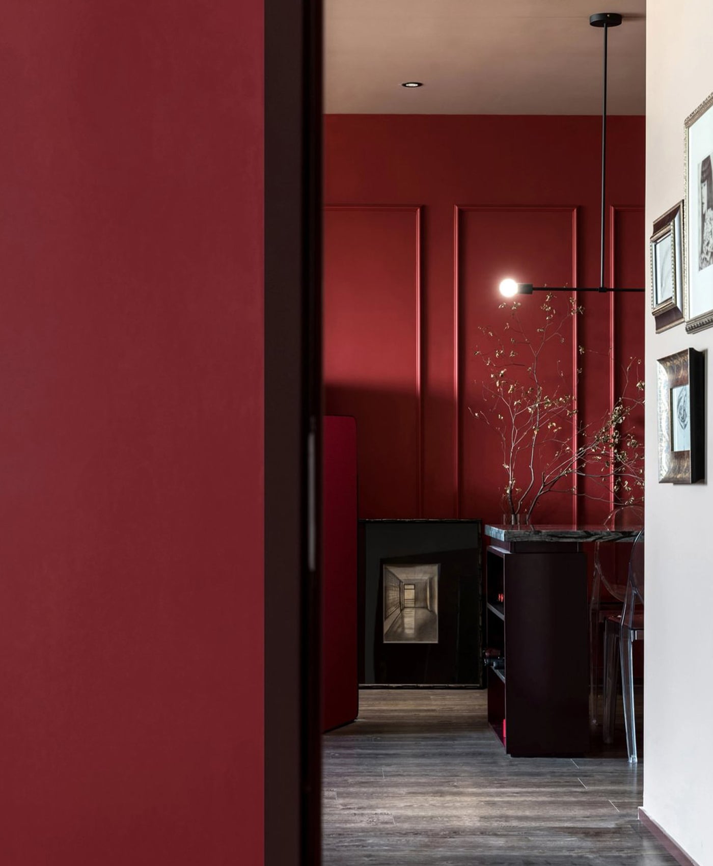
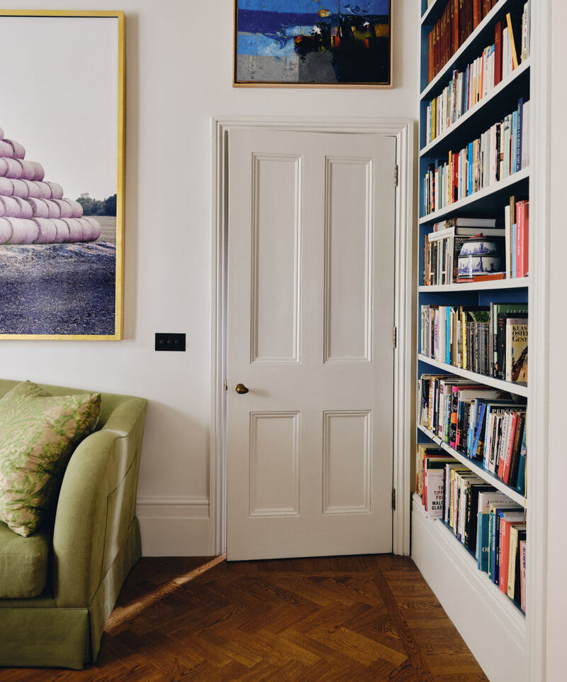
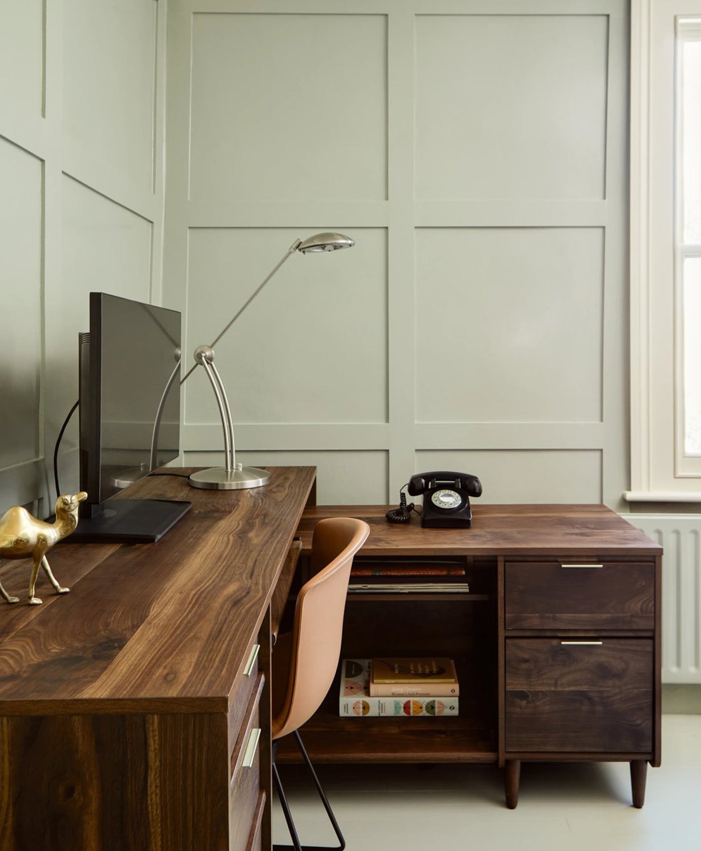
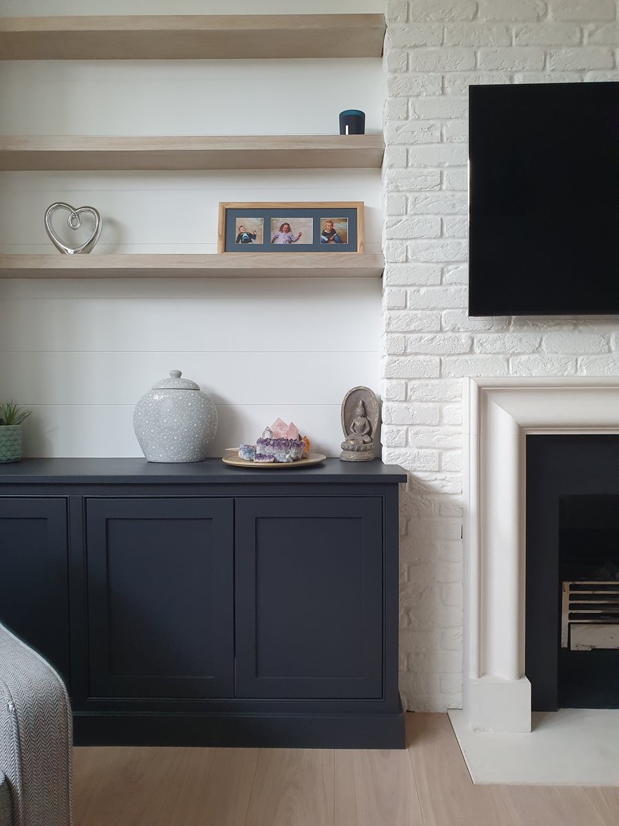
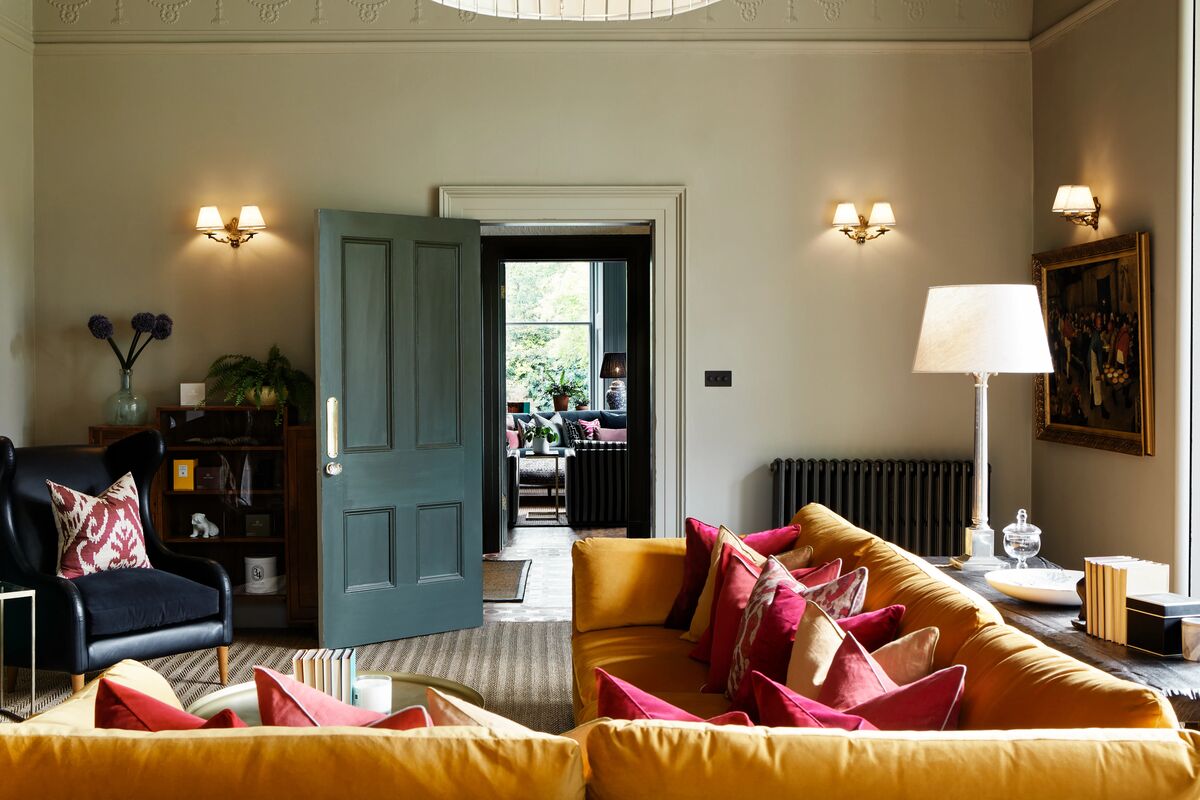
Left image: Artillery Ground No.164, Right image: Egyptian Grey No.154 on door
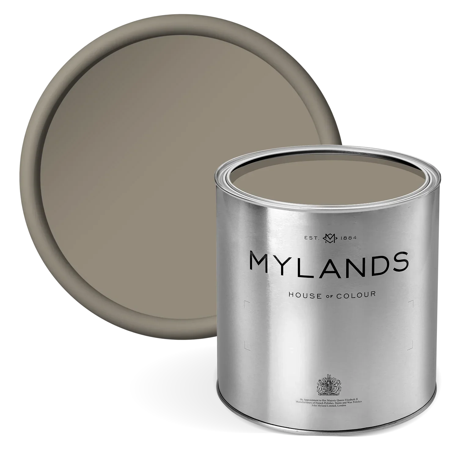
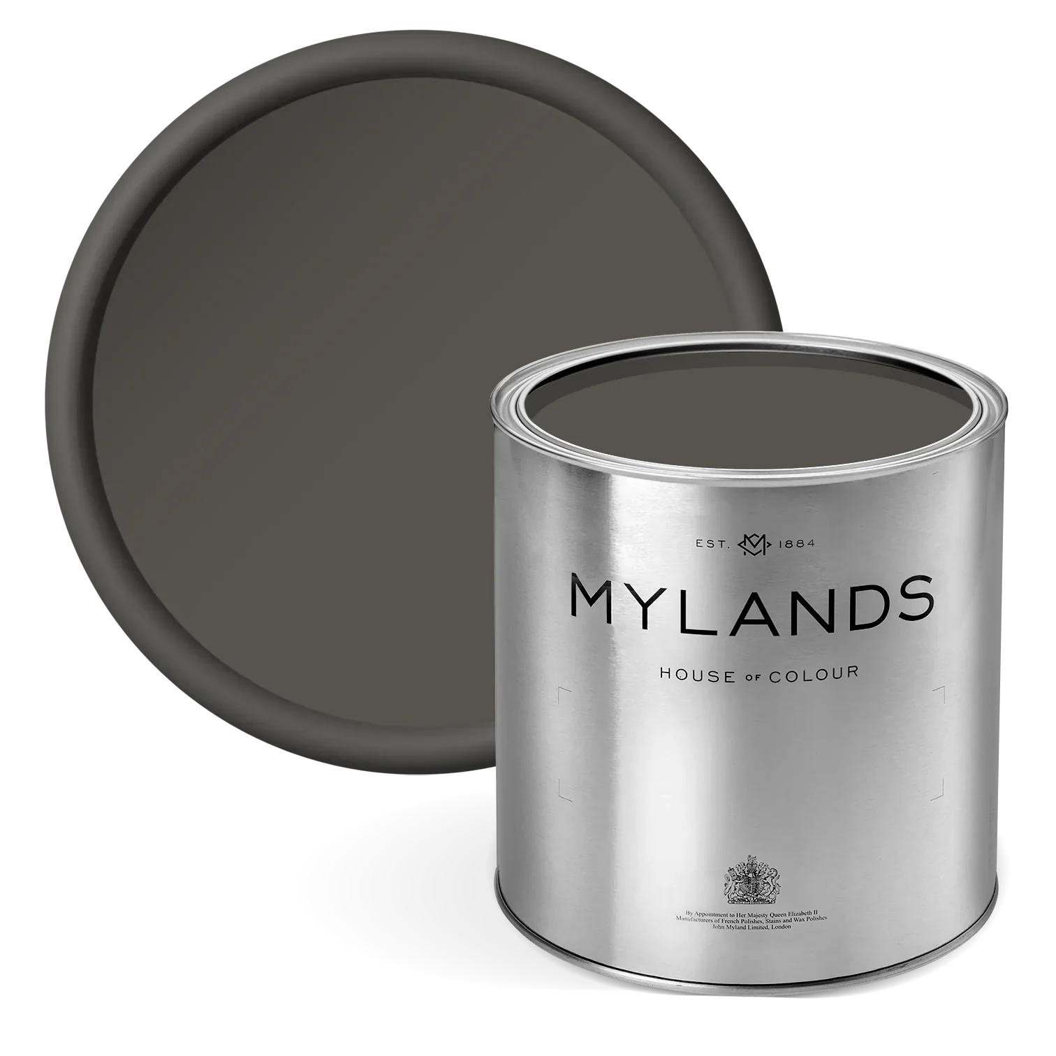
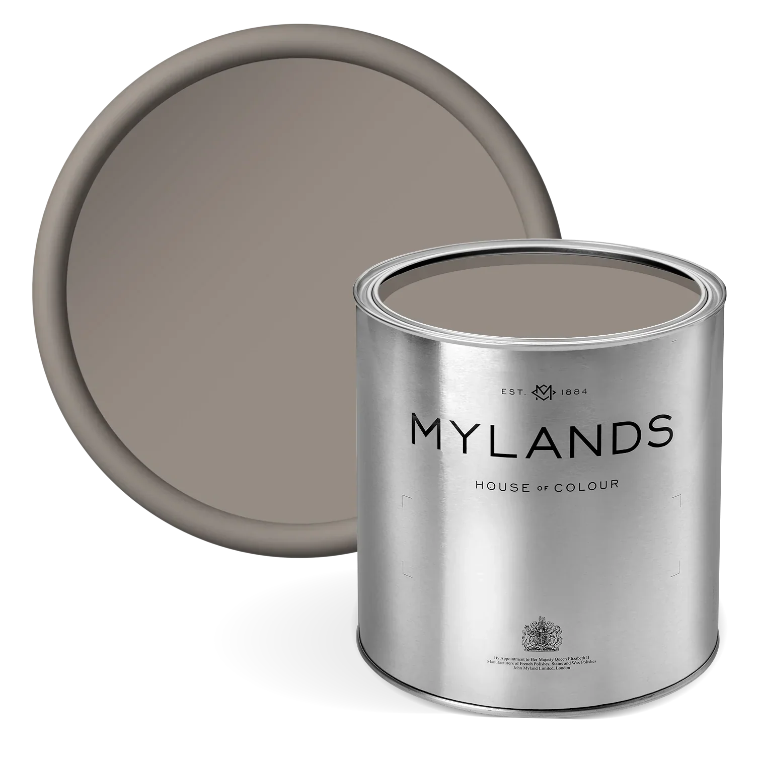
Artillery Ground No.164
A rich deep green-brown inspired by London's oldest regiment, the Honourable Artillery Company, this shade is a dark, bold, and unmistakably traditional. When set against lighter earthy greens, it provides the perfect contrast while maintaining a natural, harmonious feel throughout the space.
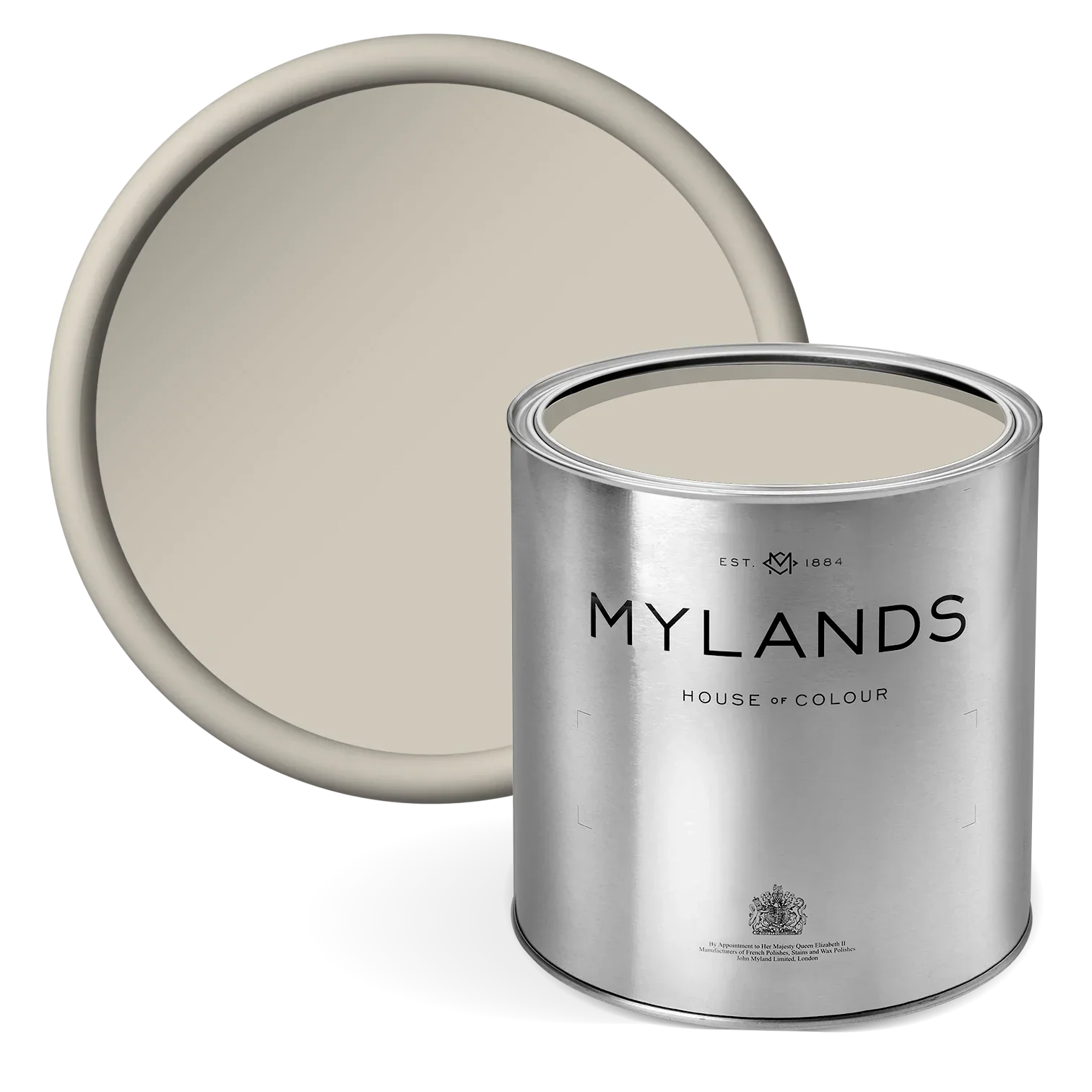
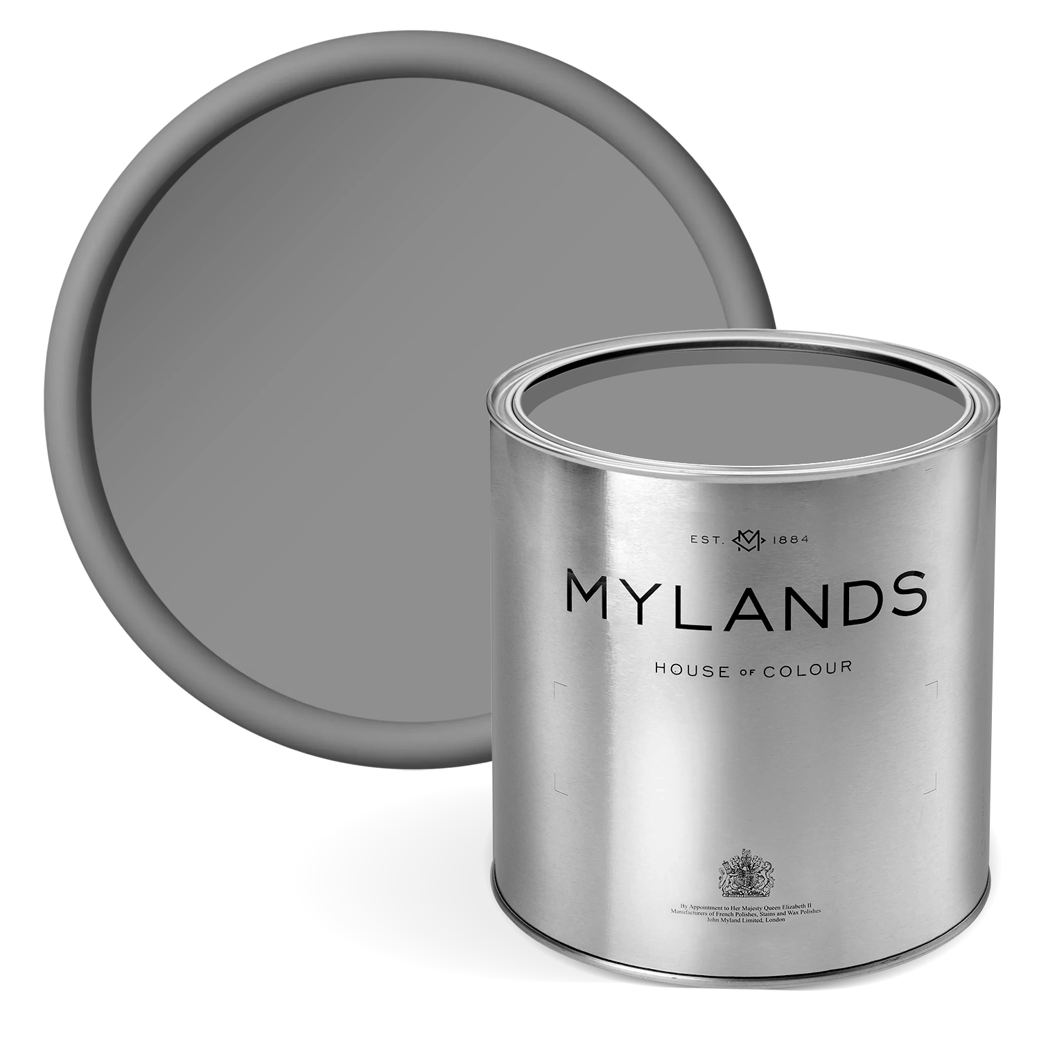
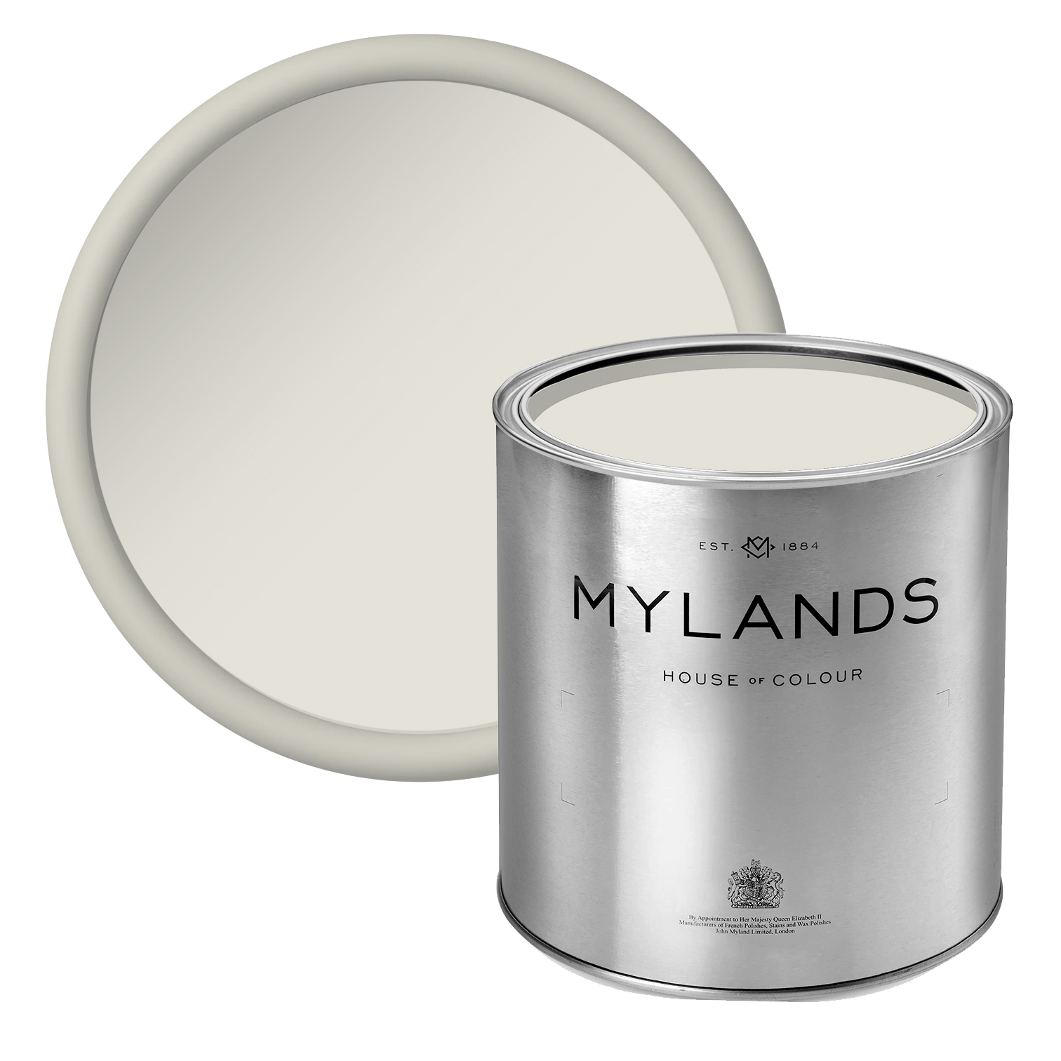
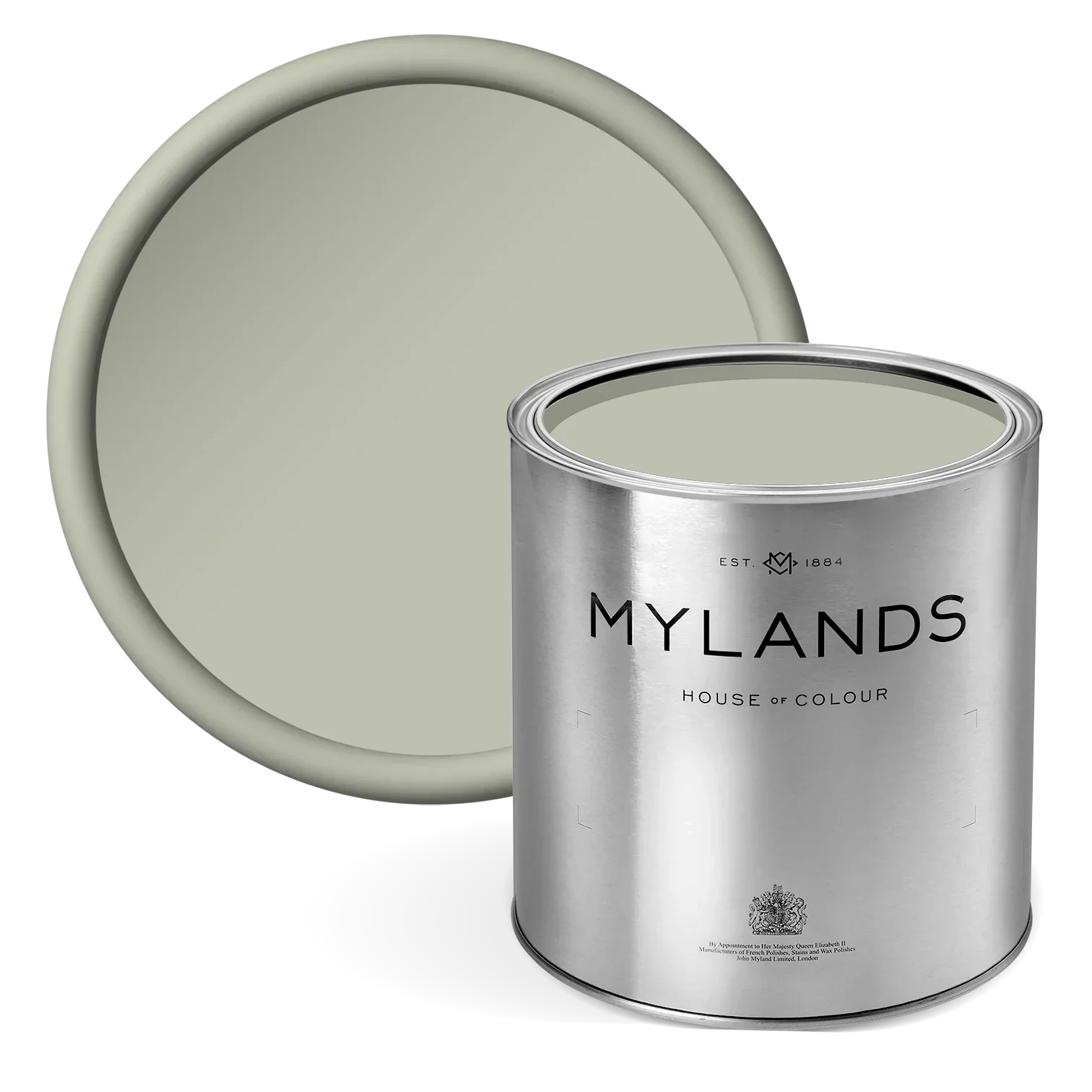
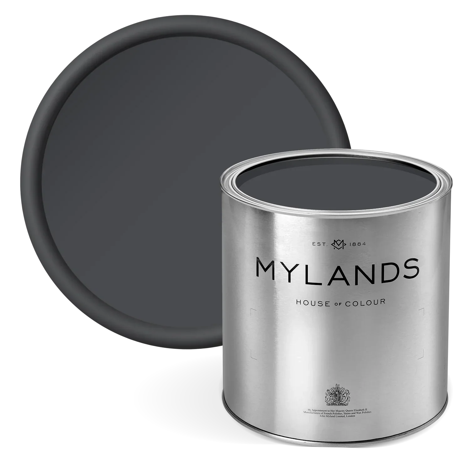
Egyptian Grey No.154
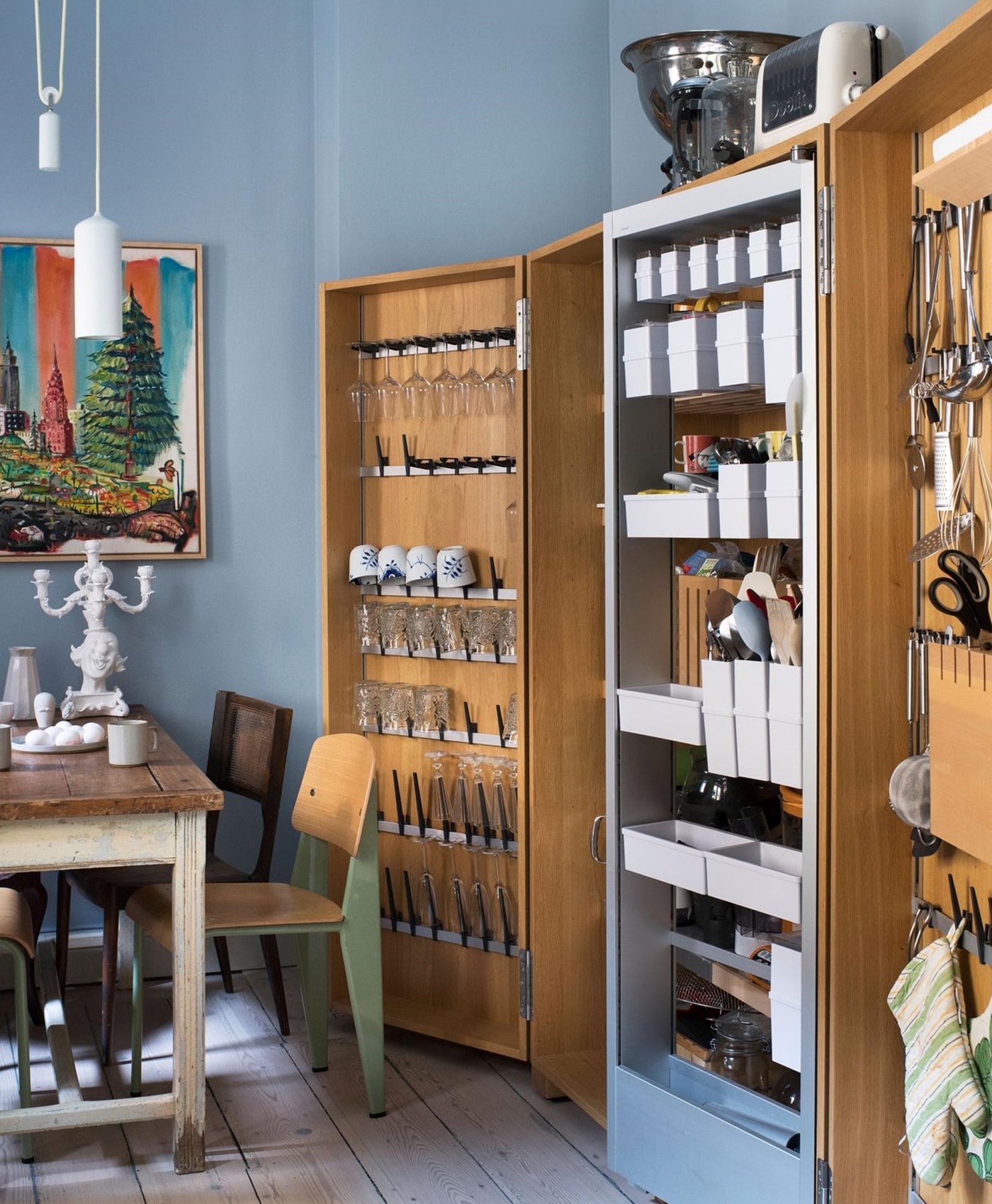
A classic and historically significant grey that feels as relevant today as ever, this shade brings timeless appeal to both traditional and modern spaces. Subtle undertones of green and umber give it warmth and depth, creating a hue that feels clam, grounded and quietly luxurious.

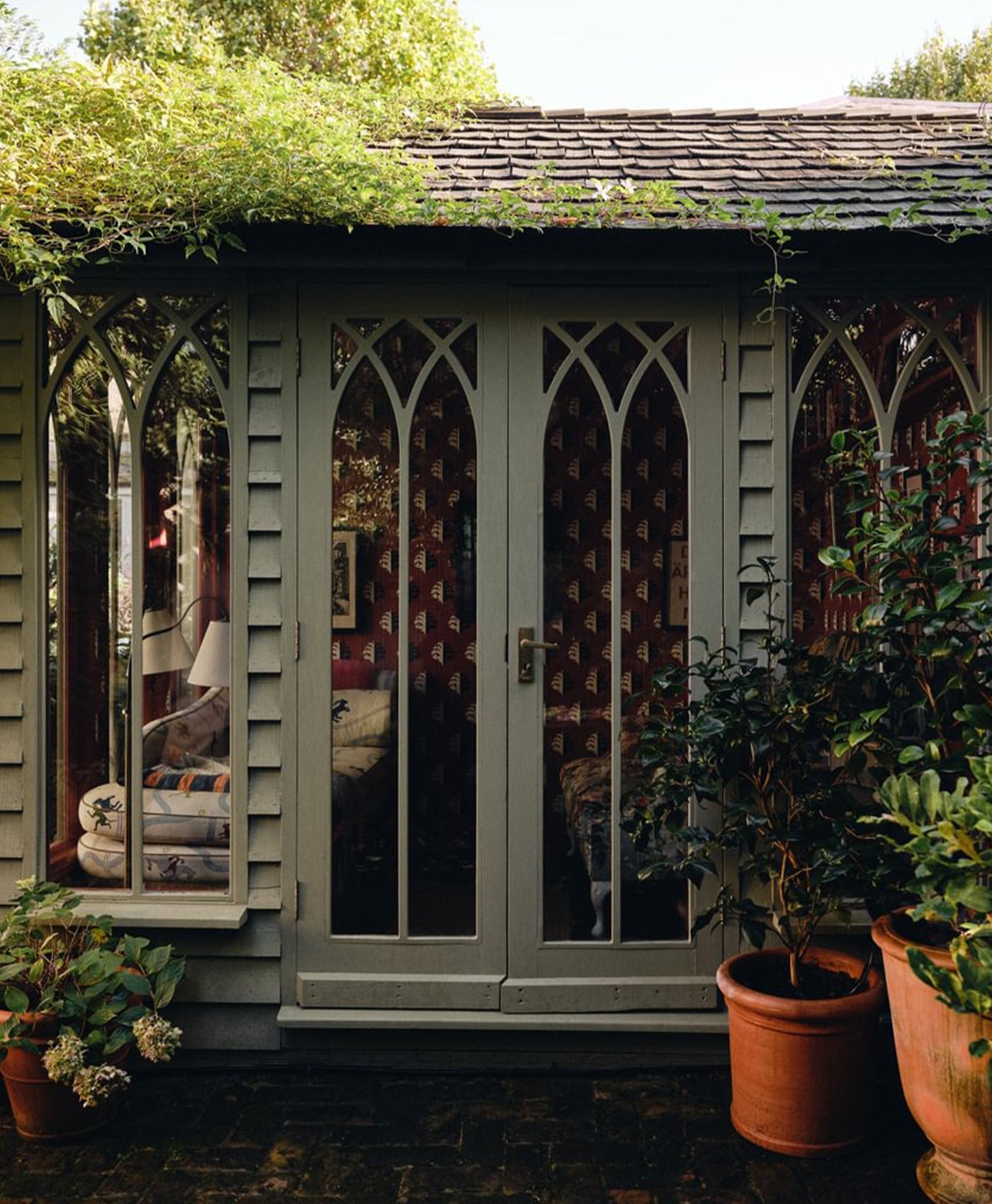
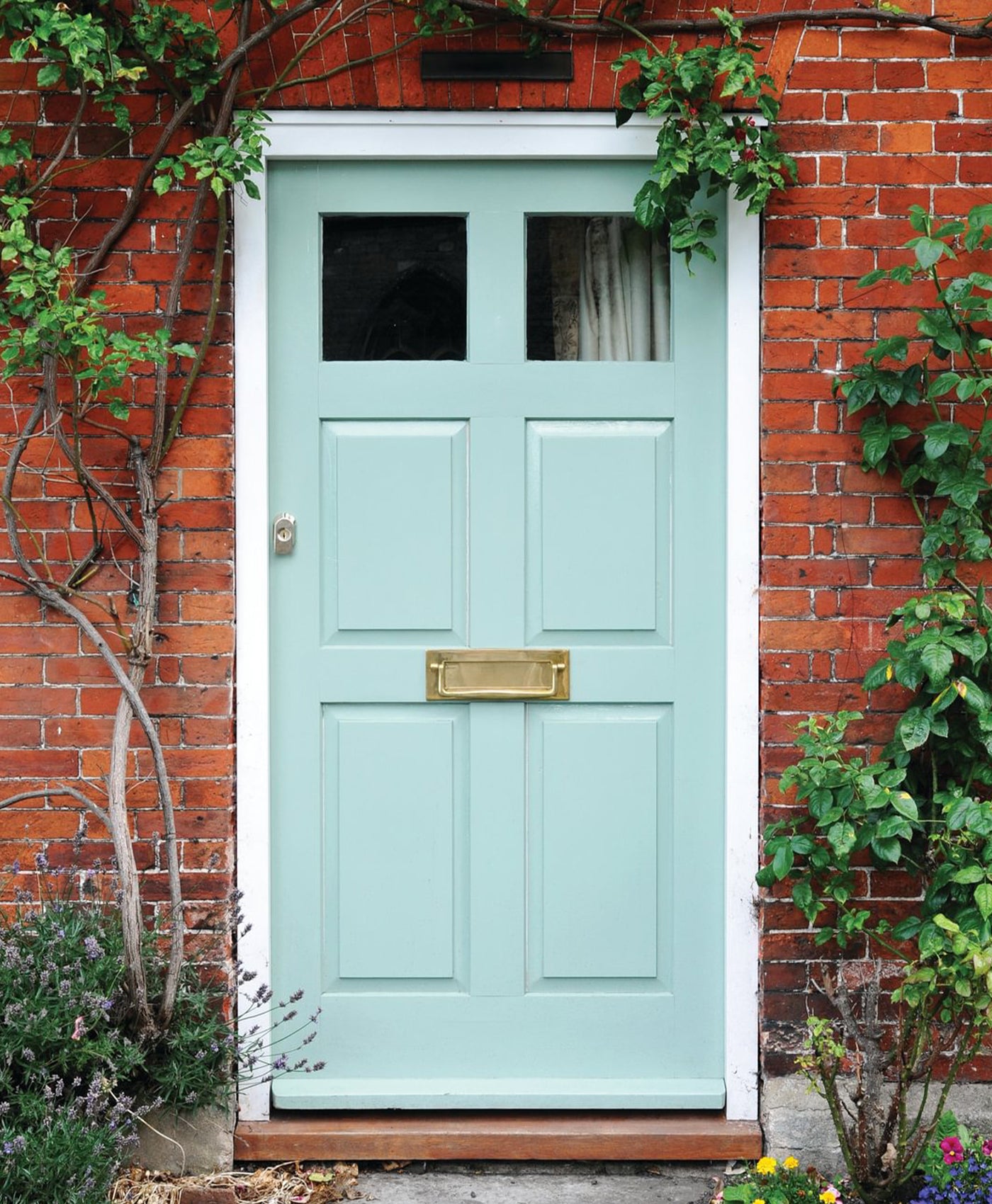
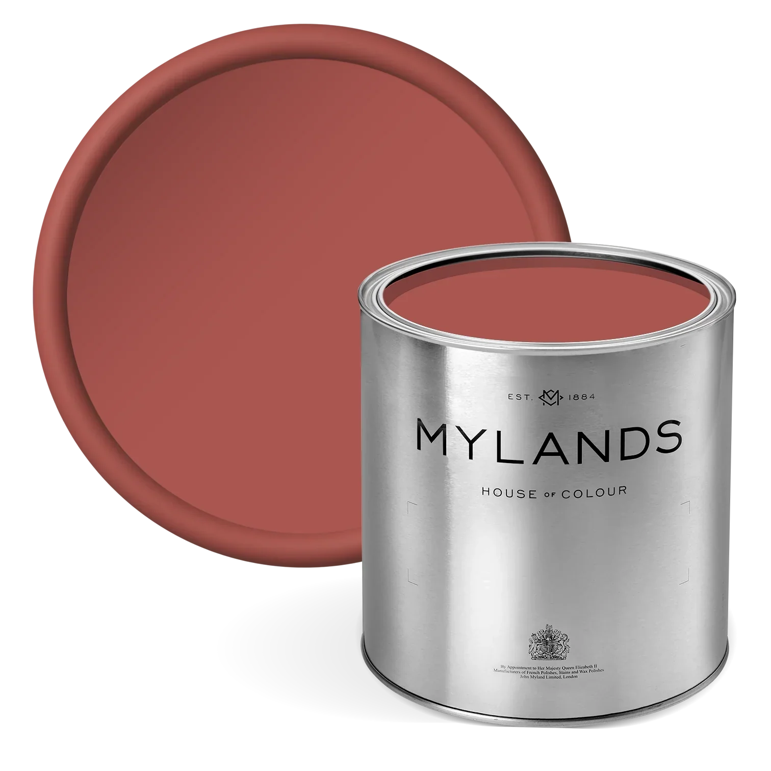
Left image: White Hart No.51 Right image: Caca d’Oie BH.15
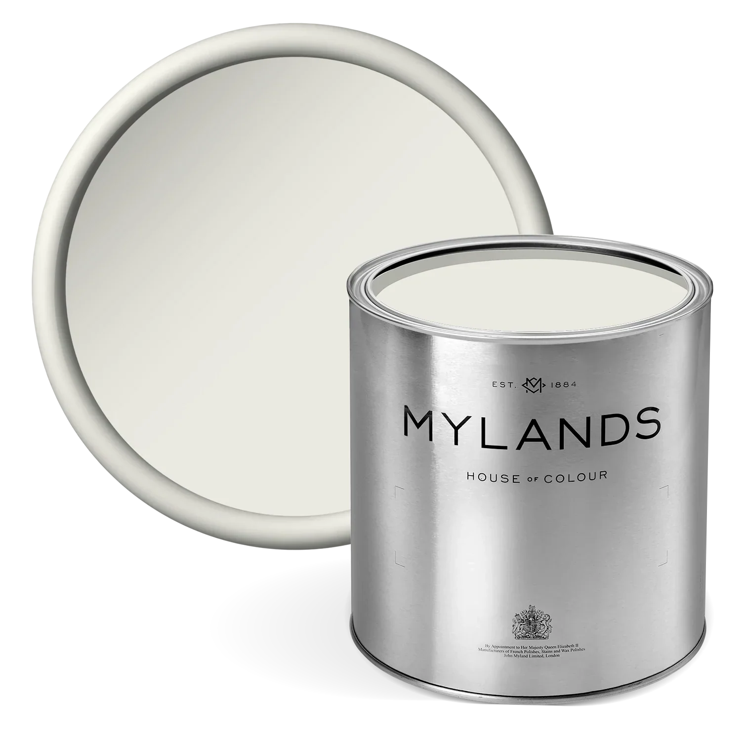
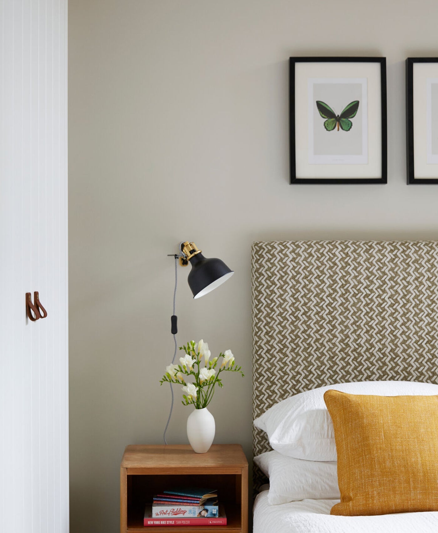
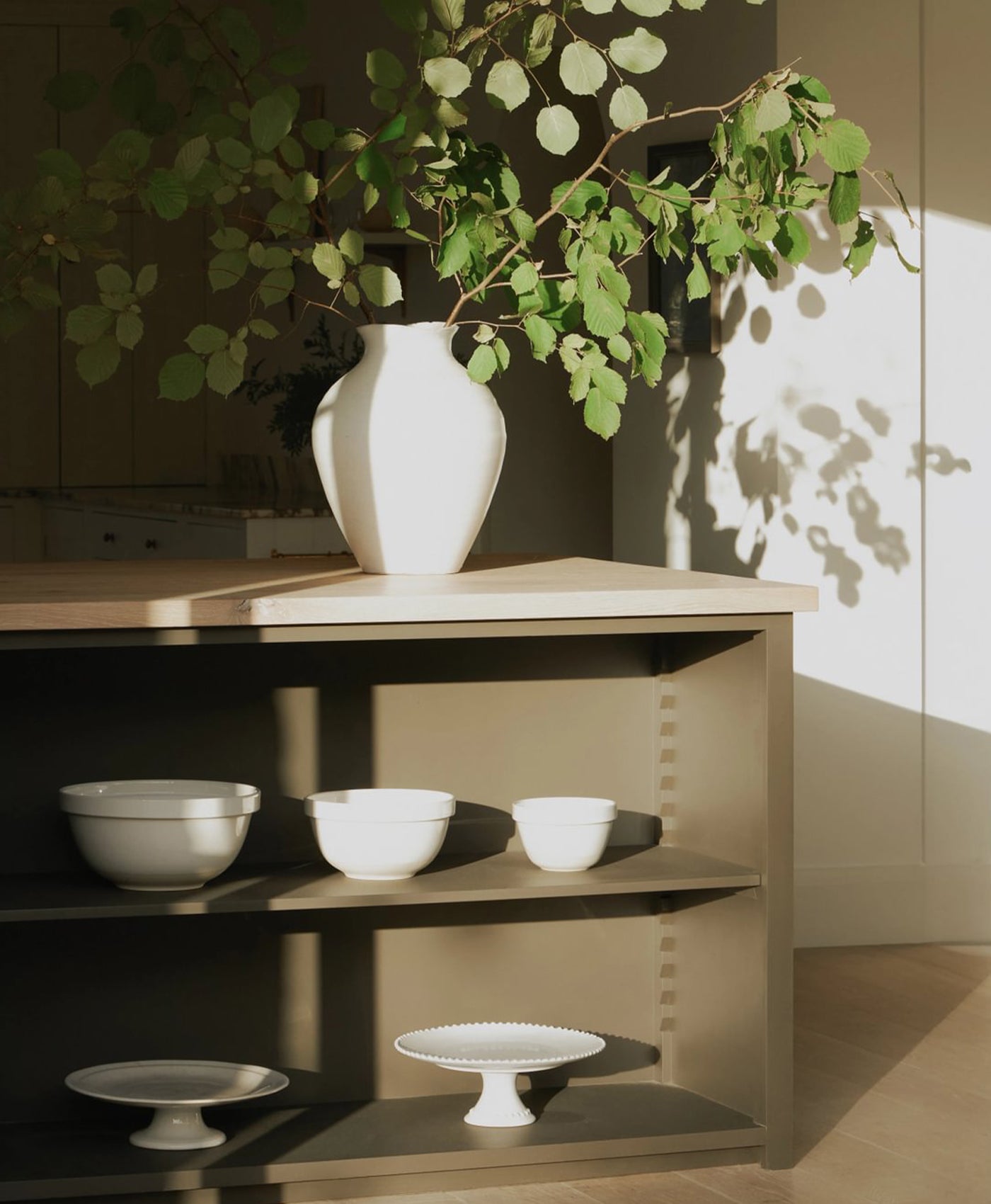
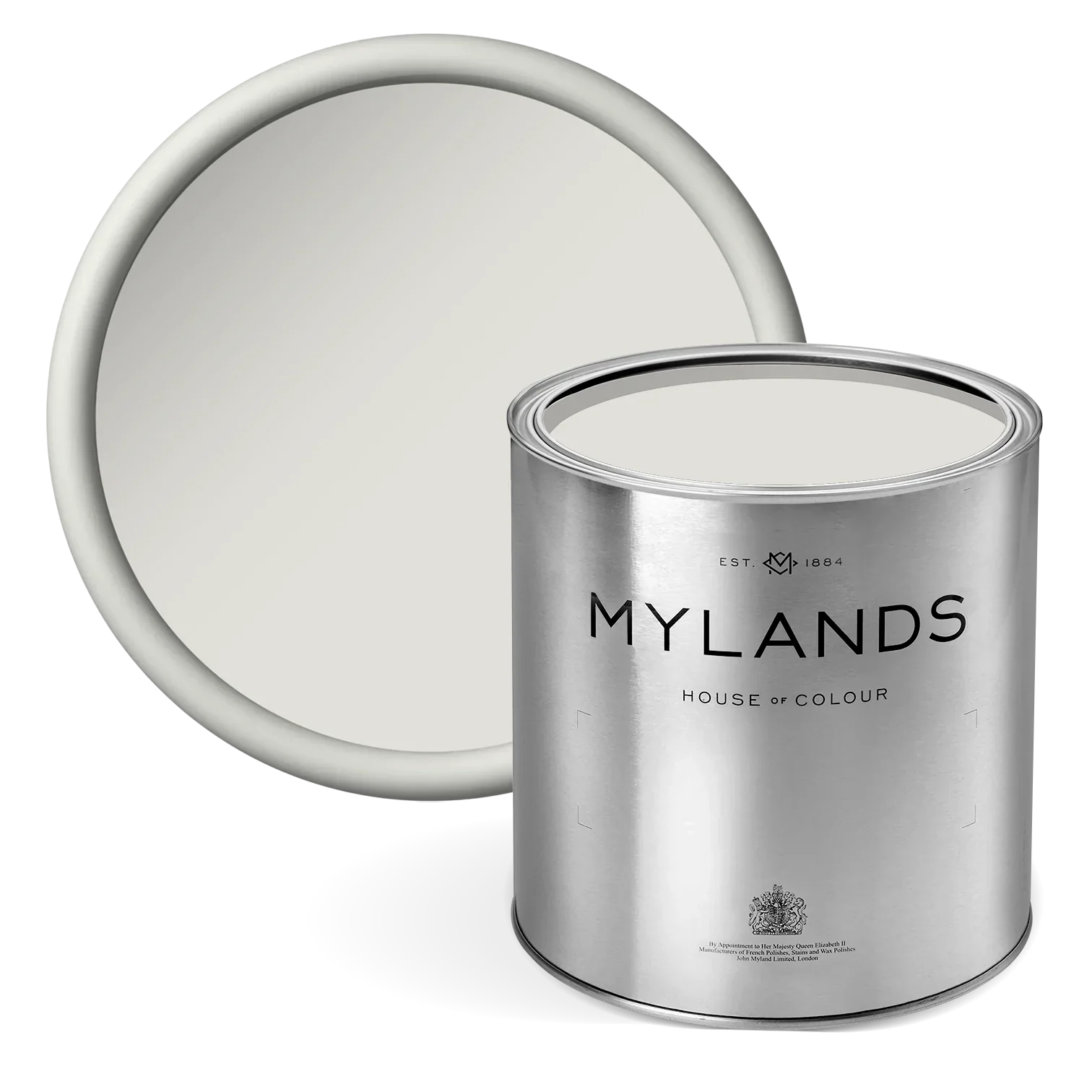
White Hart No.51
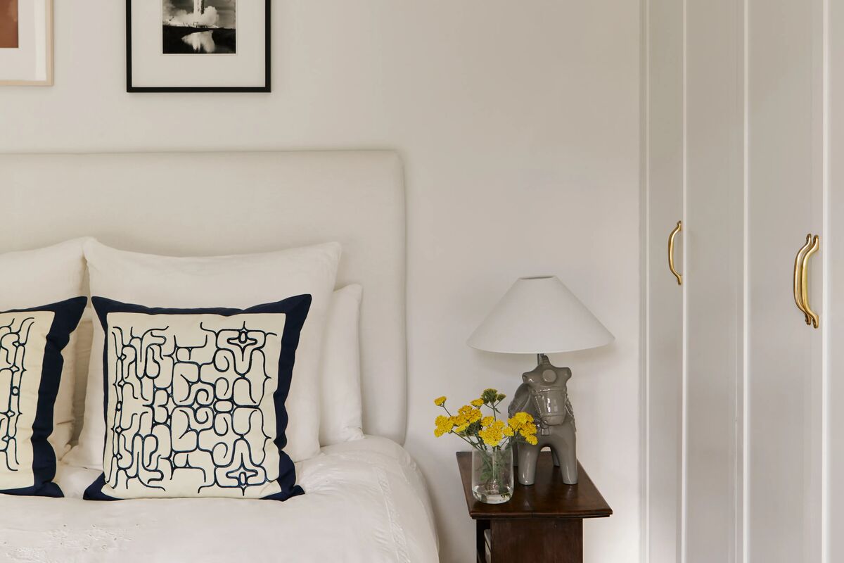
A very pale neutral shade with a subtle grey quality and a gentle warm glow, this colour is understated and refined. it brings a sense of calm and serenity to any space, making it an ideal choice for a larger room where a soft, timeless backdrop is needed.
Its versatility allows it to complement a wide range of interiors, from contemporary minimalism to classic heritage schemes.
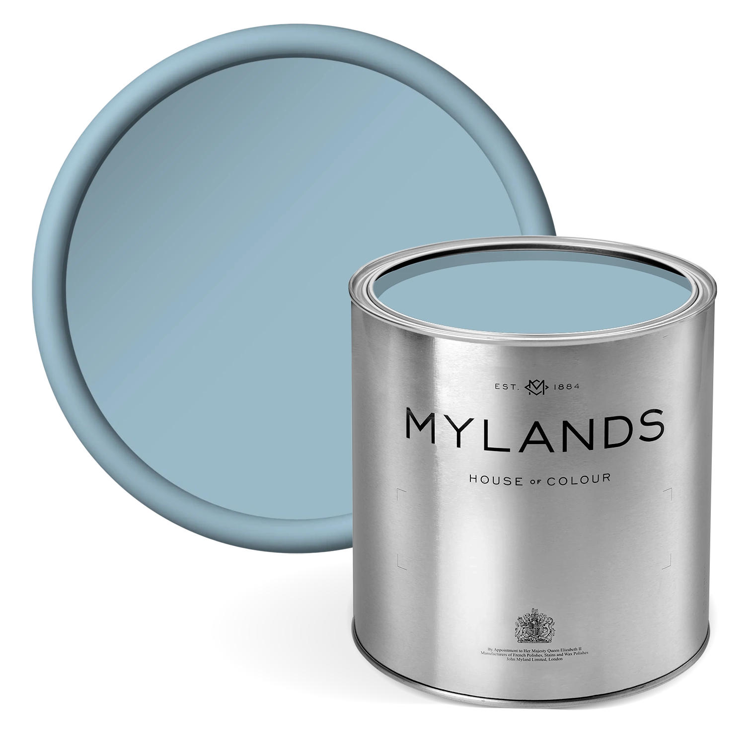
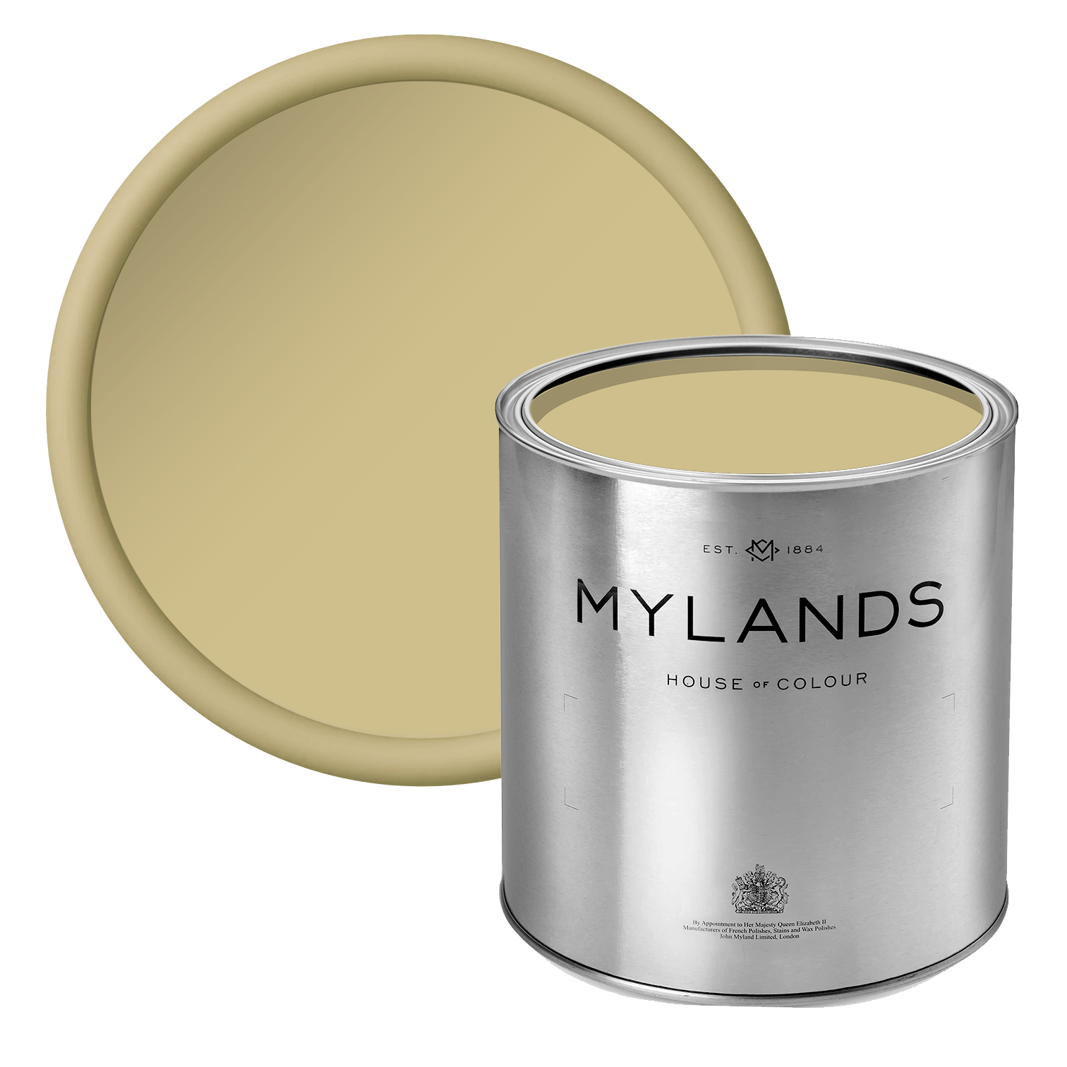
Caca d’Oie BH.15
A distinctive, deep olive green that brings character and sophistication to any space. While it works beautifully as an accent colour, it can also make a bold statement when used across larger areas. In a grand drawing room or traditional library, a glossy varnish finish enhances its rich tones, especially when paired with lighter woodwork and layered with large, expressive artwork for a dramatic and timeless effect.

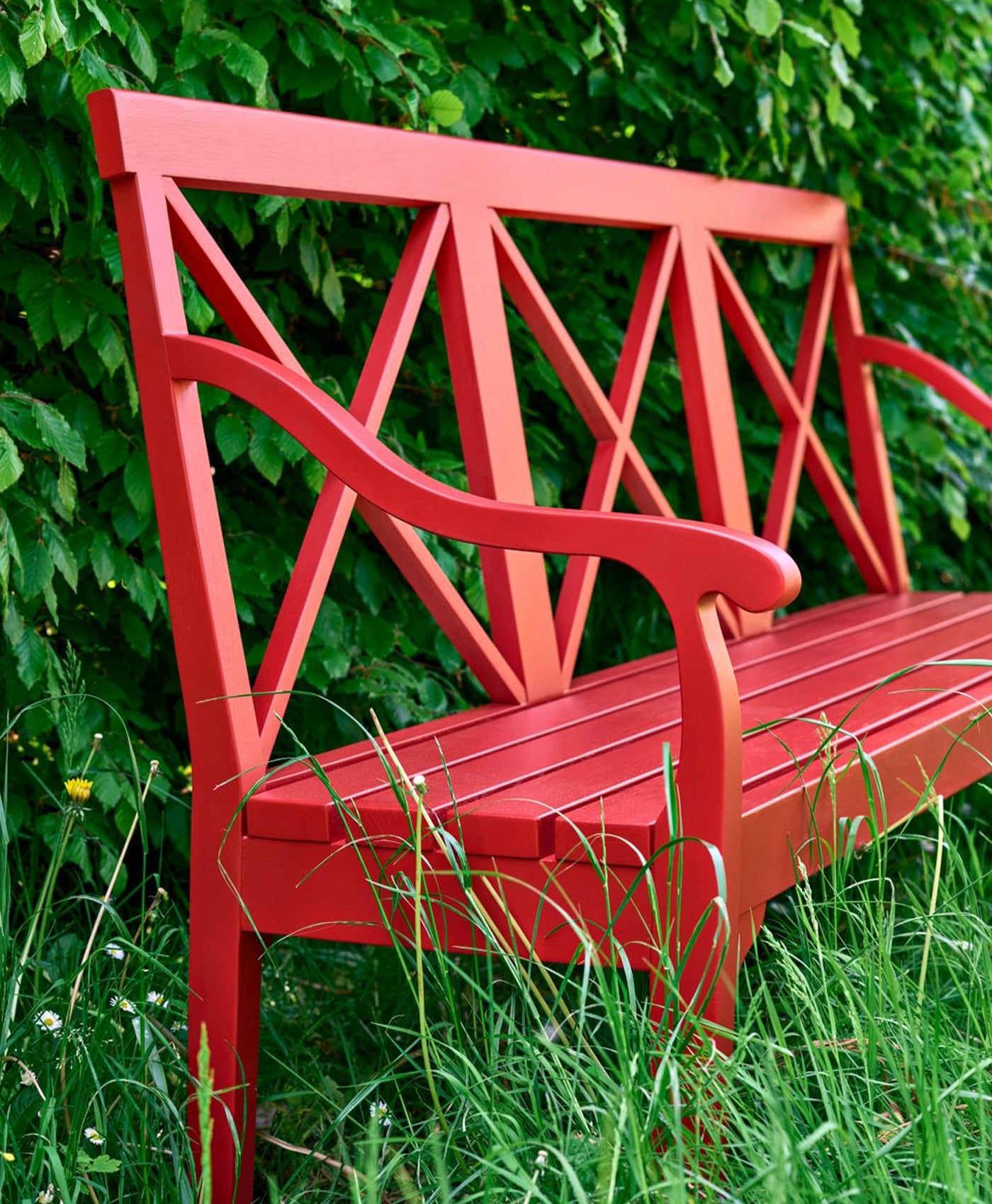
Left image: Artichoke BH.13 Right image: Wheatsheaf BH.23
Artichoke BH.13
Discover this soft, muted green with elegant depth and versatility. Its subtle warmth makes it an excellent choice for both classic and contemporary interiors. Used as an accent or across entire walls, Artichoke creates a calm, sophisticated atmosphere. In a living room or study, it pairs beautifully with neutral furnishings and natural textures, bringing a refined sense of balance and understated luxury to the space.
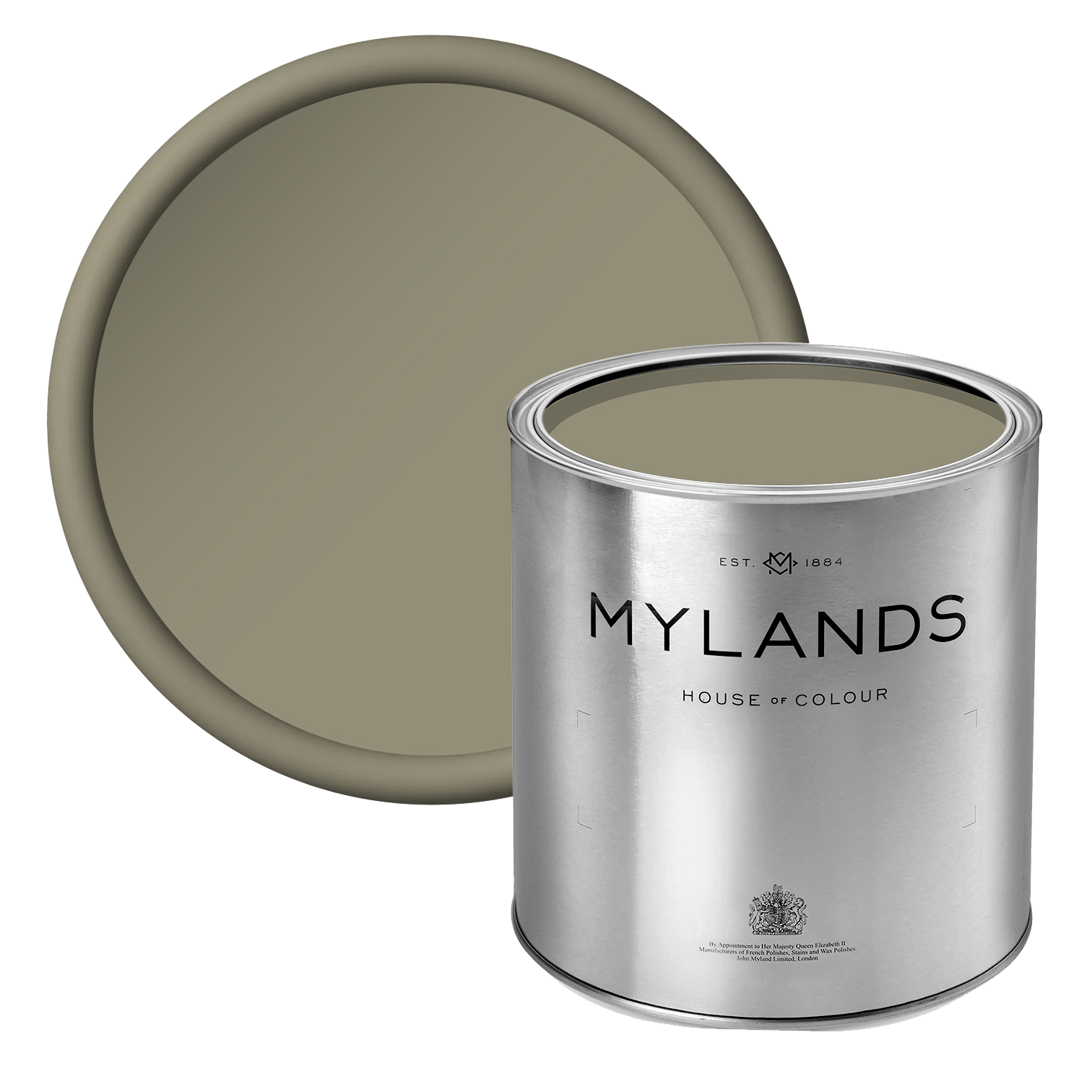
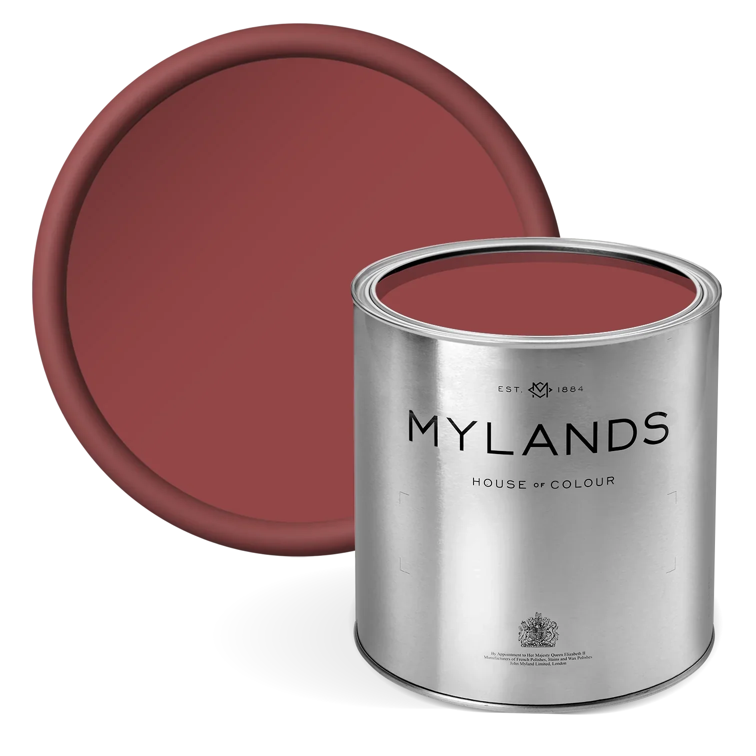
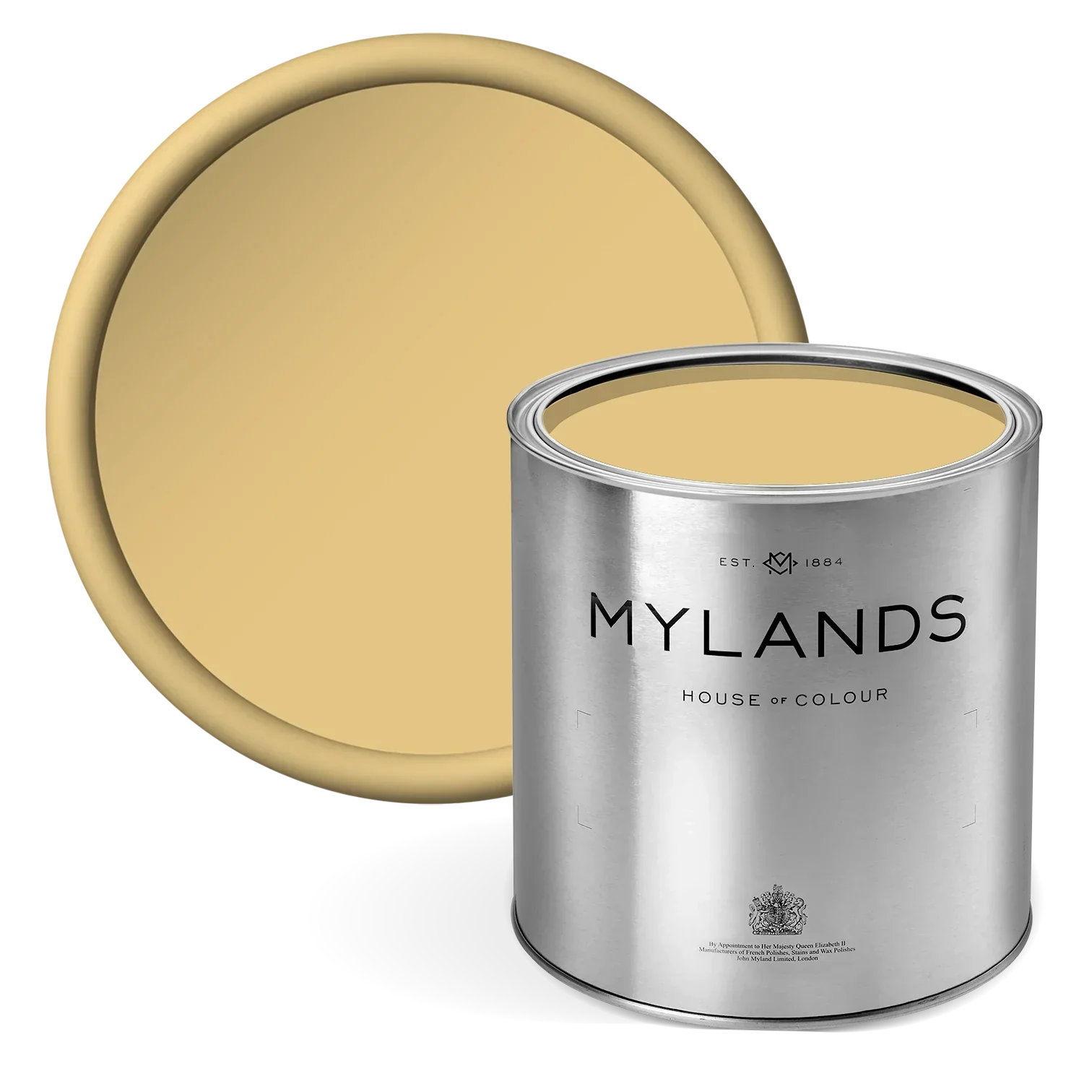
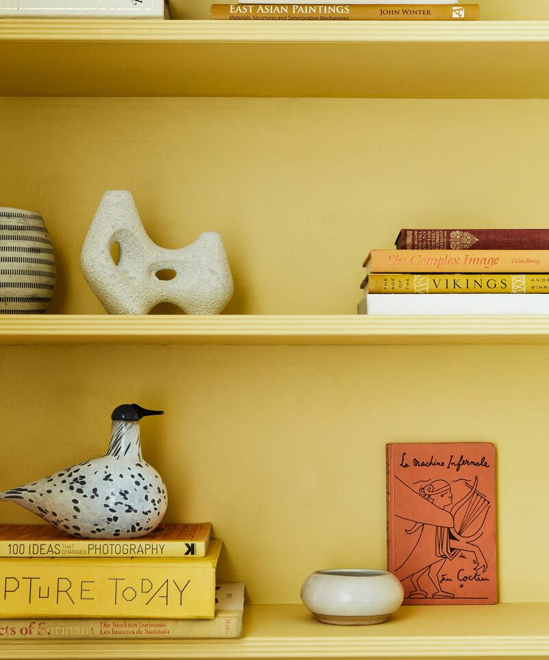
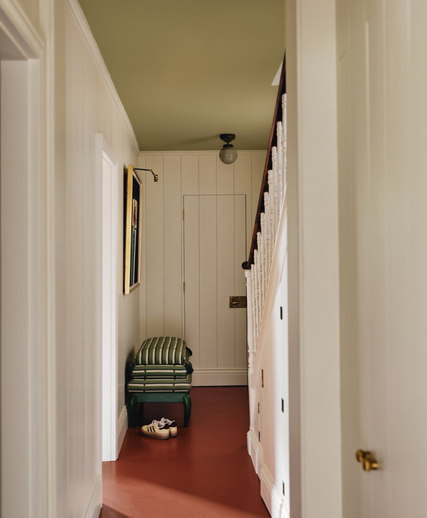
Wheatsheaf BH.23
Inspired by pregnant wheat fields just before harvest, this colour has become a favourite for both walls and joinery. Its tone shifts subtly throughout the day, appearing light and airy in the morning and deepening to a richer, moodier hue as the evening draws in. This dynamic quality gives spaces a living responsive feel that evolves with natural light.