Which colours go with stone?
Softer and gentler than a bright white or cool grey, stone colours make a great choice as a neutral paint colour. But there is more to a stone colour than you may first think. It is a calming shade, deriving from nature which can bring a relaxing, comforting ambience to your home.
Stone is not one single hue. Depending on the undertones used, it can span blue, yellow, green and earthy brown shades. That means it is warmer than the cool grey neutrals that have been so popular over the past decade. Stone is not shy and retiring though. It is strong enough to match vibrant shades, as well as other neutral colours. It is wonderfully versatile which makes it a brilliant companion colour in your interior design.
So if you want to create timeless, sophisticated yet inviting home decor, stone colour schemes are an ideal choice. Here, we will share the best colour combinations to go with stone.

Cabinetry in Temple Bar™ No.70, Kitchen island in Rothschild Street™ No.296 - @herringbonehouse
What are the undertones of stone?
First things first. It is good to understand what we mean by stone colour. If you think about stone in nature, it varies in shade from pebble grey to sandstone and many others in between. That variation also goes from cool to warm neutral via mid-tones.
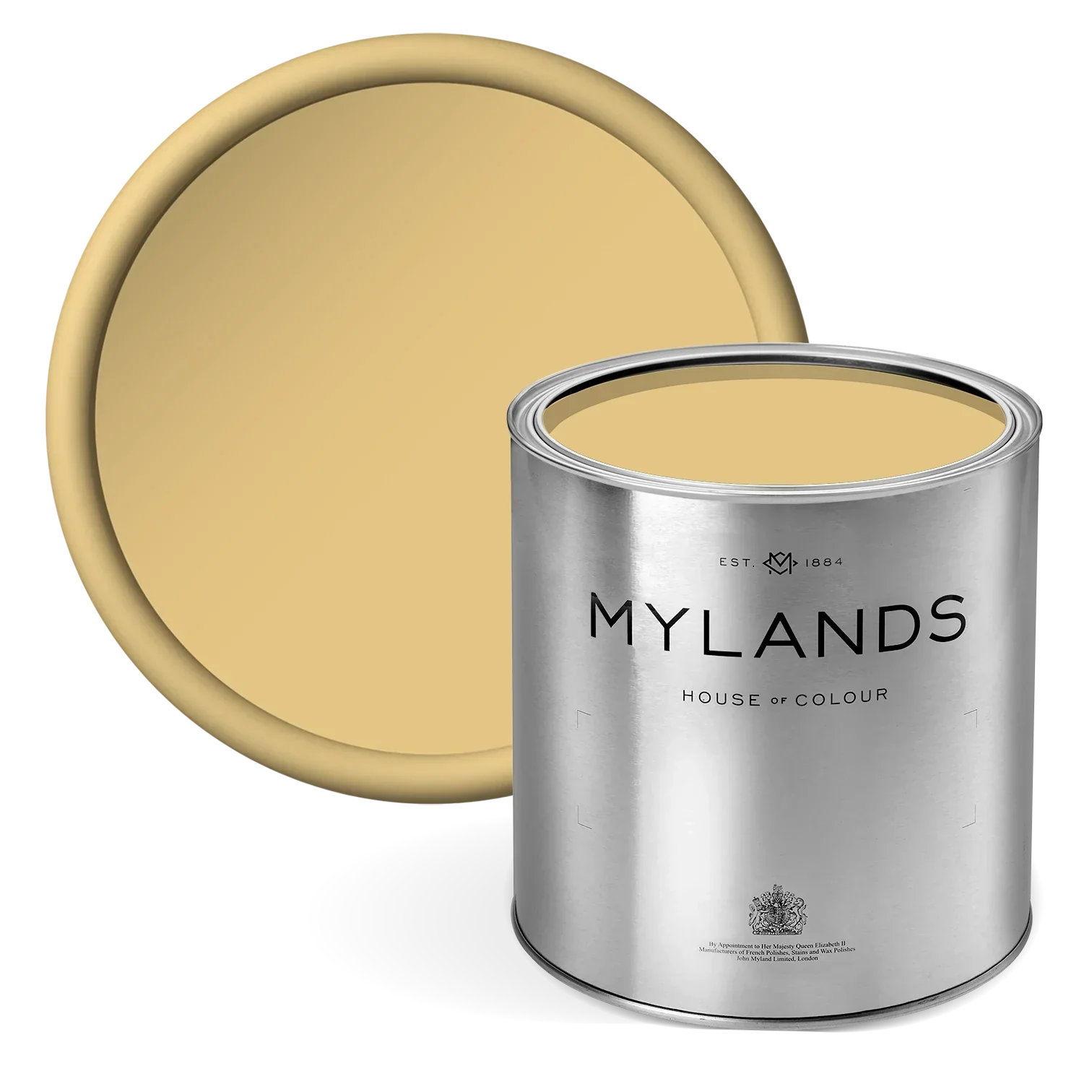
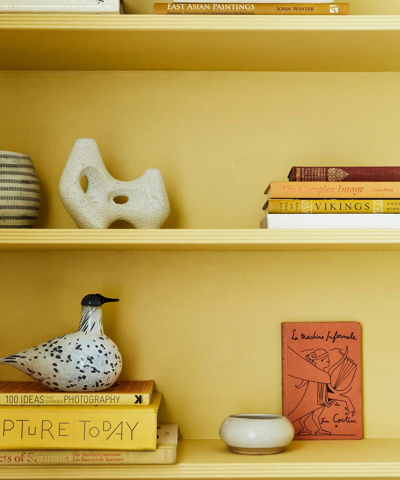
Stone can have yellow undertones. That brings a sunny warmth to your room which is welcoming and comforting. But if you have a particularly sunny room, it can tip the balance too far. In that case, you are better balancing the sunshine with an off-white or stone with green undertones.
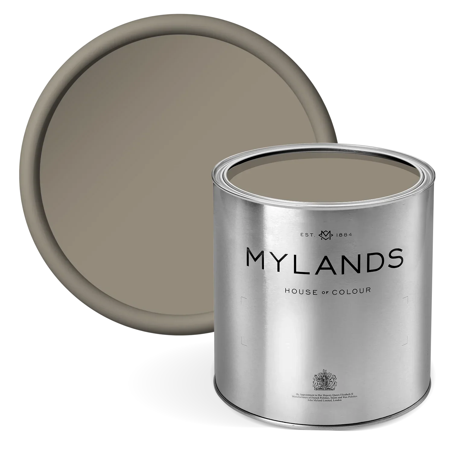
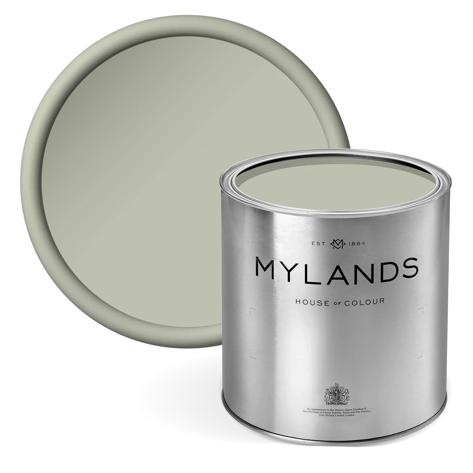
Yes, that is right, stone can have green undertones too. That brings its earthy, natural quality. It is often leaning towards a khaki or sage green element in the stone paint colour. Mylands' Alderman™ No.60 is a good example of a soft, neutral stone paint with green tones.
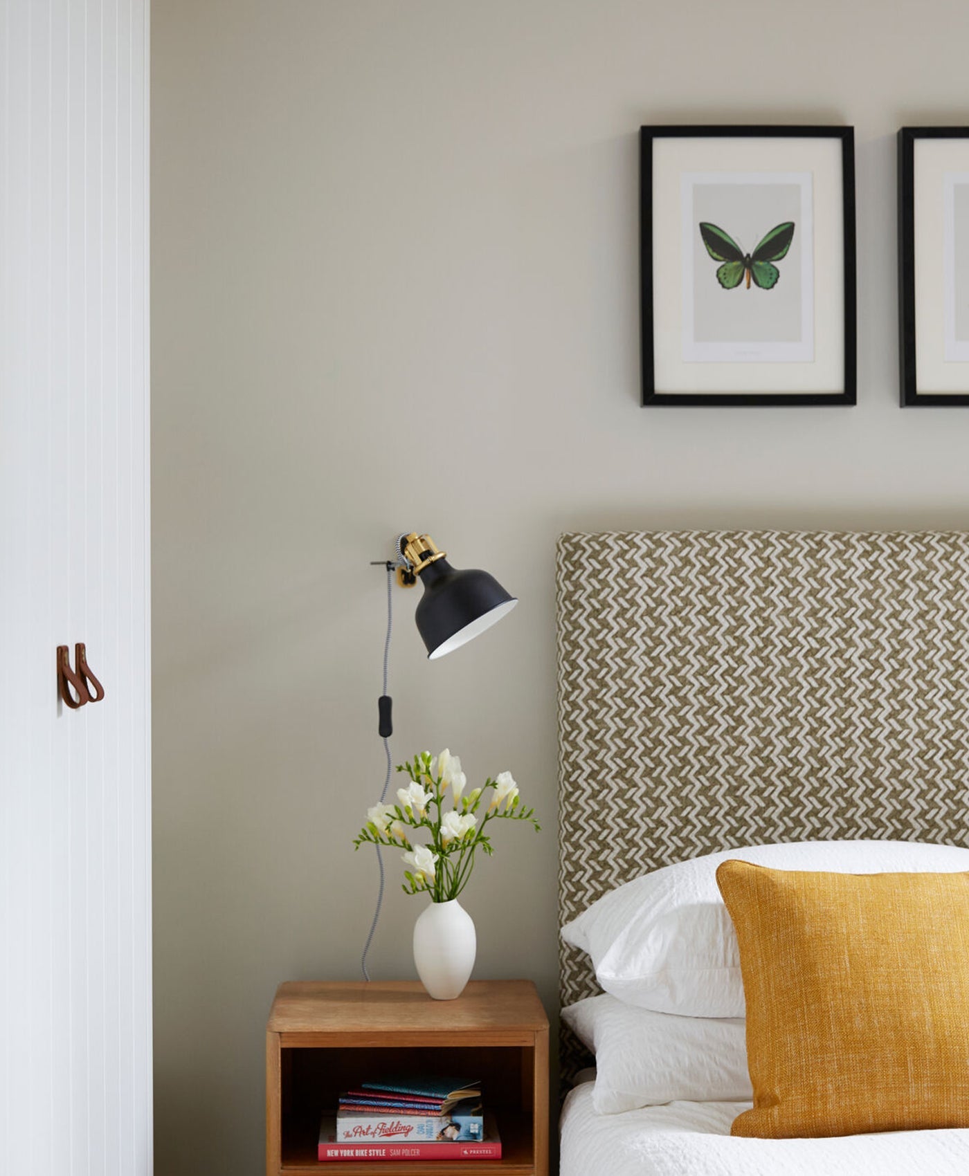
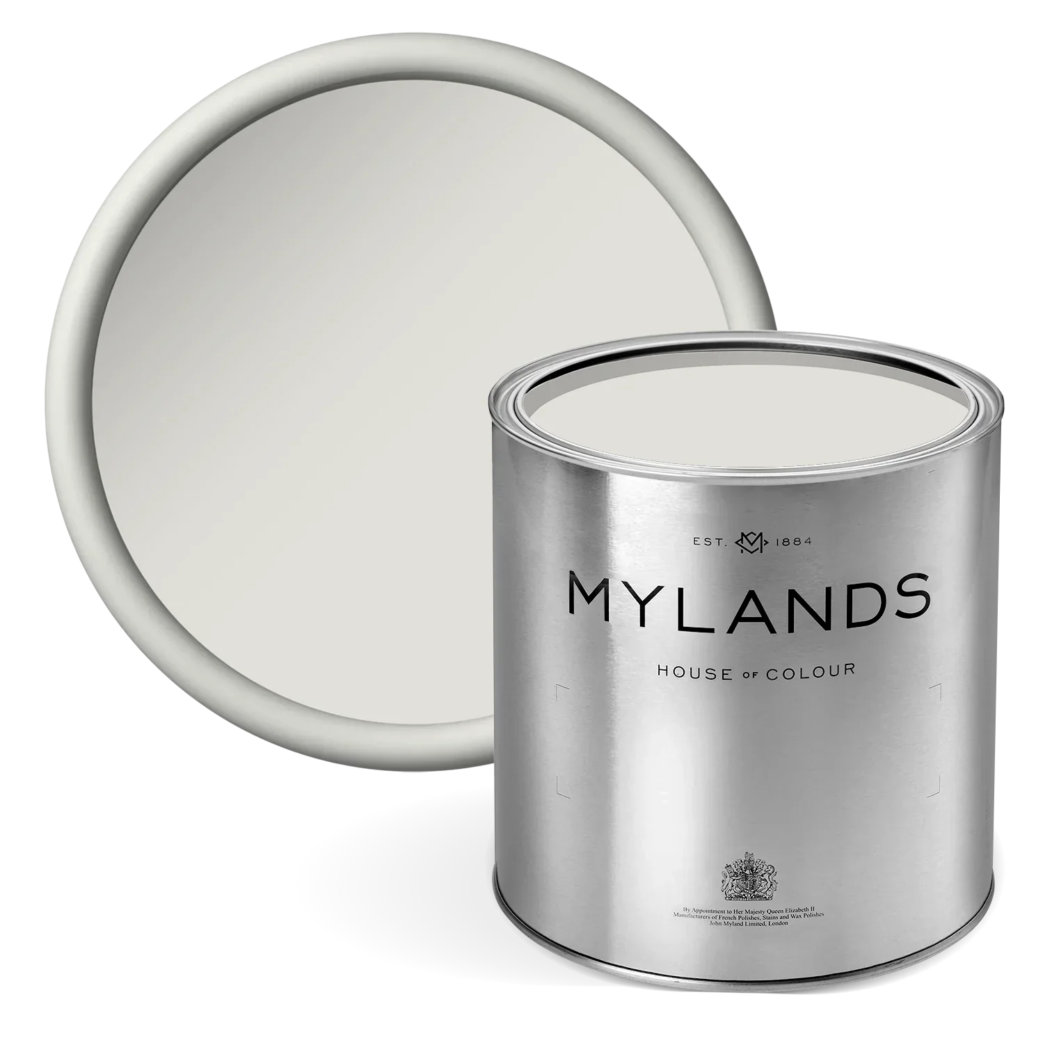
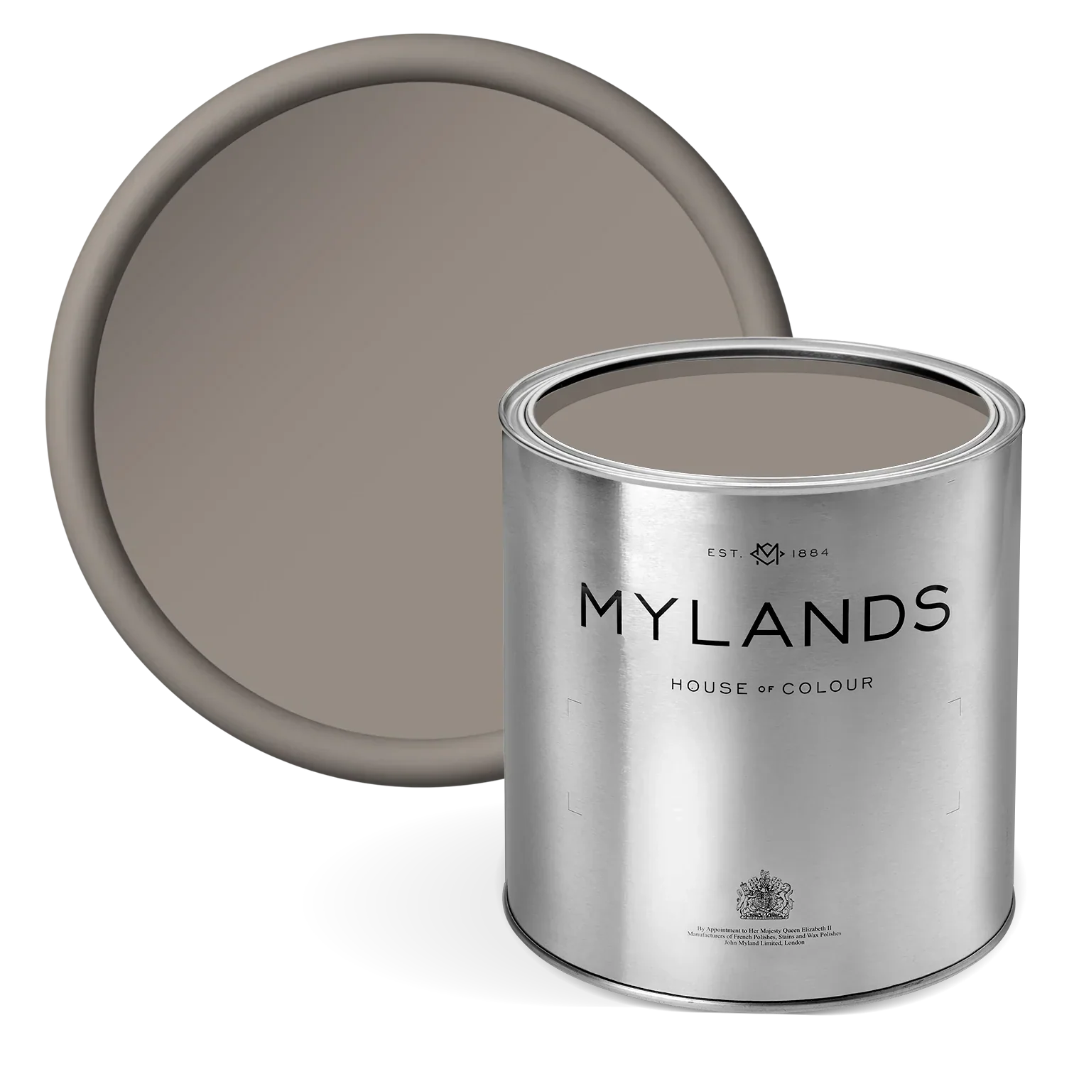
Stone paint with grey undertones can reflect natural colours from a light pebble grey to dark grey granite. You will probably be familiar with the term ‘greige’, a blend of grey and beige, which is an apt description of many stone colours.
9 colour combinations to match with stone
For a toasty and welcoming living space or a serene and restful bedroom, the soft hues that a warm neutral stone colour palette provides are simply perfect. It is a versatile colour that will sit comfortably alongside many others. Here are 10 of our favourite colour combinations with stone.
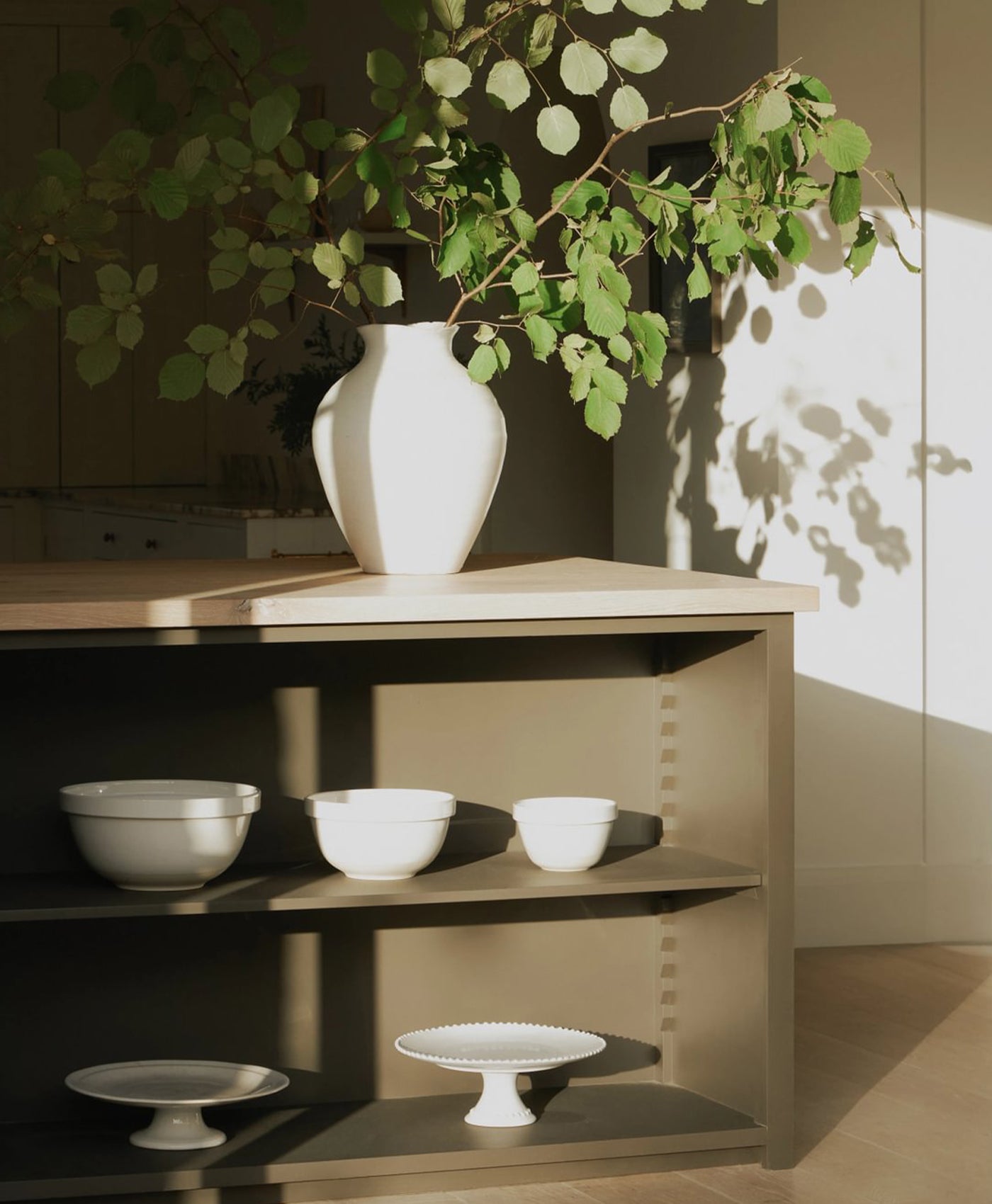
1. Layer neutral colours
Why single out one neutral colour when you can layer multiple warm neutrals to create an elegant and inviting environment? Pair different strengths of stone colour. You could go for a light stone colour (like off-white) on the walls with a darker stone (such as taupe) on the woodwork, or vice versa. It creates a cohesive and stylish colour scheme.
This neutral colour palette works well with natural interior design themes. If you love coastal chic, bring together pale pebble colours with natural materials like wood and rope. For an organic, earthy home decor, incorporate natural elements like wooden floors and furniture, textiles, plants and brick or earthy tiling.
In this photo, Mylands Temple Bar™ No.70 paint brings an easy-going ambience to this living space, flowing seamlessly between the kitchen and the dining room. Its chalky finish and soft tone is less harsh than a bright white and pairs beautifully with the pale wooden floor and furniture.

Walls and cabinetry in Temple Bar™ No.70 - @herringbonehouse


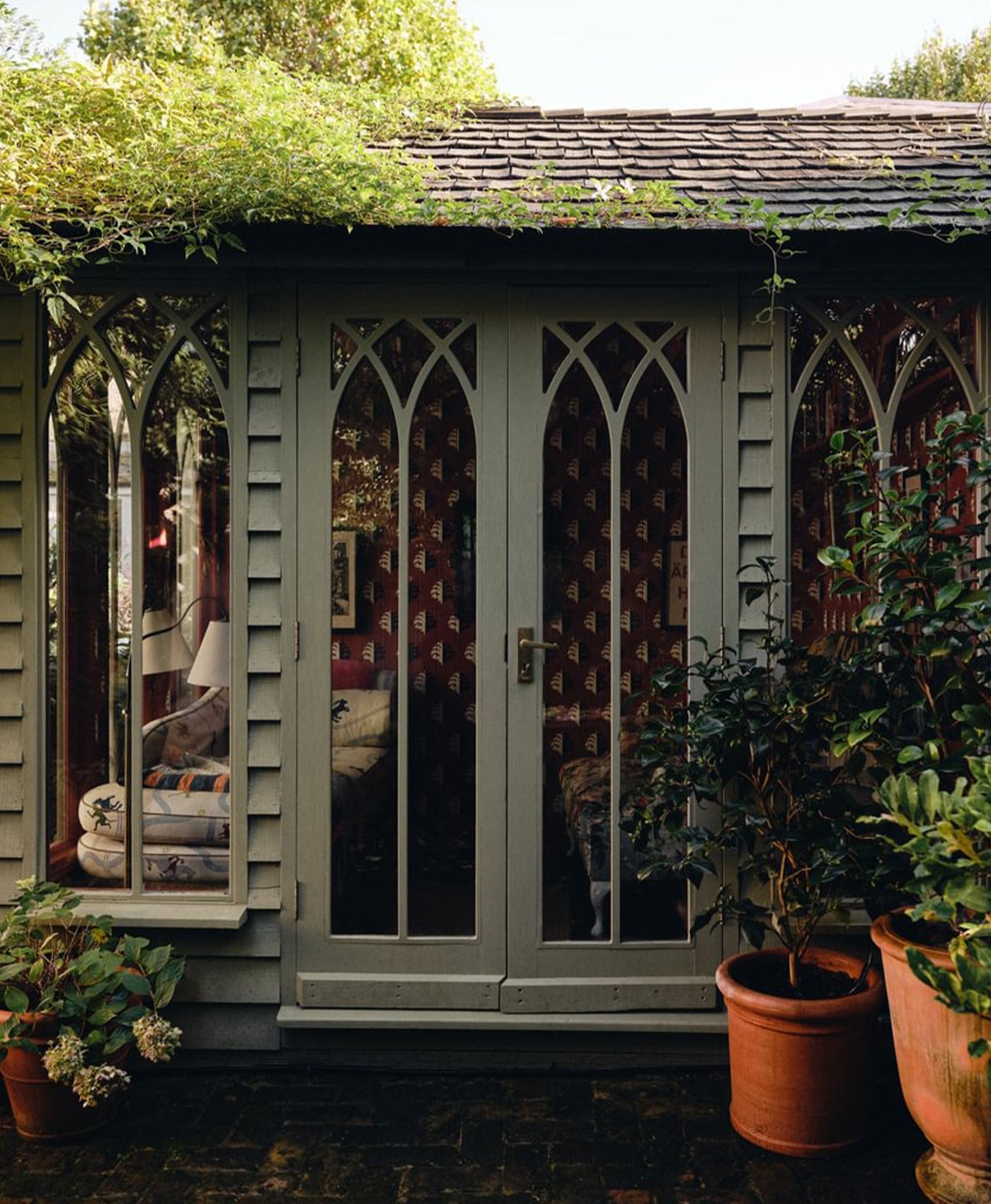
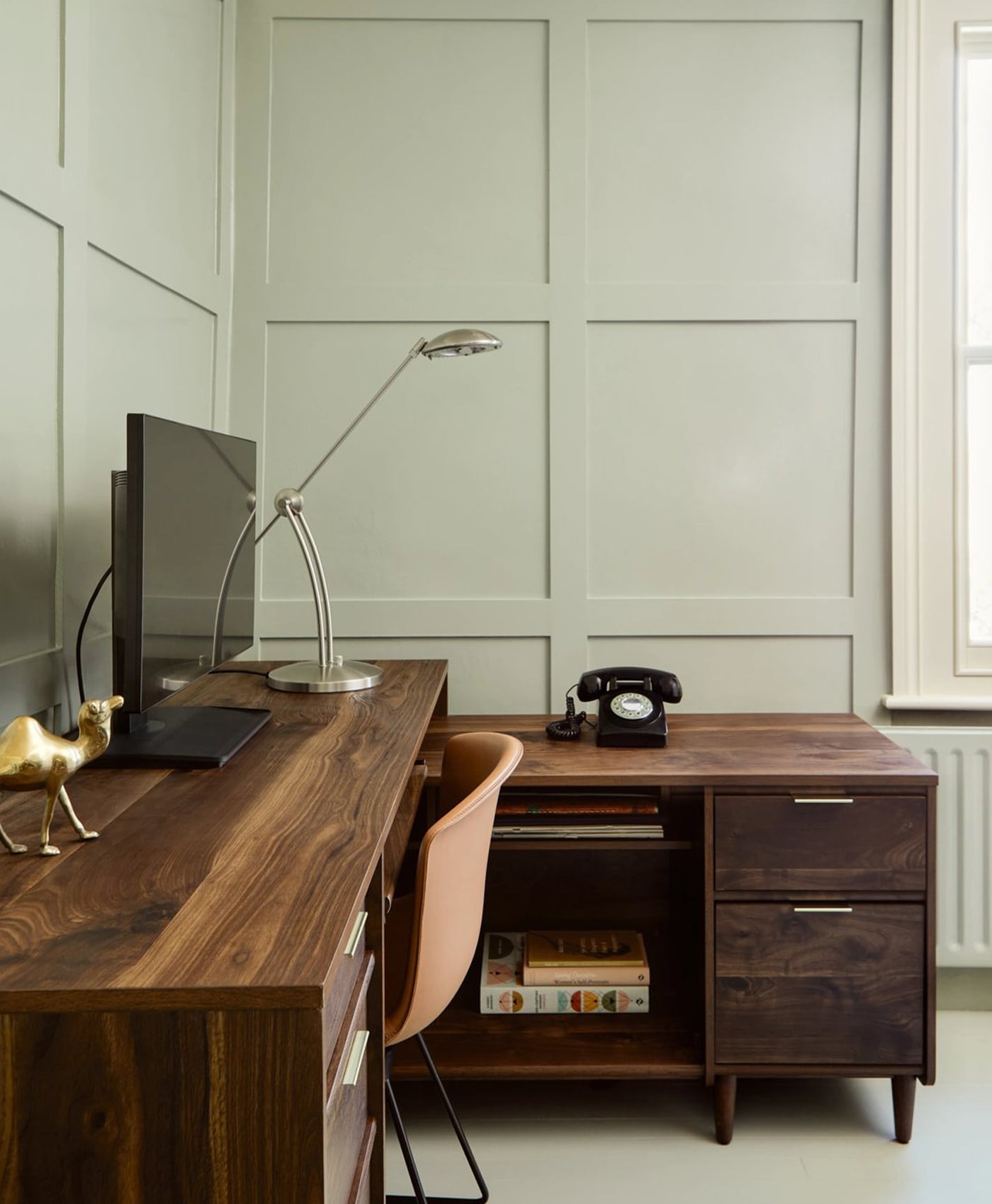
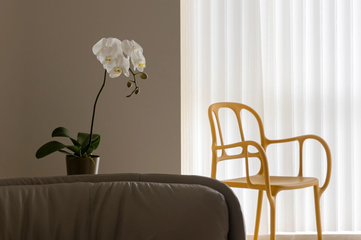
2. Deep green
Keep it natural by pairing earthy tones. A deep, leafy green works wonderfully alongside a natural stone colour. With deep green as a dark accent, the natural shade lends itself to combinations with light, earthy neutral tones.
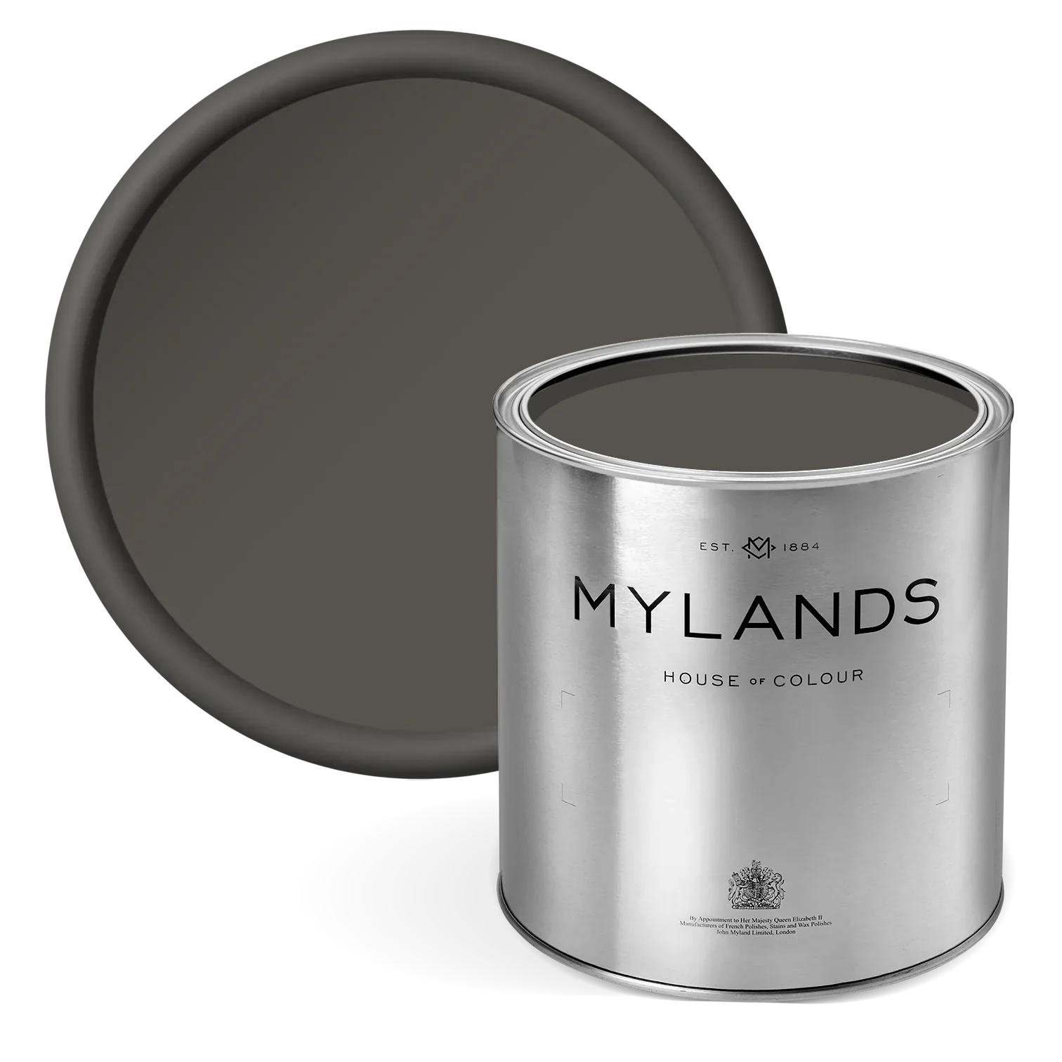
In this living room, Mylands Brompton Road No.205 defines the window frame and draws the eye to the beautiful greenery outside. Meanwhile, the Cadogan Stone walls provide a soft, complementary pairing to the deep green. The neutral green and stone colours sit in harmony, echoing the natural vista outside.
Walls in Holland Park No.5 (left image) Walls in Honest John™ No.58 (right image), Woodwork in Messel™ No.39
3. Sage green
Another natural earthy tone, sage green is a mid-tone colour with a muted appearance that has been exceptionally popular of late. The soft green shade exudes a sense of calm and harmony.
When you have had a hectic day, you will feel your tense shoulders relax and you will breathe easier in this serene environment. The colour combination of sage green and stone works equally well in a kitchen, bedroom or living space. Here, it creates a fresh and balanced kitchen colour scheme.


Cabinetry in Greenstone™ No.190, Walls in Honest John™ No.58, Ceiling in Charterhouse™ No.4
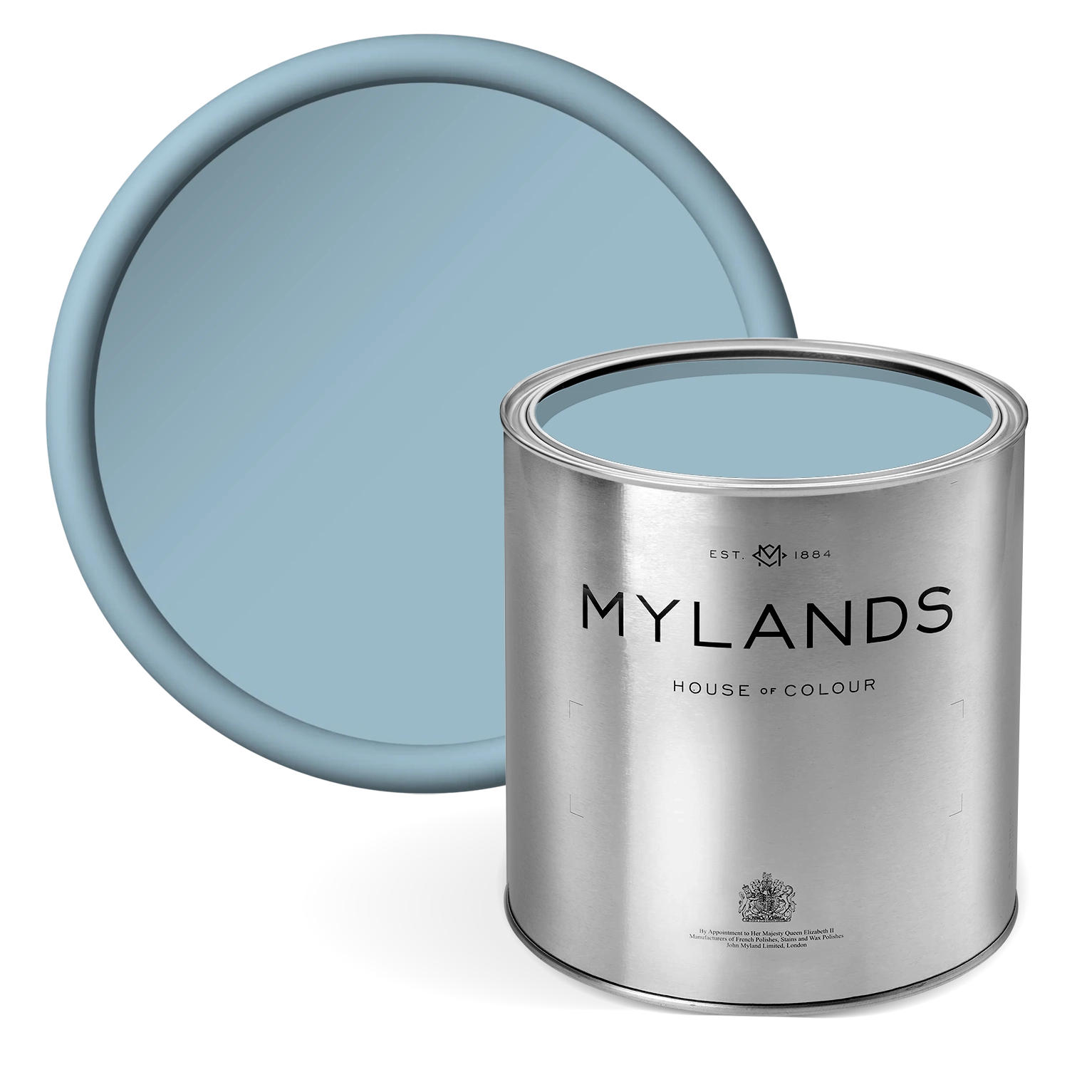
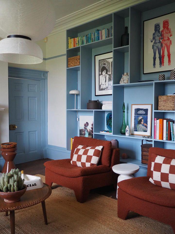
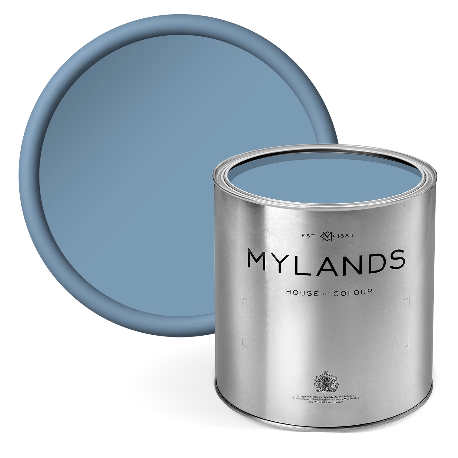
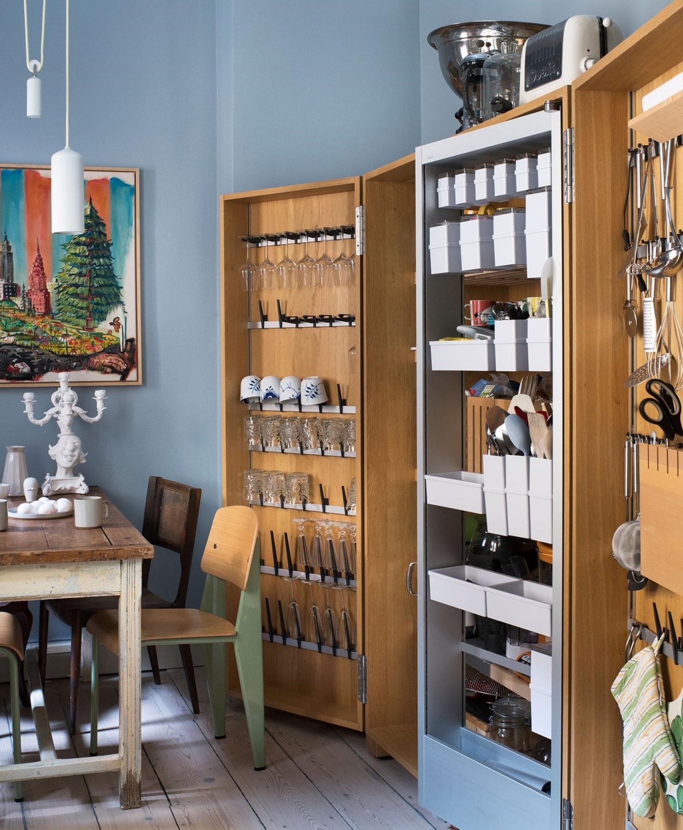
4. Pastel blue
Another colour that is perfectly suited to creating a tranquil ambience, is a soft pastel blue. Blue, like grey, can be a cool tone so a warm neutral colour can lift it and ensure you have a well-balanced colour scheme. Instead of traditional white woodwork alongside pastel blue walls, use a stone colour for added warmth.
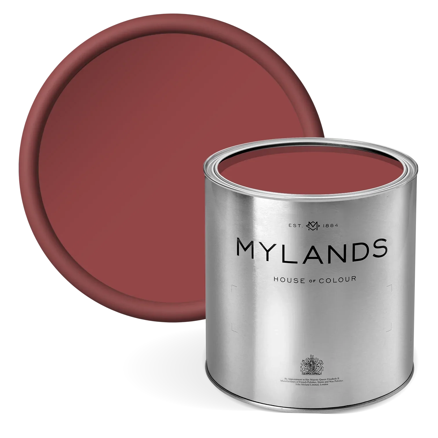
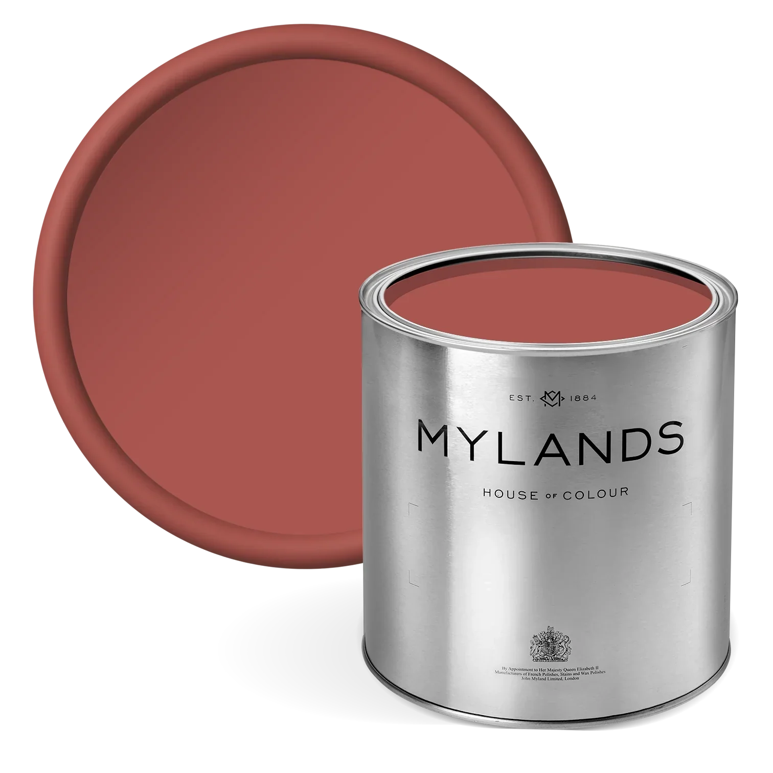
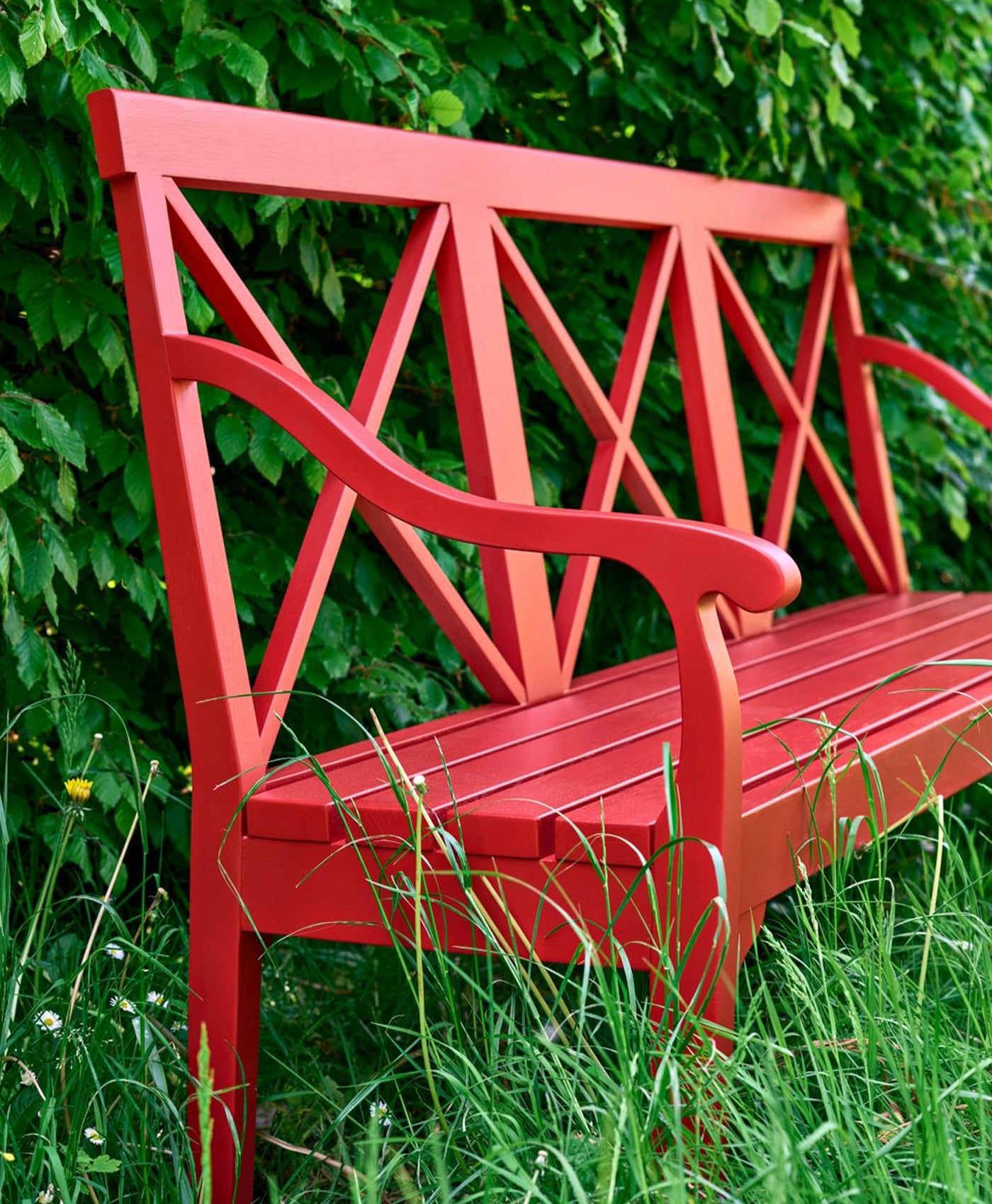
5. Spicy red
Neutral stone wall colours with warm undertones can be enhanced by hits of bold accent colours. Think spicy red, burnt orange or terracotta. All of them have earthy undertones that are a great match for a fellow warm, natural colour like stone. Use pops of these red colours in furnishings like cushions, curtains, lampshades, throws - or even furniture - as a contrasting yet complementary shade.
6. Glistening gold
Do not be scared of metallic shades or use them only at Christmas. A touch of gold can bring a certain magic and sophistication to your home decor. Its reflective lustre can enhance the light and provide a contrasting finish to matt stone paint. It brings an extra layer of interest and elegance to a room.

Panelling in Temple Bar™ No.70 - @mrs_lang1
To make a real statement, you could pair gold walls with soft, muted stone colour accessories. This combination works to great effect in this stunning bedroom. Mylands FTT-001 drenches the walls, ceiling and radiator whilst natural stone-coloured linen drapes soften the overall look.

Walls in FTT-001™ - Rich Gold - @tatjanavonstein
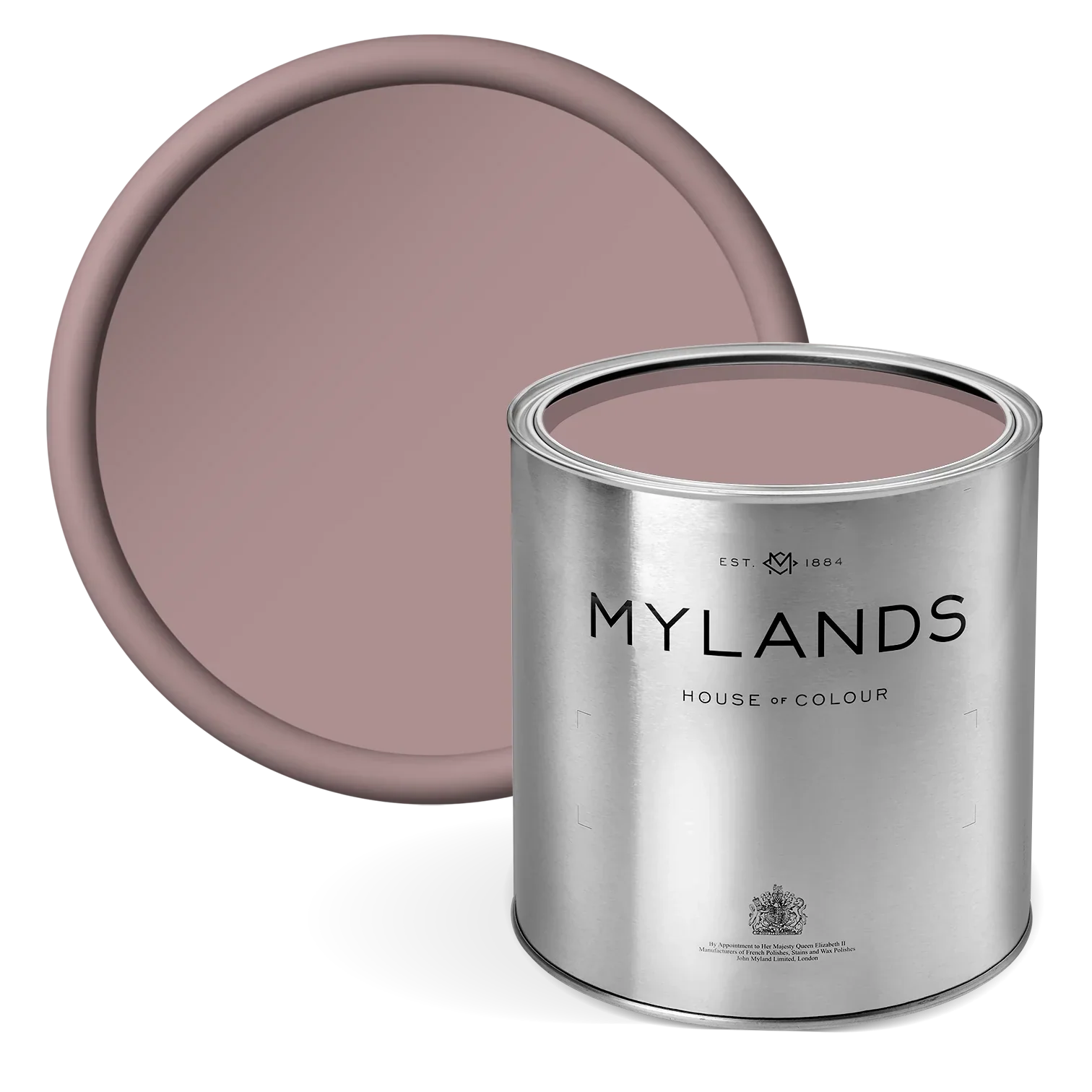
7. Soft pink
A soft muted pink (like Bloomsbury No.267) enhances a living space with a romantic elegance. Combined with an earthy stone wall colour, it brings an easy warmth. That is an ideal atmosphere for a hallway - the place to welcome guests to your home.

Cabinetry in Bloomsbury™ No.267
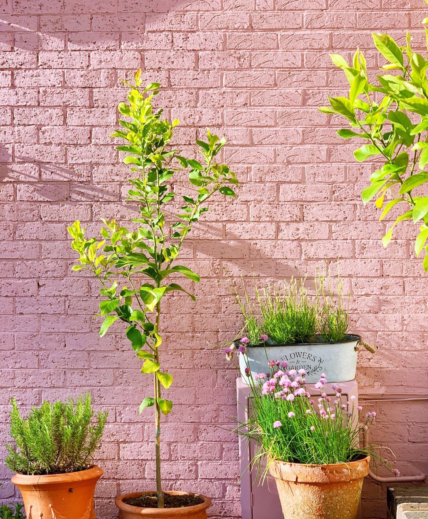
This pretty colour combo can elevate your exterior space too. Brighten up neutral stone exterior walls with a pop of pink. Here, a pink-painted ladder adds warmth and interest but you could paint garden furniture or even ceramic flower pots to great effect.

Ladder in Bloomsbury™ No.267 - @masonandpainter
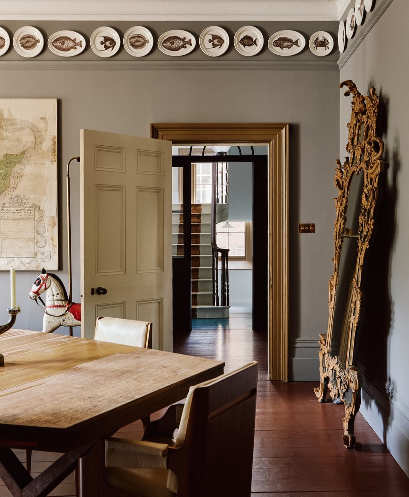
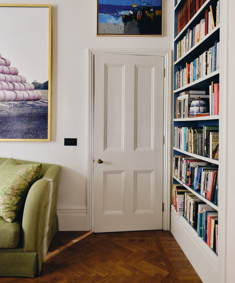
8. Bright white
For a timeless style, team bright white with a softer stone colour. Natural stone is strong enough to contrast with bright whites and light woods bringing an element of warmth. Stone can act as a grounding colour with white as the accent.
In this living room, the wall colour is Mylands' Honest John™ No.58. It is a warm, stone colour which is far less stark than the pure, snow white used on the ceilings and woodwork. Honest John is a firm favourite of ours as this traditional off-white paint colour is named after our founder, John Myland (‘Honest John’) who started this company in 1884.

Walls in Honest John™ No.58

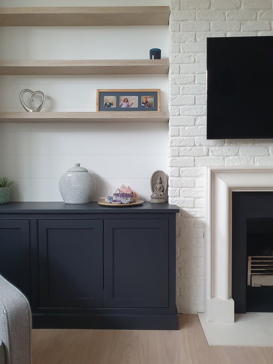
Cabinetry in Blackout™ No.41, Walls in Ludgate Circus™ No.89
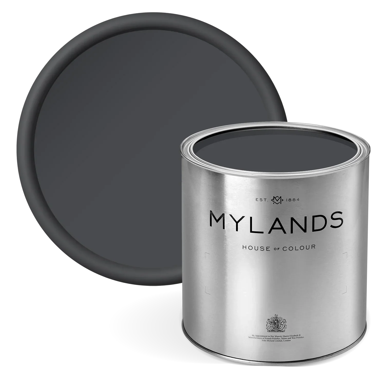
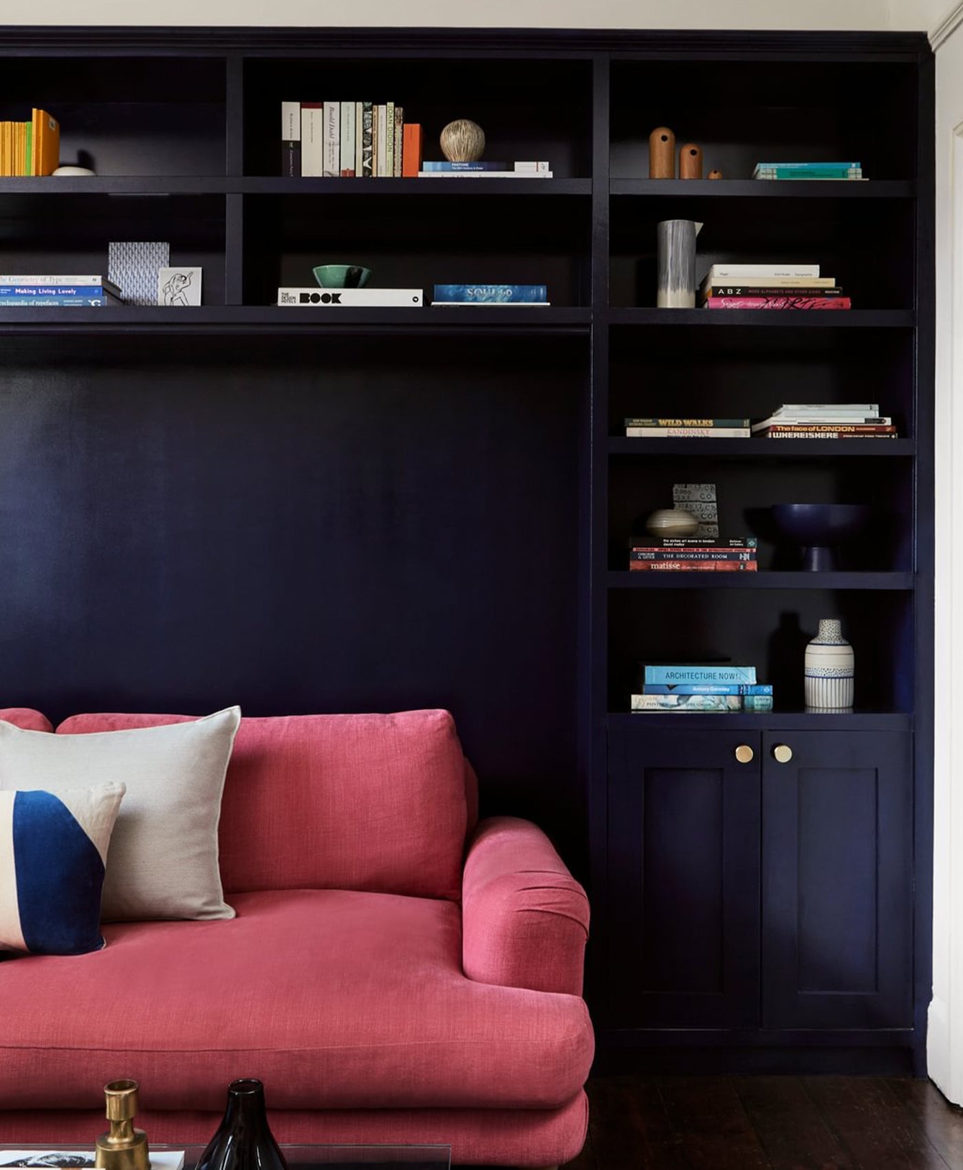
9. Back to black
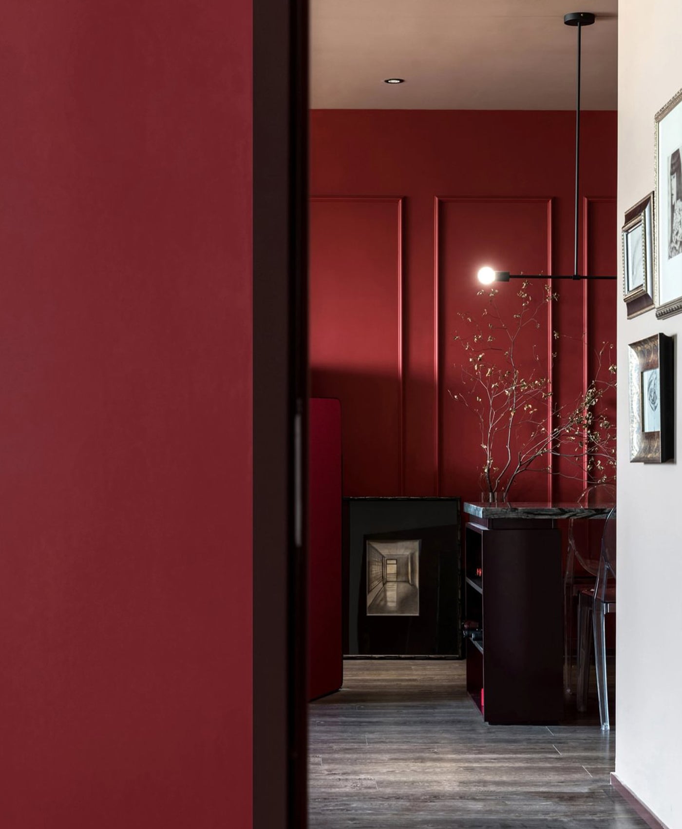
Softer than the classic black and white monochrome colour combination, black and stone is an elegant and sophisticated pairing. That could be sleek black cabinetry alongside stone walls and ceilings in the kitchen. It may be contemporary black furniture offset by soft stone decor in a living room or dining room for example. It could even be a smart black front door and/or window frames against a stone exterior.
Find your ideal colour combination with stone
Warm neutral colours are perennial favourites, unsurprisingly. Given that they create inviting, cosy environments, it is no wonder that warm neutrals like stone have become so popular.
They are also wonderfully versatile, allowing you to inject your own personality and style into stone interior design schemes. Stone can be incorporated into most home decor styles too, from sleek contemporary minimalism to calming coastal chic or natural earthy design.
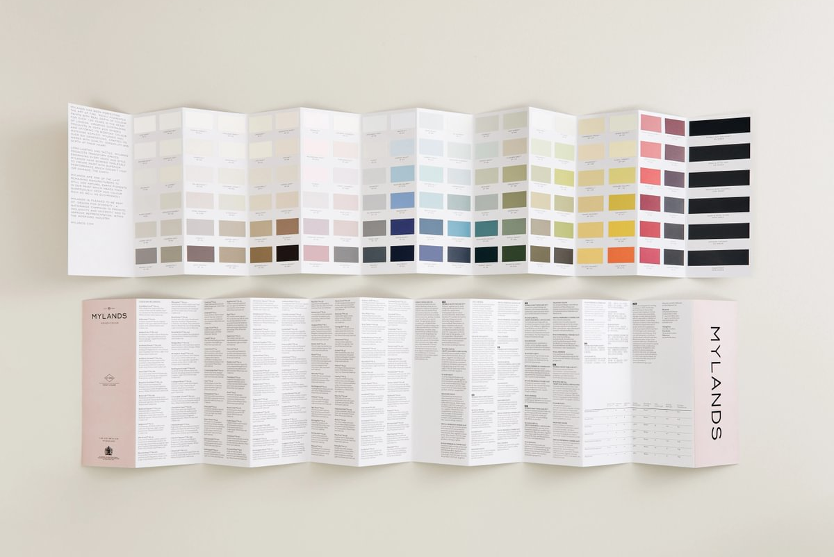
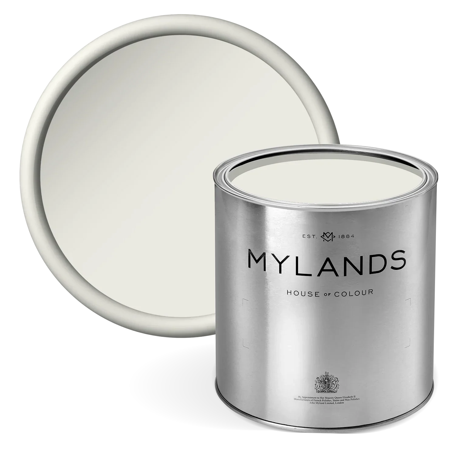
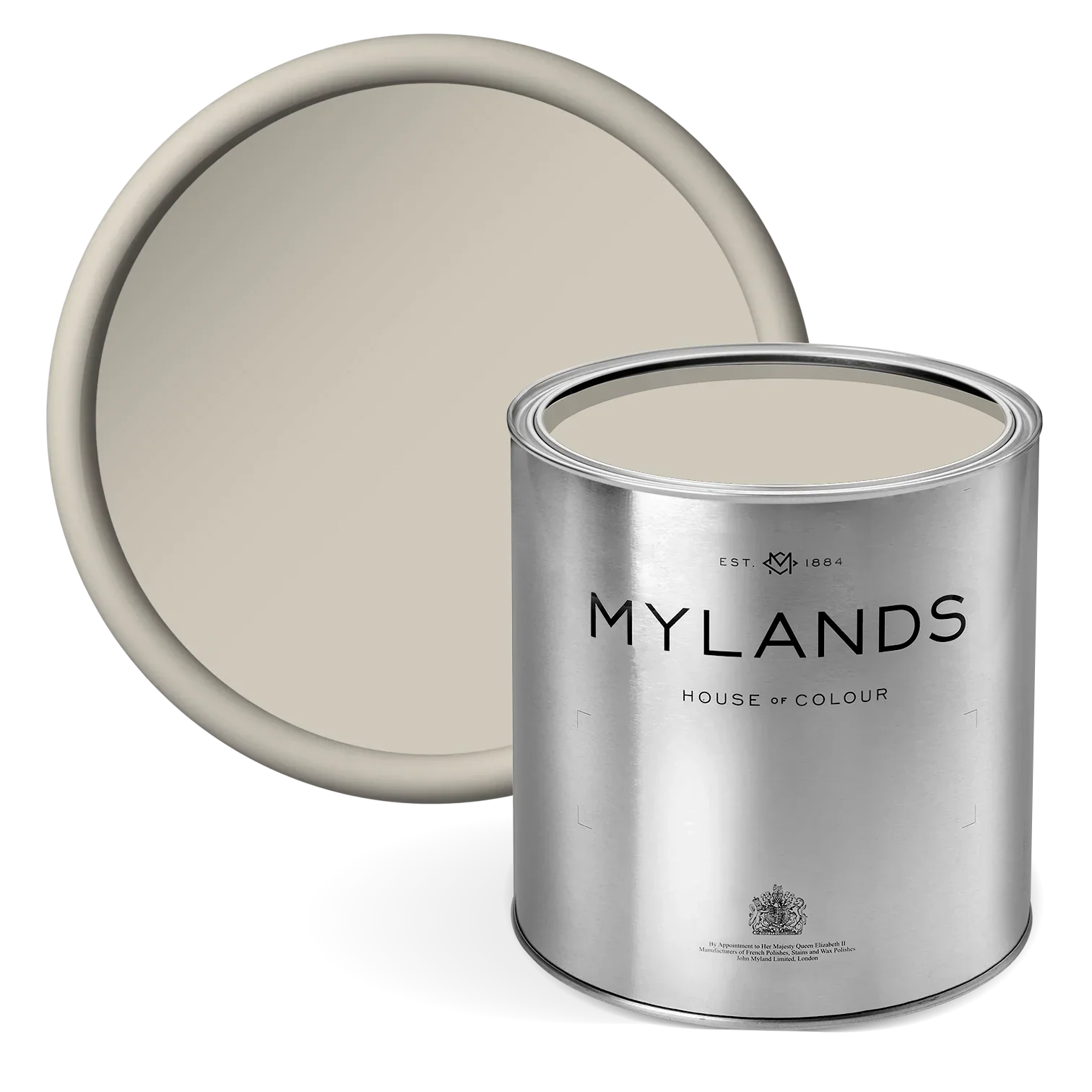
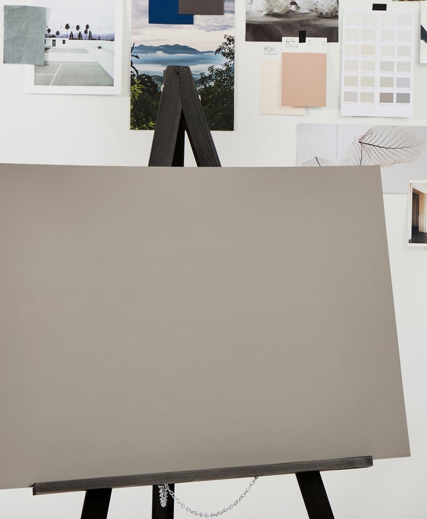
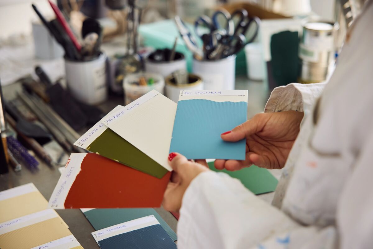
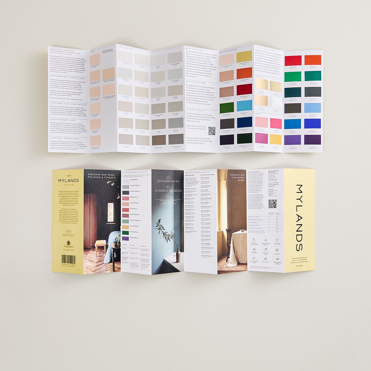
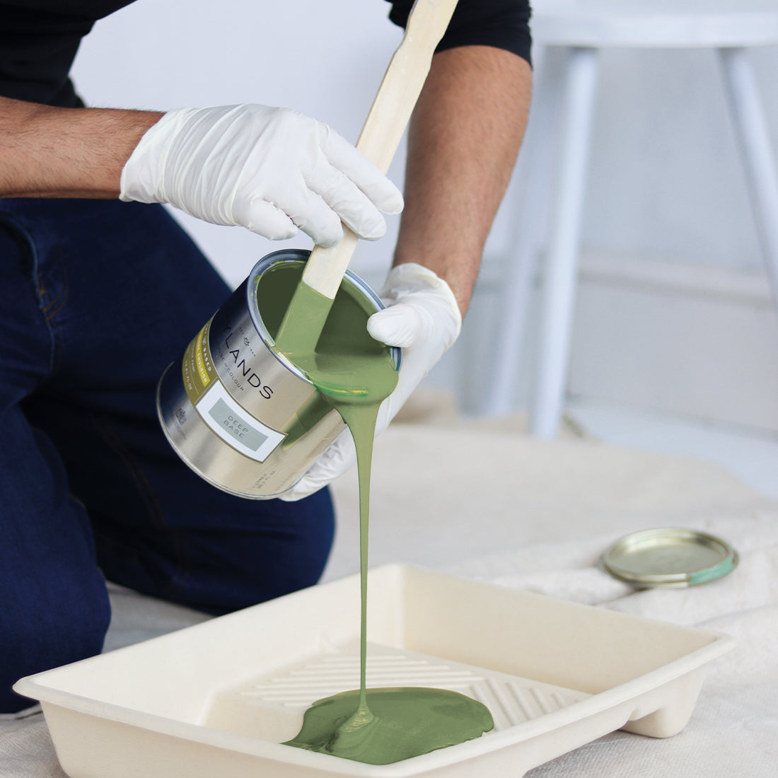
Try before you buy to find your ideal colour combination. Check our free colour card, experiment with sample pots of paint colour and swatches of fabric to discover which shades suit your space best. Our stone paint colours come in multiple finishes with our marble matt emulsion being the most popular. Check our Advice section for help with choosing your paint colour and finish.