Tones To Elevate Your Quiet Corners

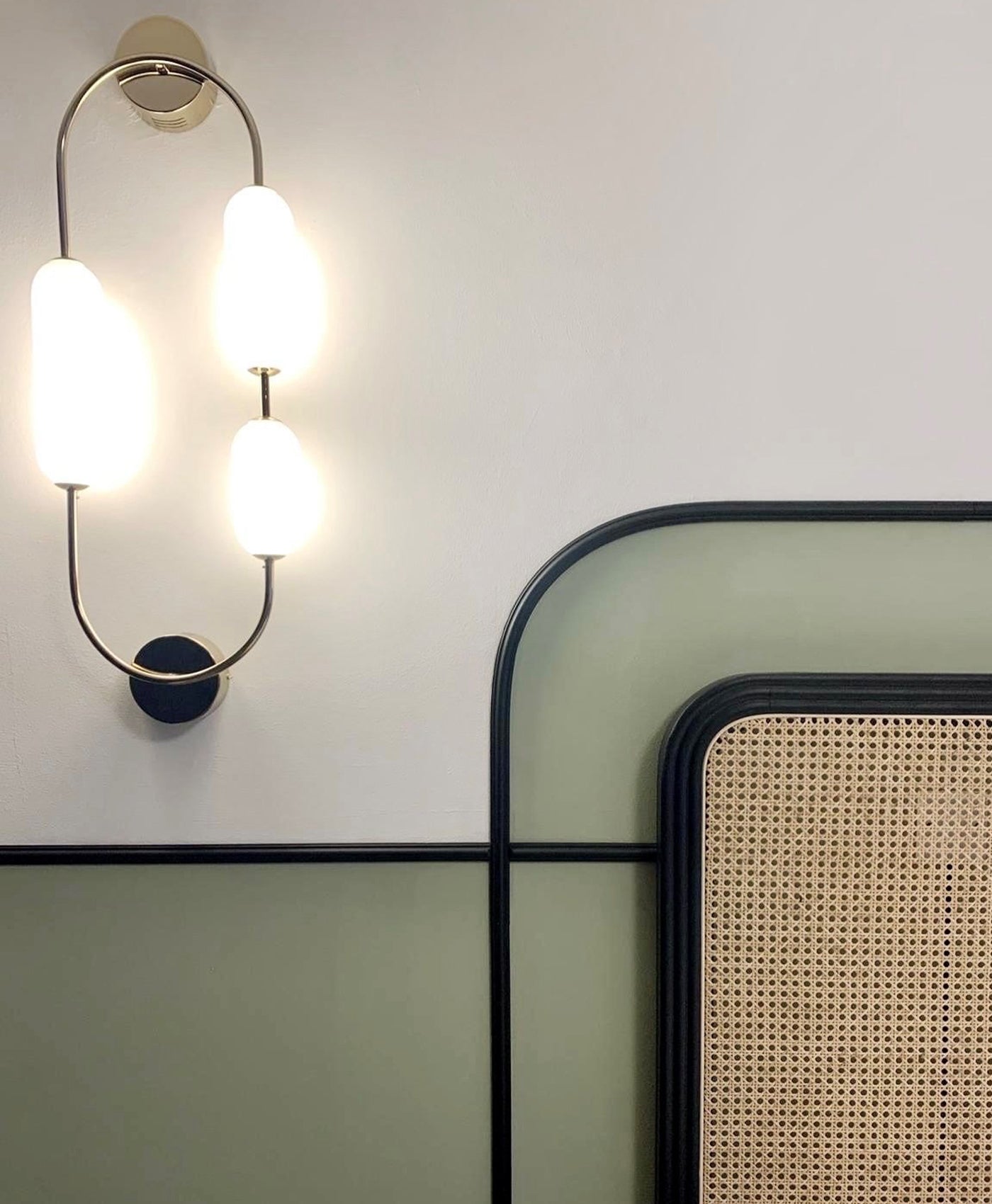
Walls in Wheatsheaf BH.23, Woodwork in Stockholm BH.11
A well-chosen palette can transform a quiet nook into a space of calm and comfort. Whether it’s a reading spot by the fire or a sunlit alcove, using warm tones, layered finishes, or subtle contrasts can bring depth and softness to smaller spaces. Explore how colour can shape mood, define space, and make every corner feel considered.

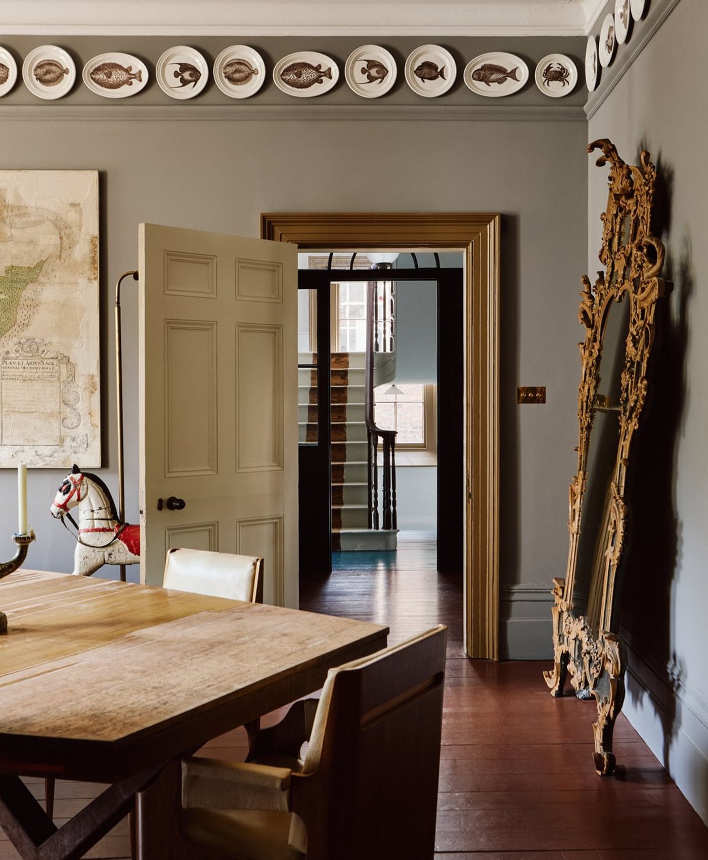
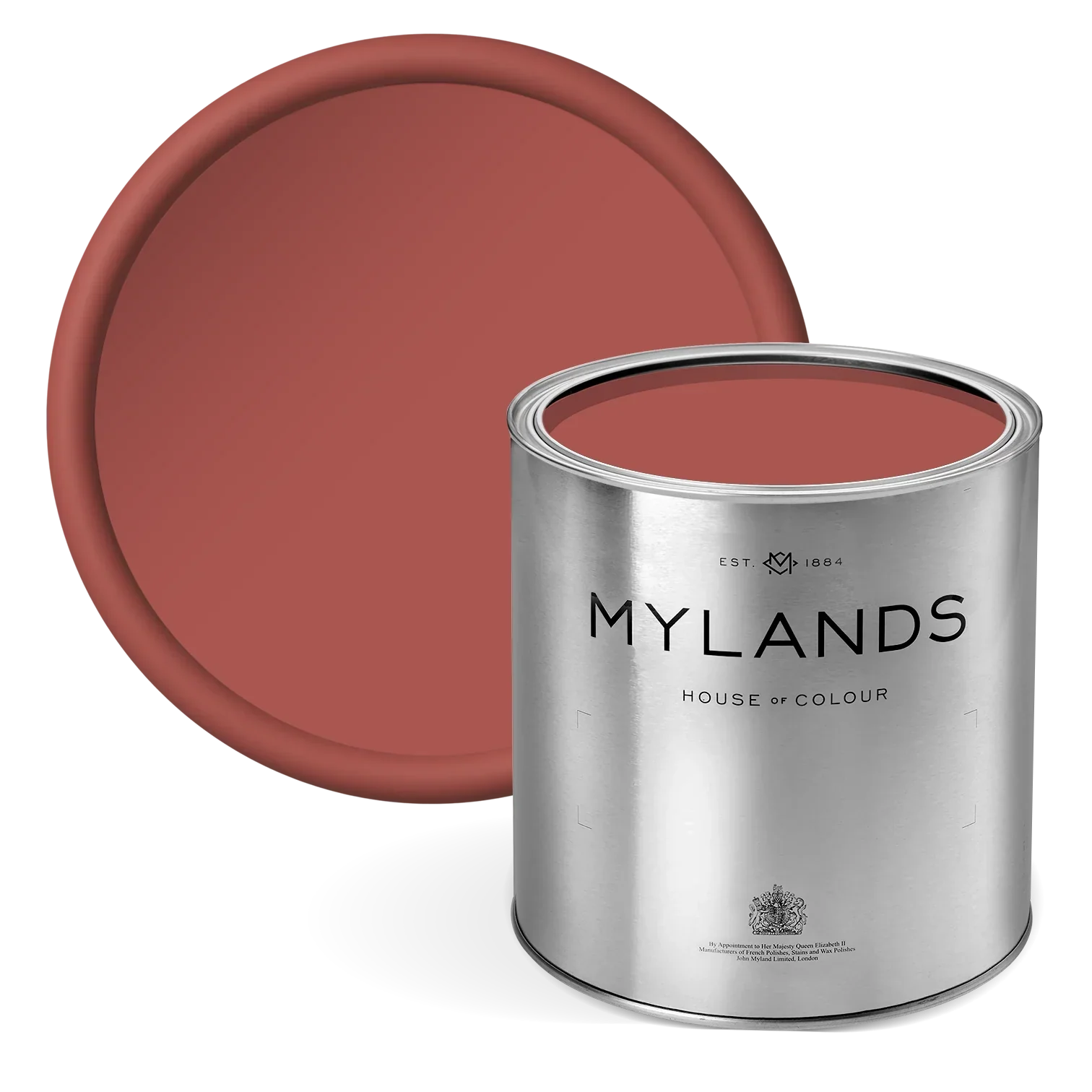
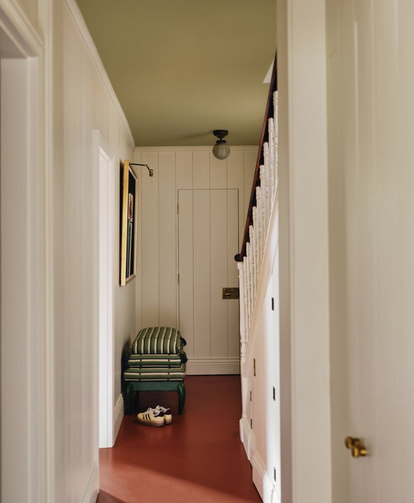
Walls, Fireplace and Ceiling in Walbrook™ No.142
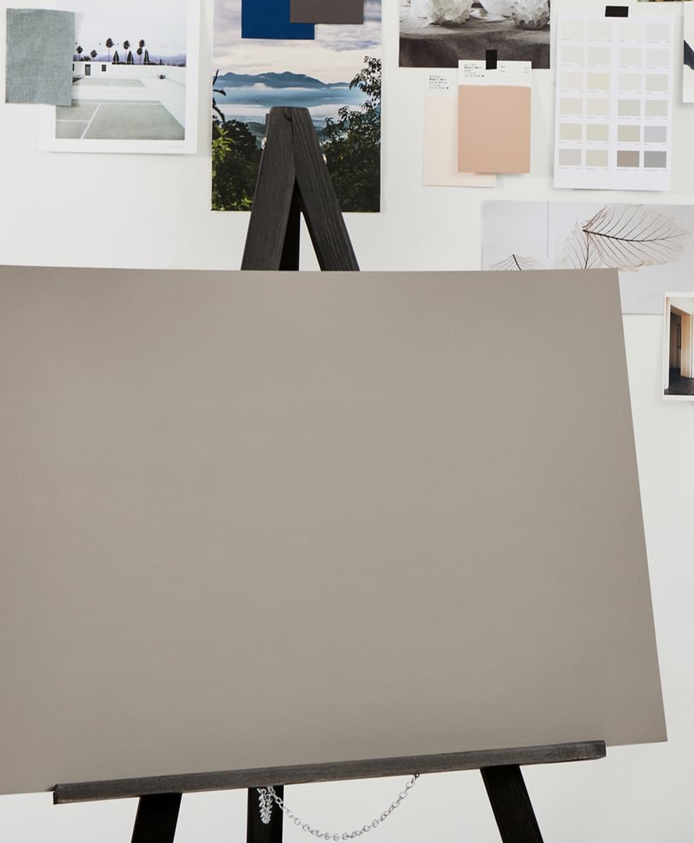
How Warm Neutrals Transform Small Spaces
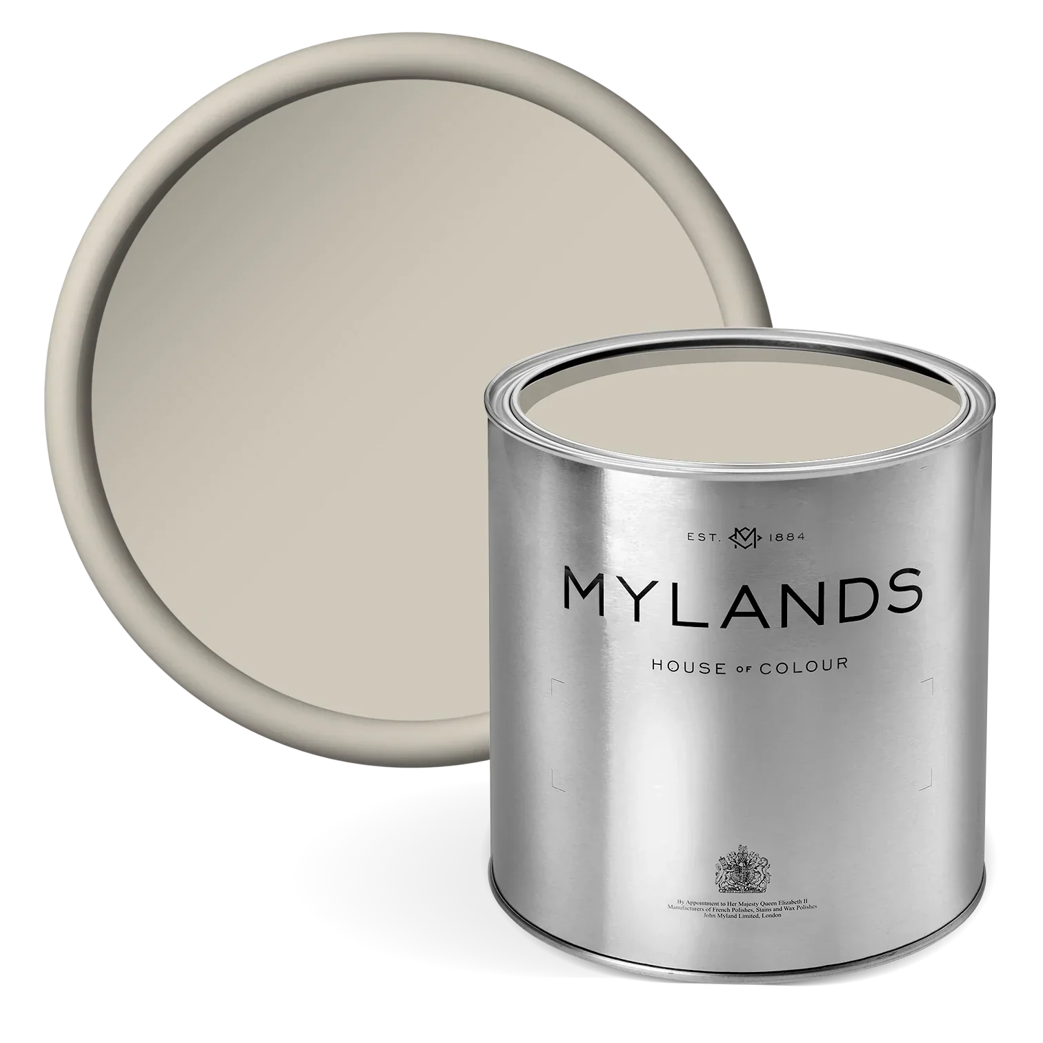
Warm neutrals are essential in design, particularly when transforming small spaces into serene, purposeful retreats. These understated tones of taupes, muted sands, and creamy off-whites, bring a sense of calm and quiet sophistication to tucked away corners.
Whether you're designing a reading nook, a hallway alcove, or a peaceful bedroom corner, a warm neutral colour palette helps create an atmosphere of comfort and timeless elegance.
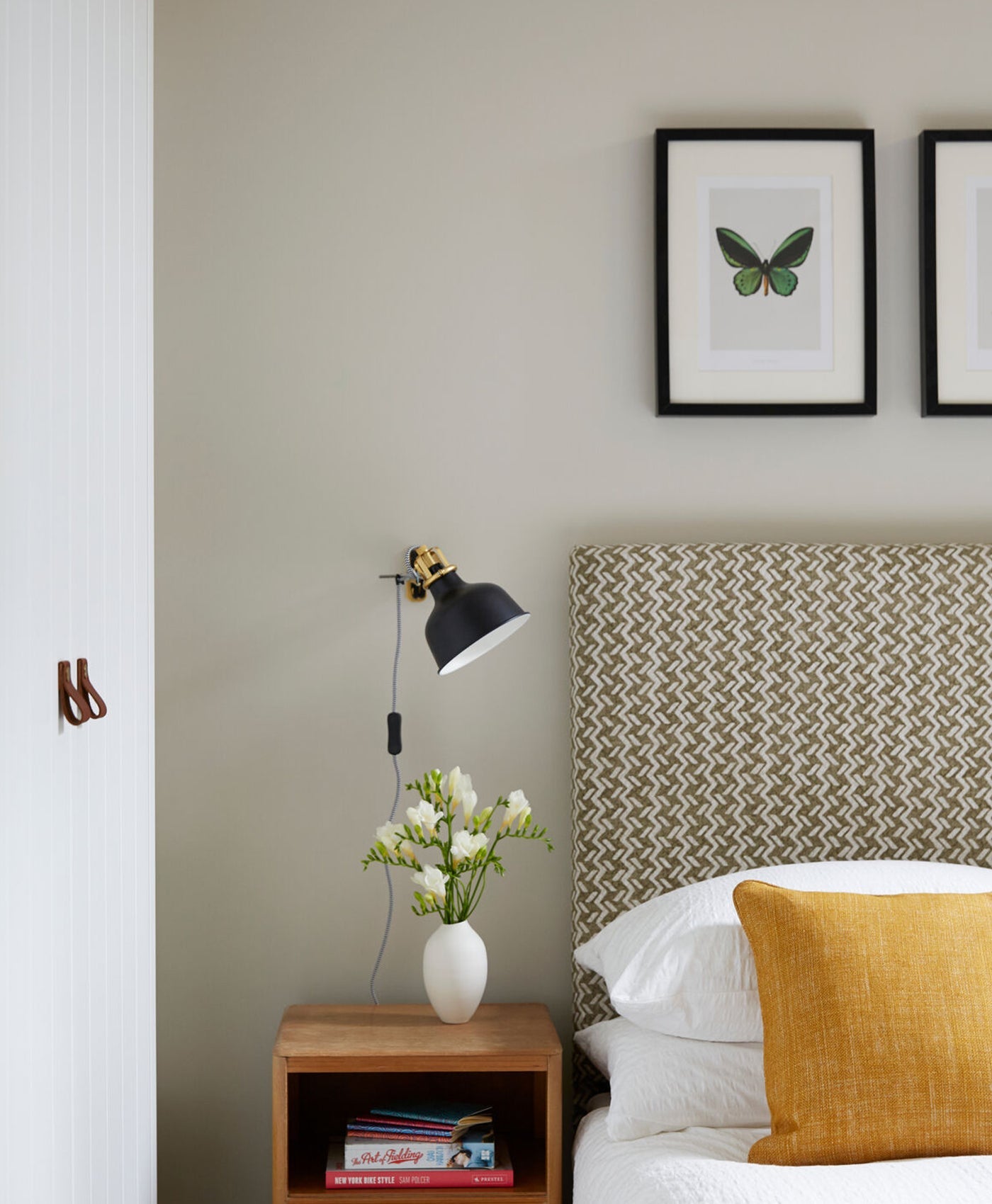
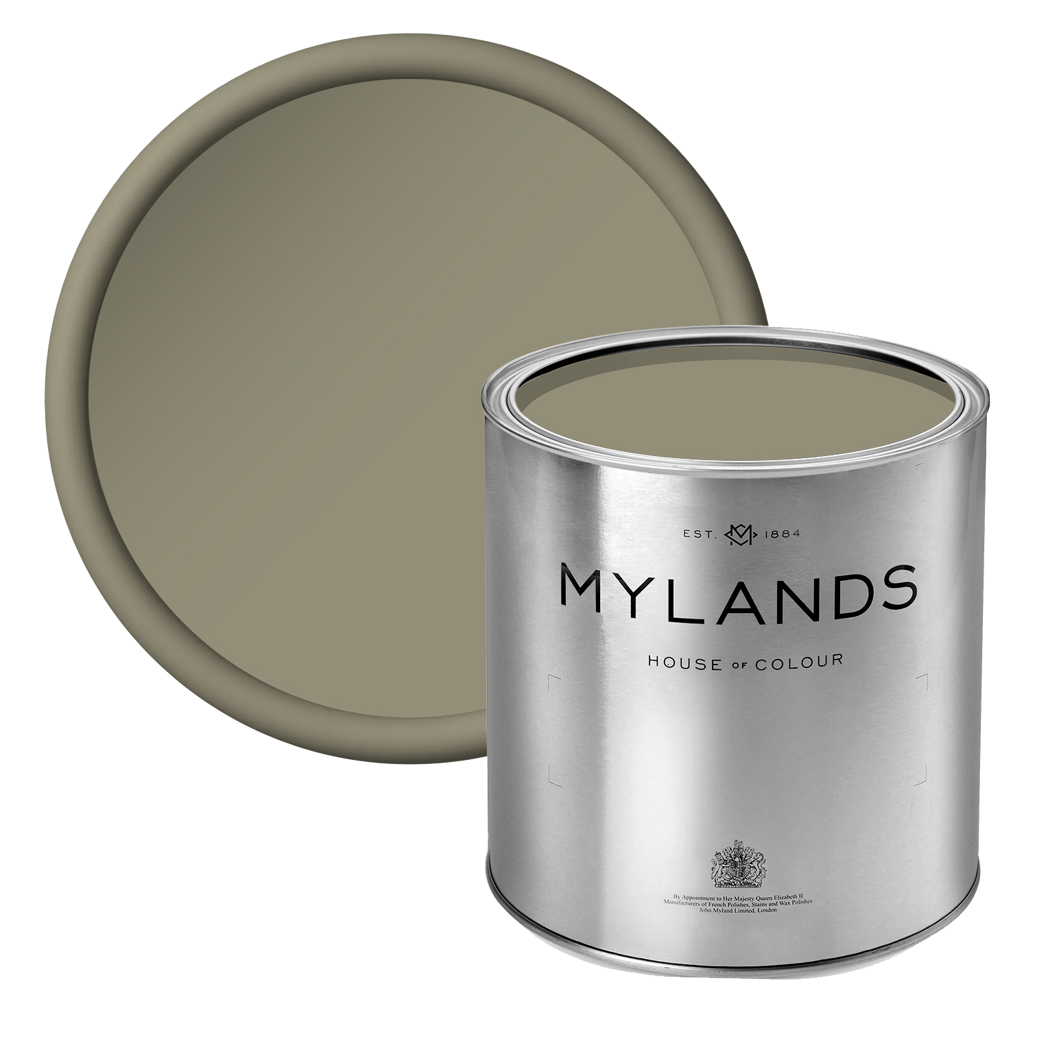
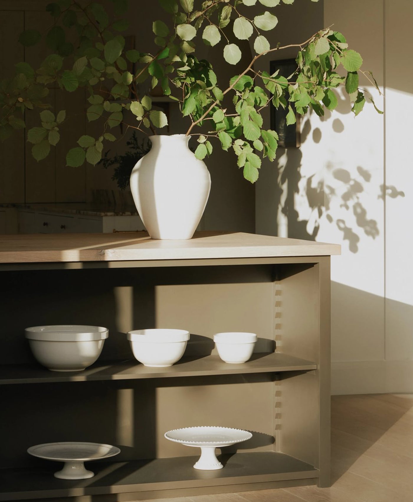
Here, Walbrook™ No.142 adorns the space. This off-white cream provides the allure of comfort. It lifts the space, creating a nurturing and intimate atmosphere. In reading nooks, alcoves, or under-stair spaces, this colour helps the space feel less forgotten and more inviting. The shade wraps the space in a soft glow, offering tranquility while exuding style and elegance.
In enclosed or angular interiors, stark colour contrasts can make edges feel more rigid and confined. Instead, neutral tones can help visually soften architectural transitions, between wall and ceiling, or around built-ins, making a corner feel more continuous and cocooned. This effect subtly draws you into the space, encouraging you to stay.
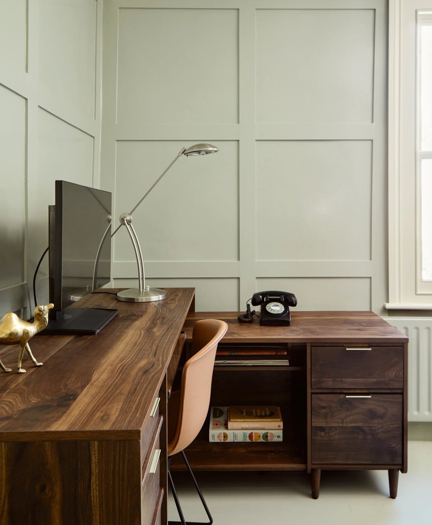
Using Gentle Colour to Create Depth
In smaller spaces, colour becomes more than just a visual element, it defines how you interact with a space. A darker or more saturated hue can create a sense of enclosure, while soft or gentle tones can open it up, letting light play across the surface in ways that feel airy and gentle.
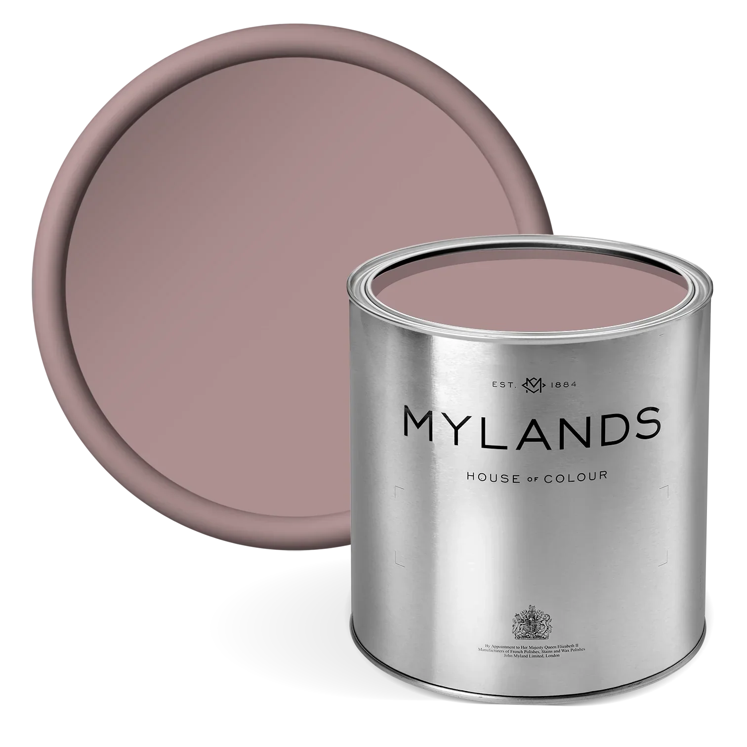
Inside this cabinetry is the blush pink shade Mormor Zaza BH.17, turning an unassuming storage piece into a striking focal point.
Soft yet sophisticated, the pink hue adds warmth and contrast against the marbled blue exterior, creating a layered visual experience that feels both intimate and refined. In a small space, this gentle burst of colour not only brightens the atmosphere but also softens the harder architectural lines around it. It draws the eye inward, making the corner feel considered and inviting; proof that even a whisper of colour can completely transform the mood of a space.

Drawing Room, inside cabinet in Mormor Zaza BH.17

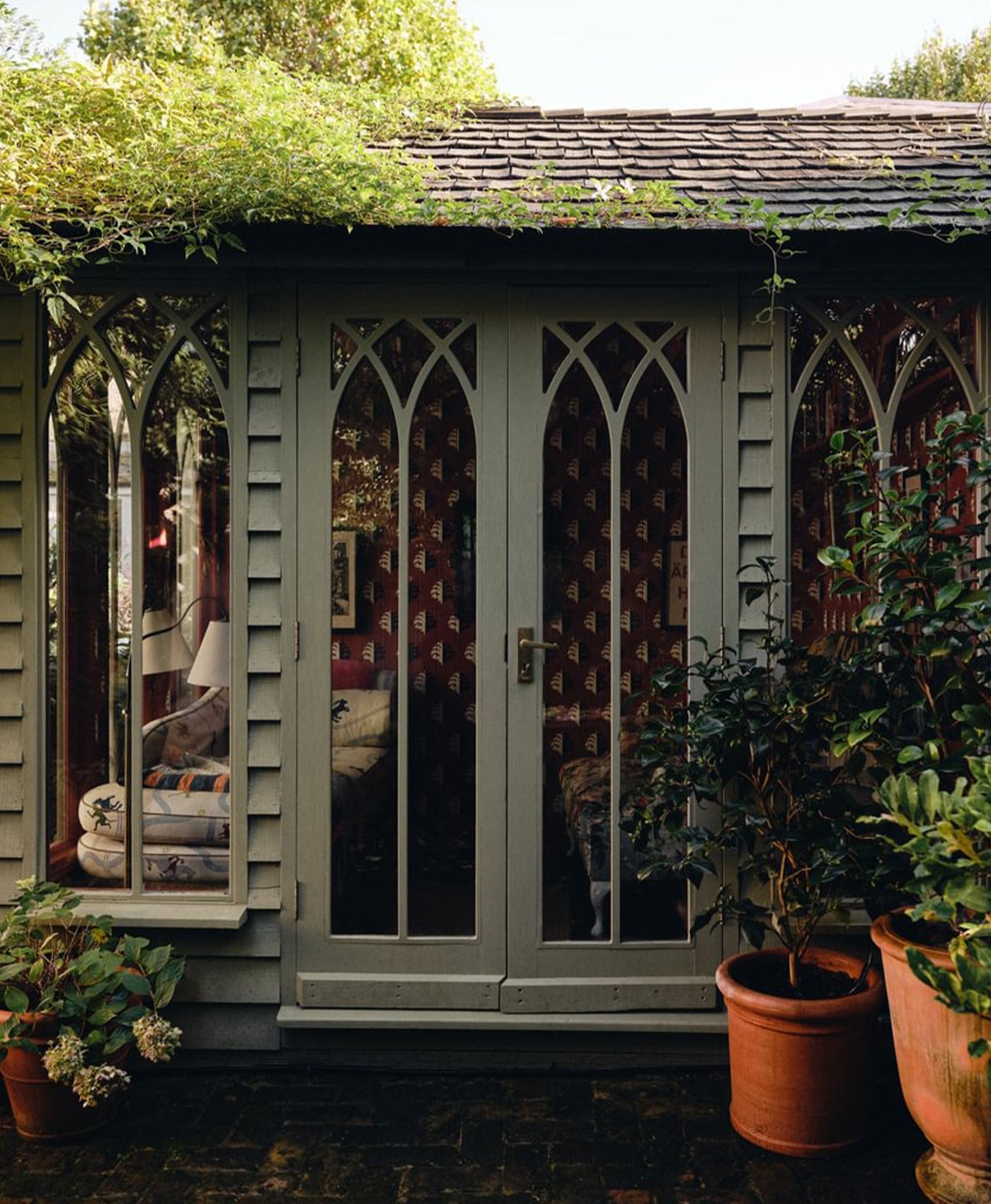
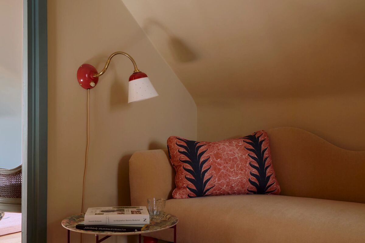
Fireplace and Woodwork in Old Man's Beard BH.03, Table in Cigar BH.20
Warmth In The Margins
Tucked between ornate architectural details and a flourish of patterned wallpaper, are corners like these. By adding darker accents and pieces, these modest corners become something far richer.
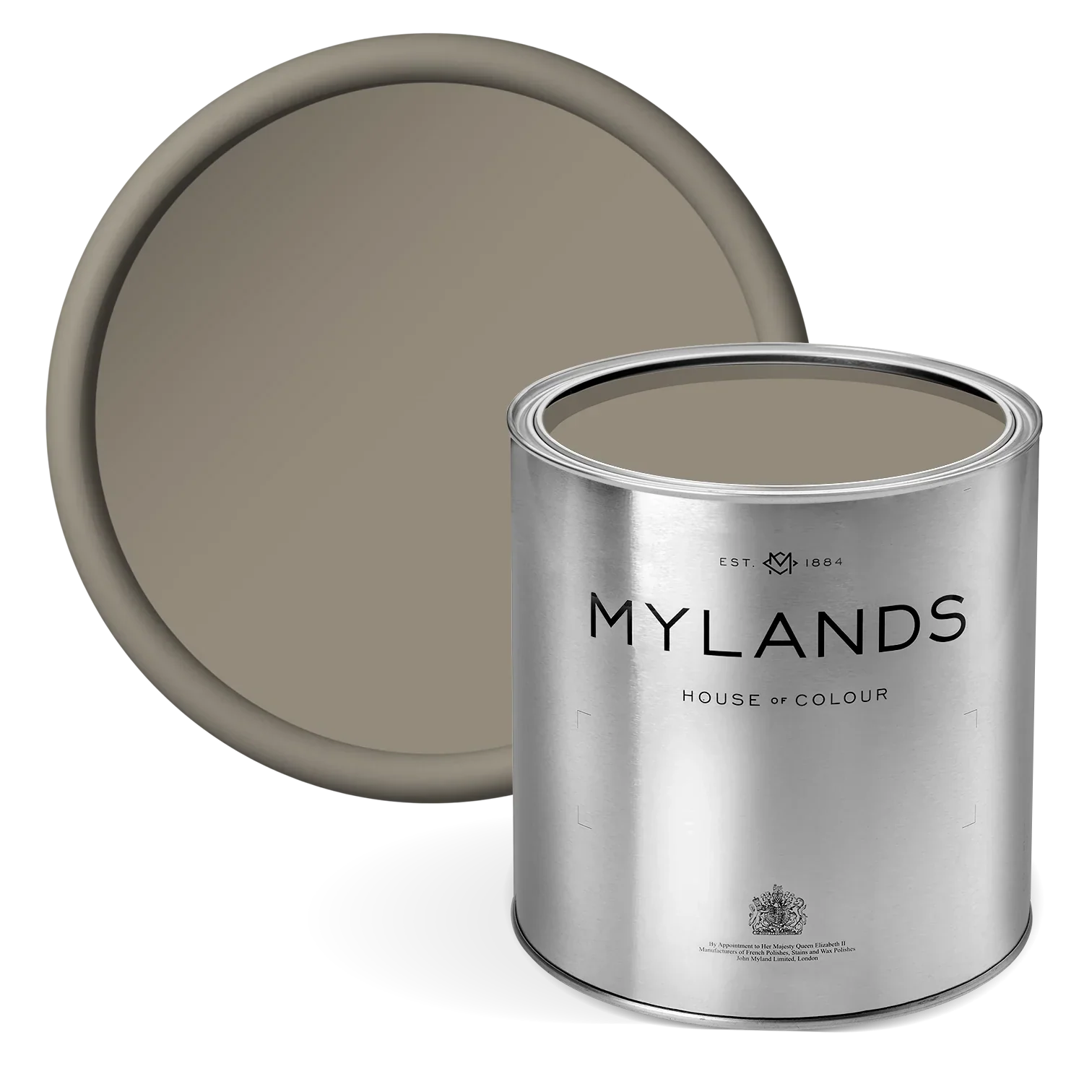
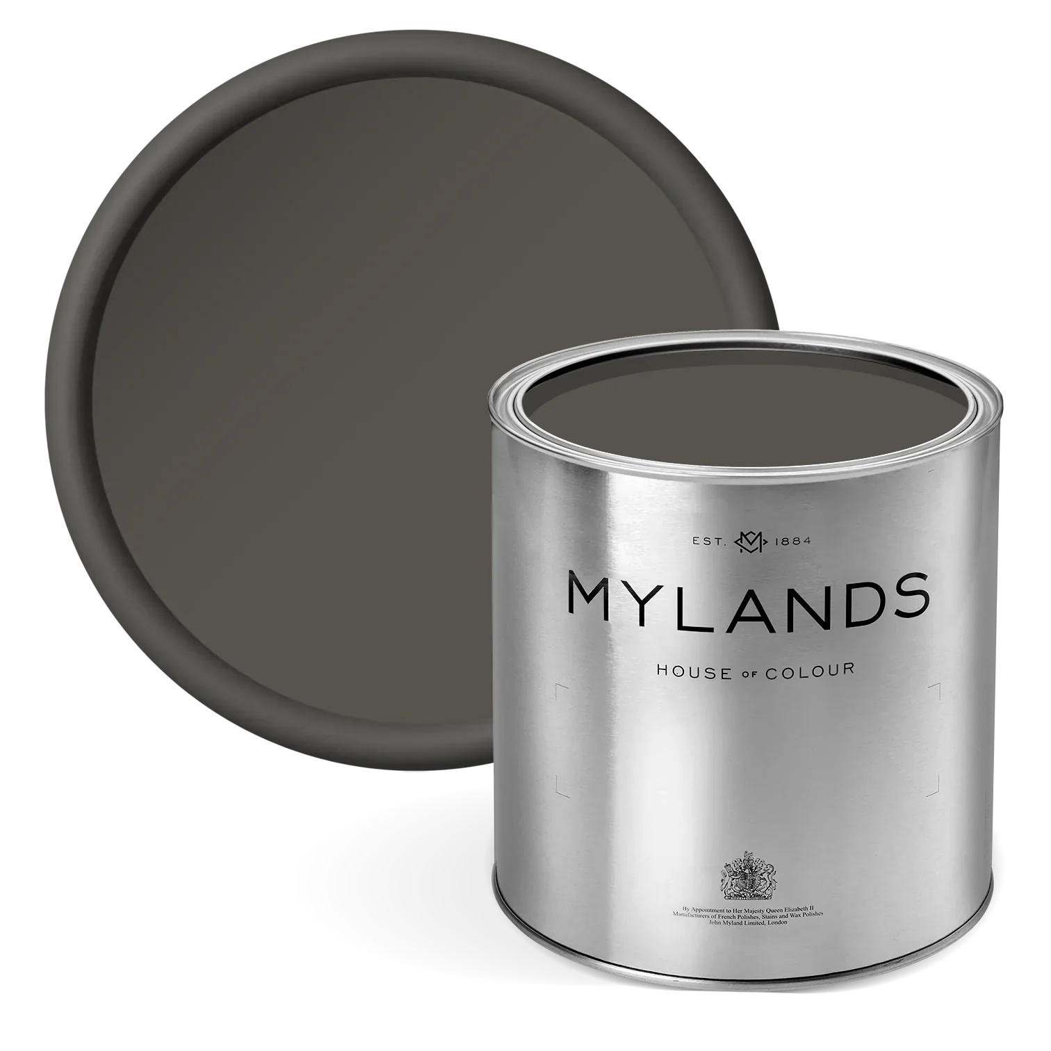
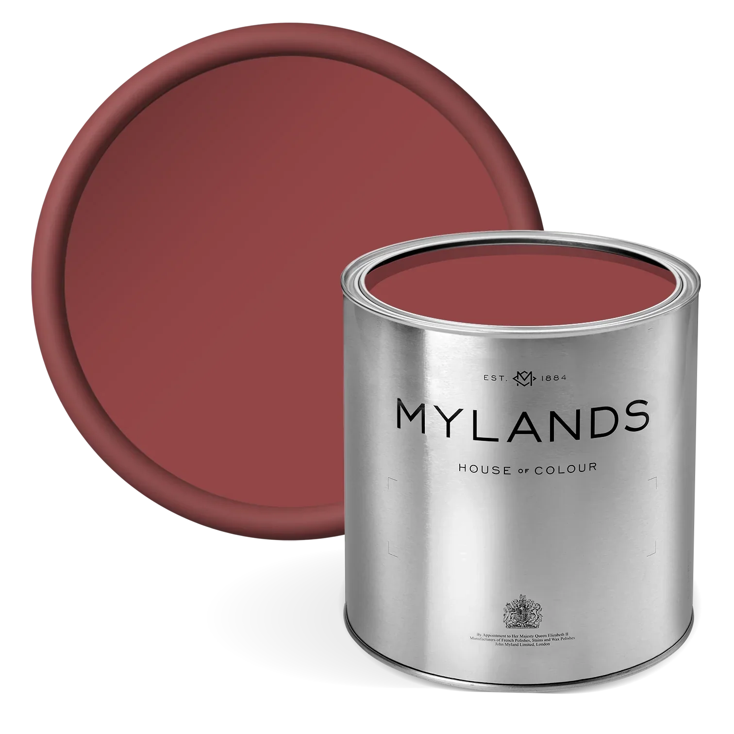
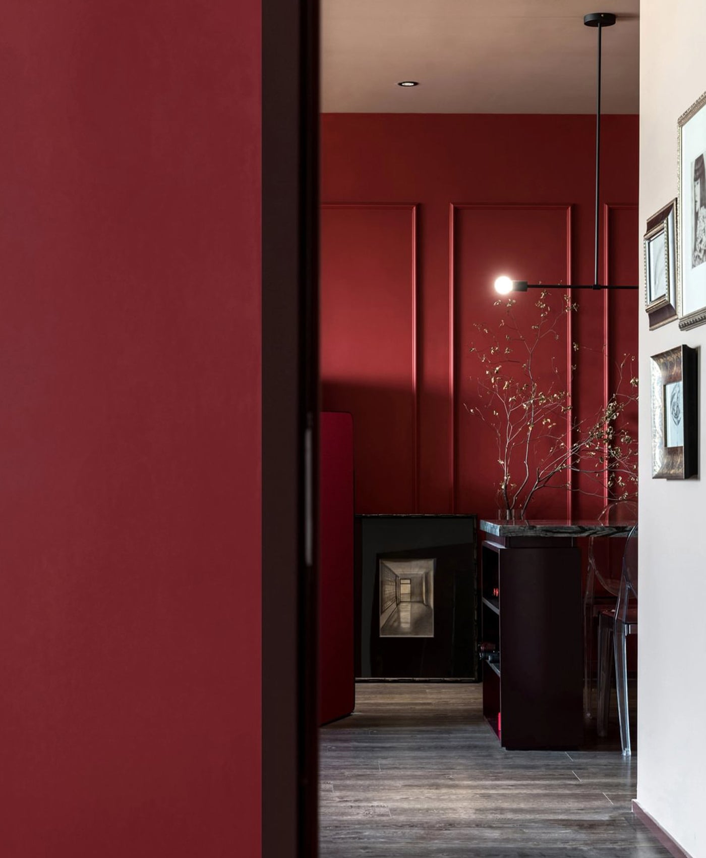
This colour does more than decorate; it defines. This deep, tabacco-toned brown, Cigar BH.20, brings a statement of permanace and depth, anchoring the space without overpowering it. In a corner that plays with light and detail, this shade acts as the steady note: calm, earthy, and confident.
Whether it’s a moment to pour a glass of wine or tend to something small, the richness of Cigar BH.20 enhances the experience, making the everyday feel a little more intentional. Paired with the olive green of Caca d’Oie BH.15 and the intricate woodwork of Old Man’s Beard BH.03, the warmth deepens, enveloping the space in quiet elegance.
These are the moments where colour is felt as much as seen; where a corner becomes not just functional, but familiar.
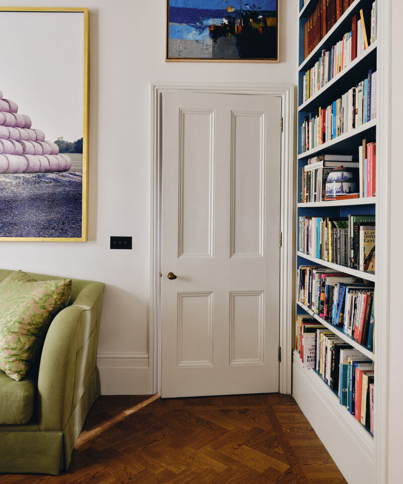
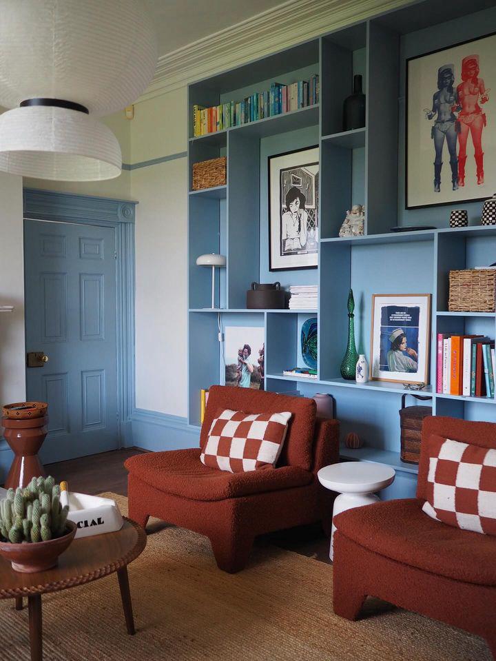
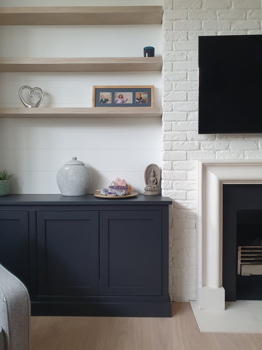
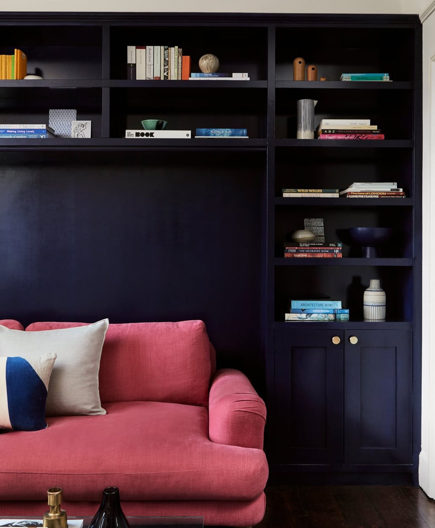
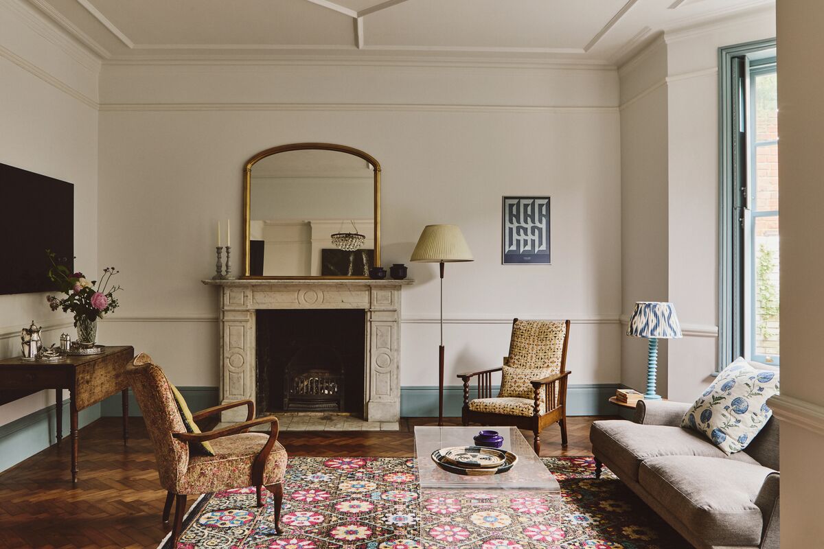
Colour and Texture
Even in traditional interiors, the right palette can introduce a sense of modern contrast and quiet sophistication. With a thoughtful balance of colour and texture, even the most unassuming corner can be transformed into a true sanctuary.
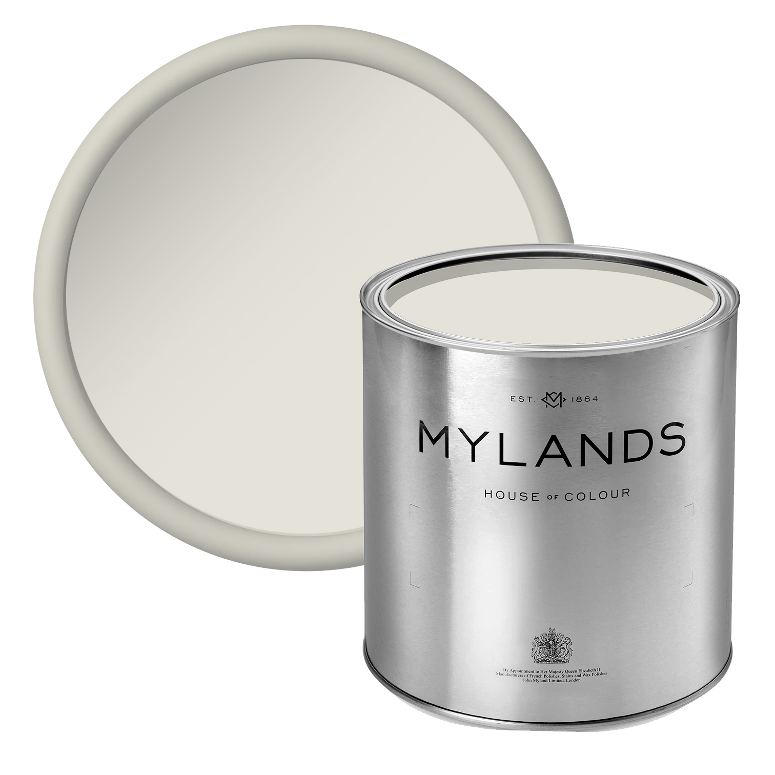
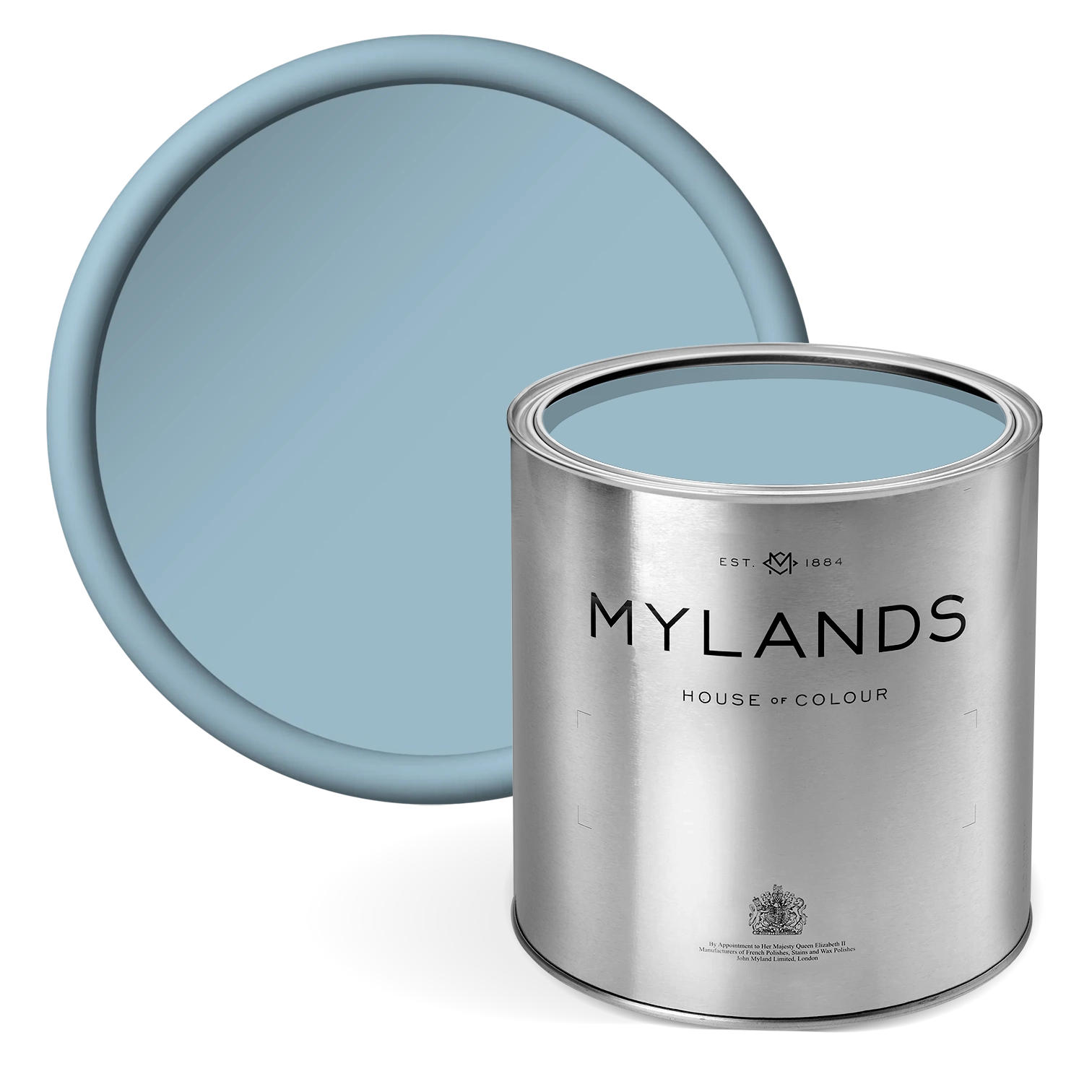
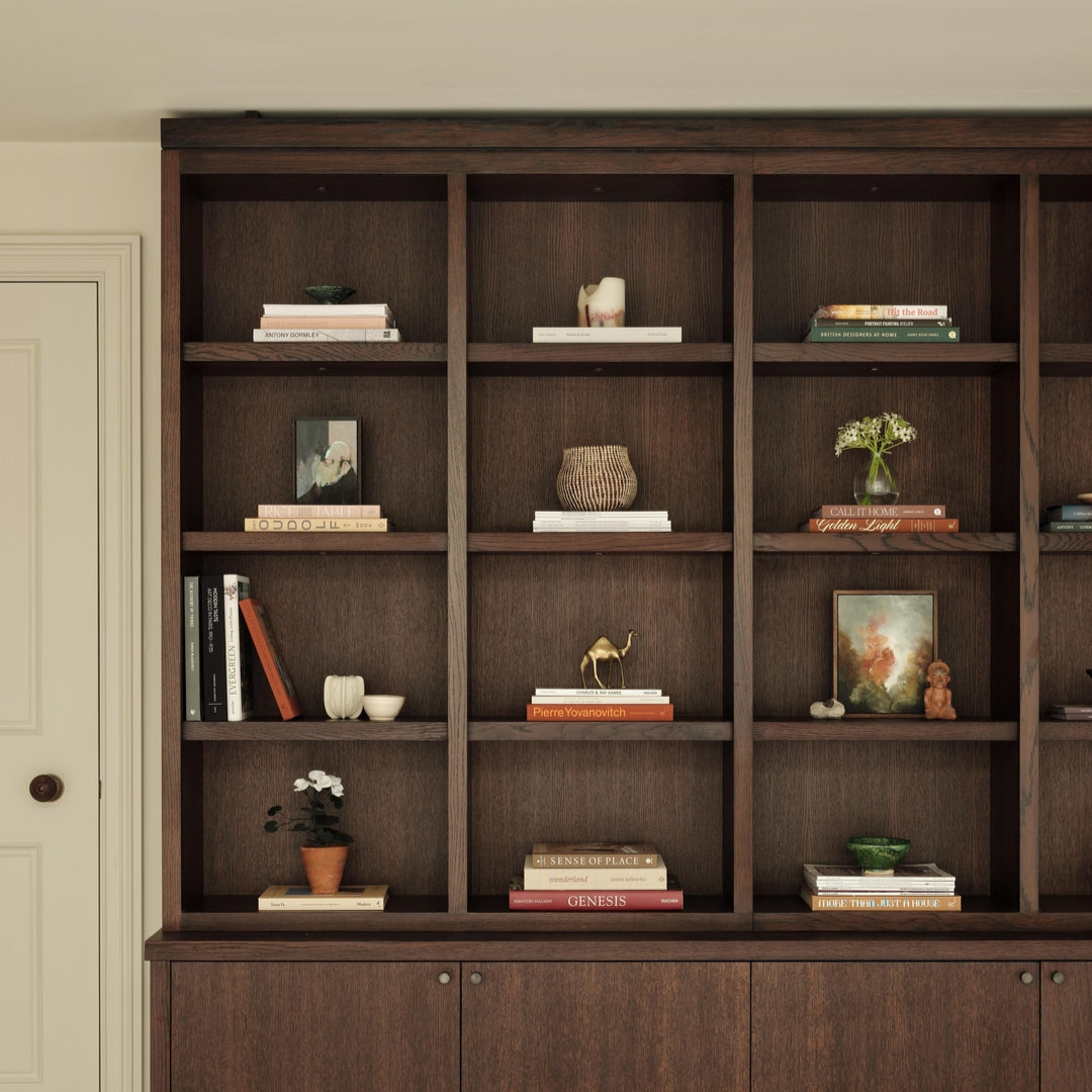
Here, creamy Beata White BH.01 walls gracefully frame deep, blue-toned shelving in Stockholm BH.11, creating a rich and elegant interplay of tones. The blue provides depth and character, while the warm white offers light and balance; a backdrop that beautifully showcases curated books, sculptural pieces, and collected treasures. The result feels both refined and inviting, where calm neutrals meet confident colour in effortless harmony.
What elevates this corner is it's understated intimacy. It’s not about grandeur, but about atmosphere. Each material, shade, and texture contributes to a mood of comfort and quiet confidence. The crisp white trim, the enveloping blue shelves, and the tactile natural elements come together to create a layered, timeless elegance that feels as personal as it is polished.

Floor in London Brown™ No.287, Walls and Ceiling in Limestone™ No.55, Stair Treads in Grosvenor Square™ No.109