The January Edit
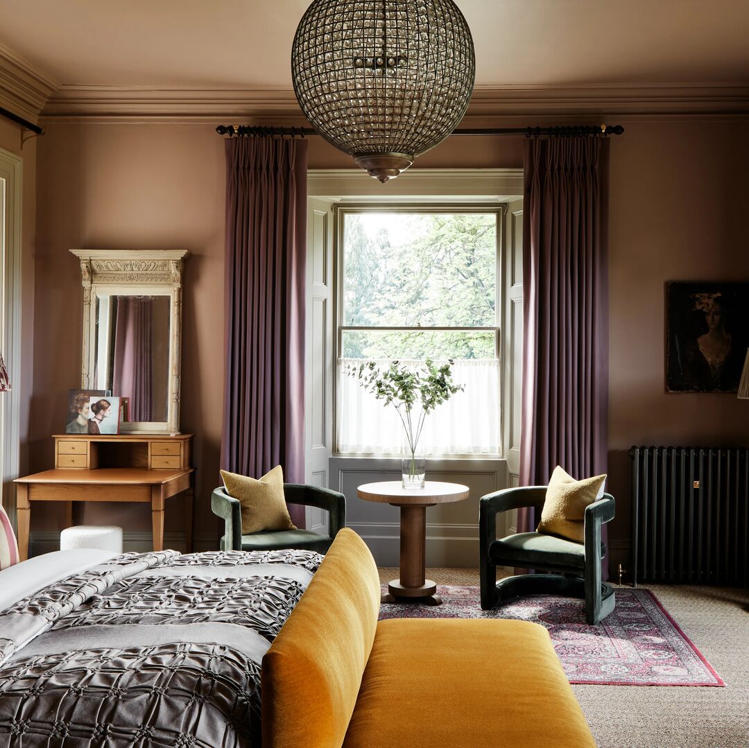
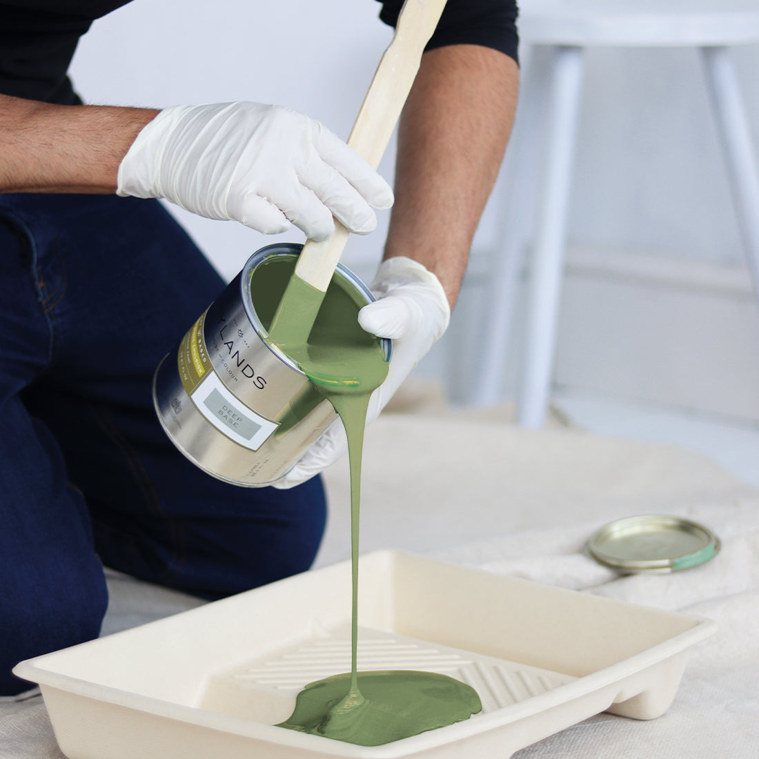
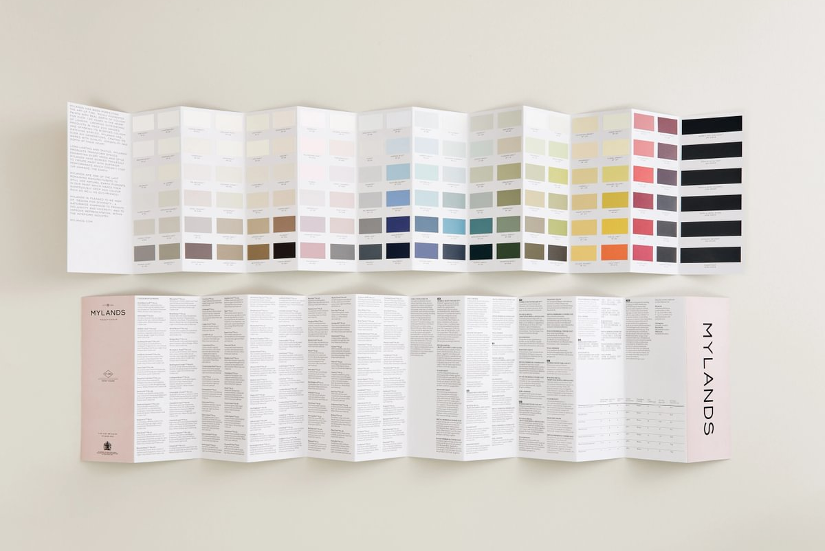
As the new year unfolds, explore our January Edit, a palette of six shades designed to inspire and elevate your home. These considered colours capture the clarity, calm, and renewed optimism that define the month of January.
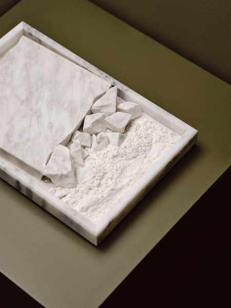
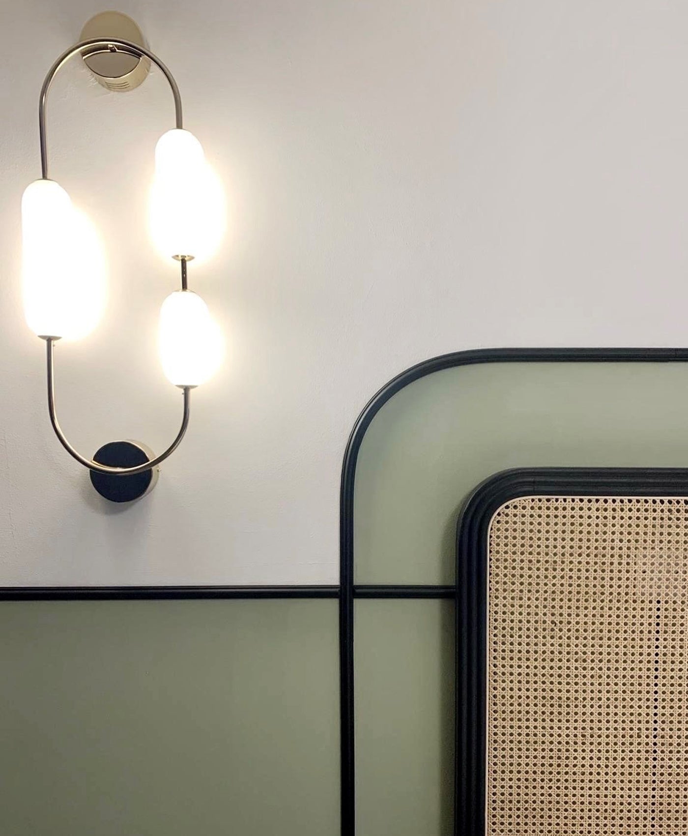
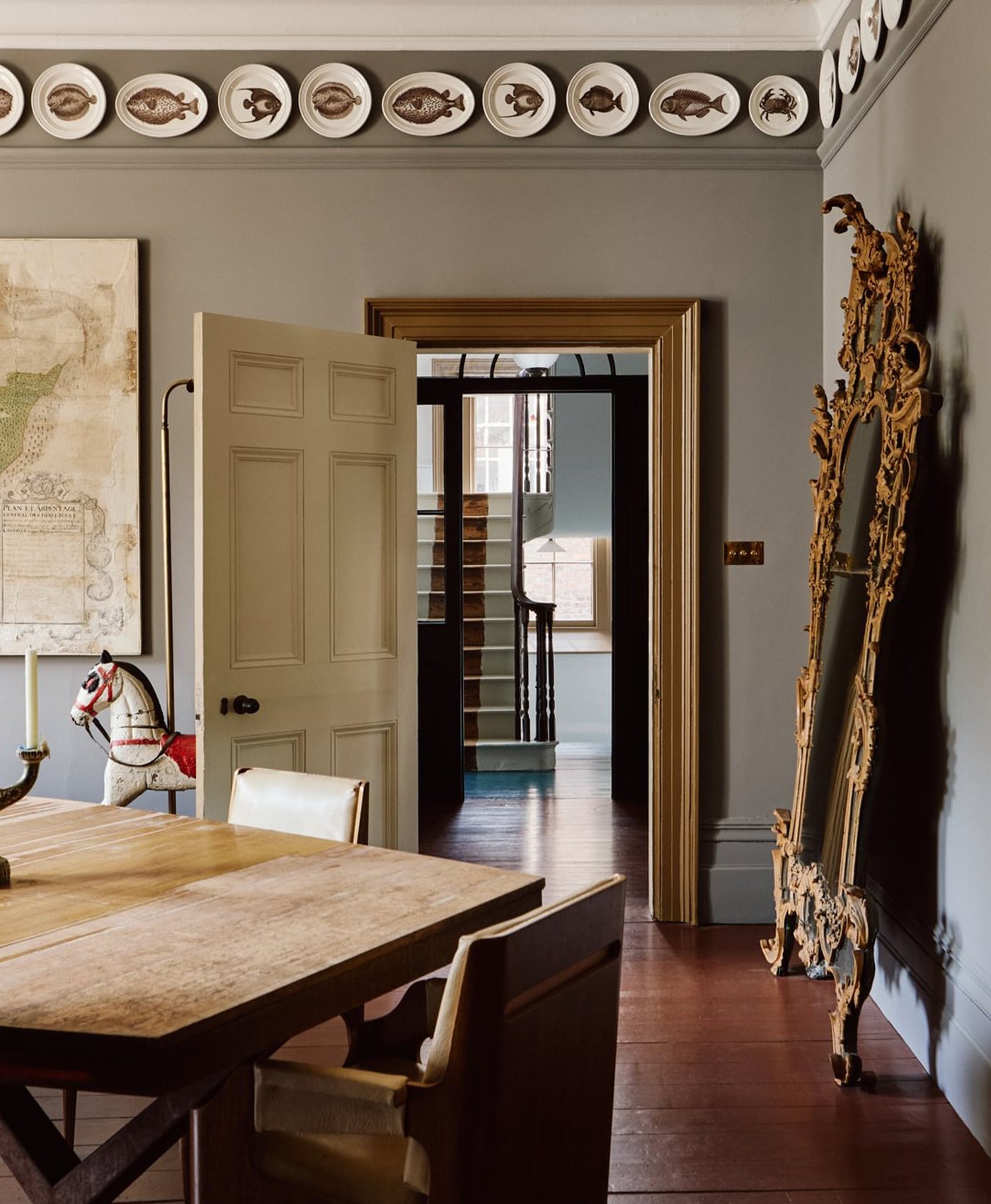
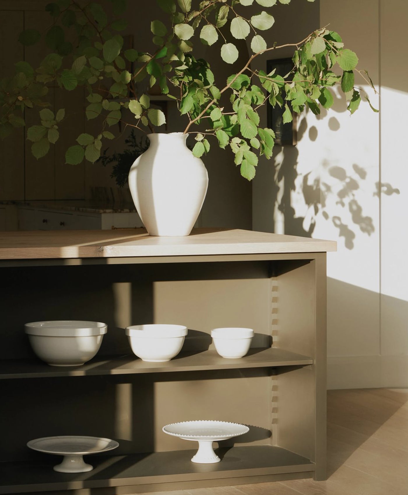
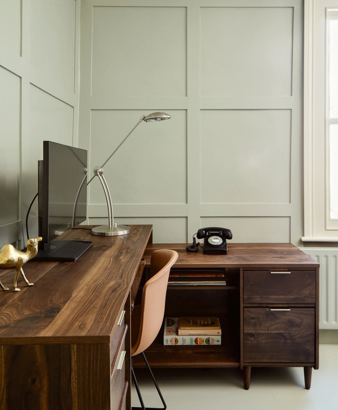
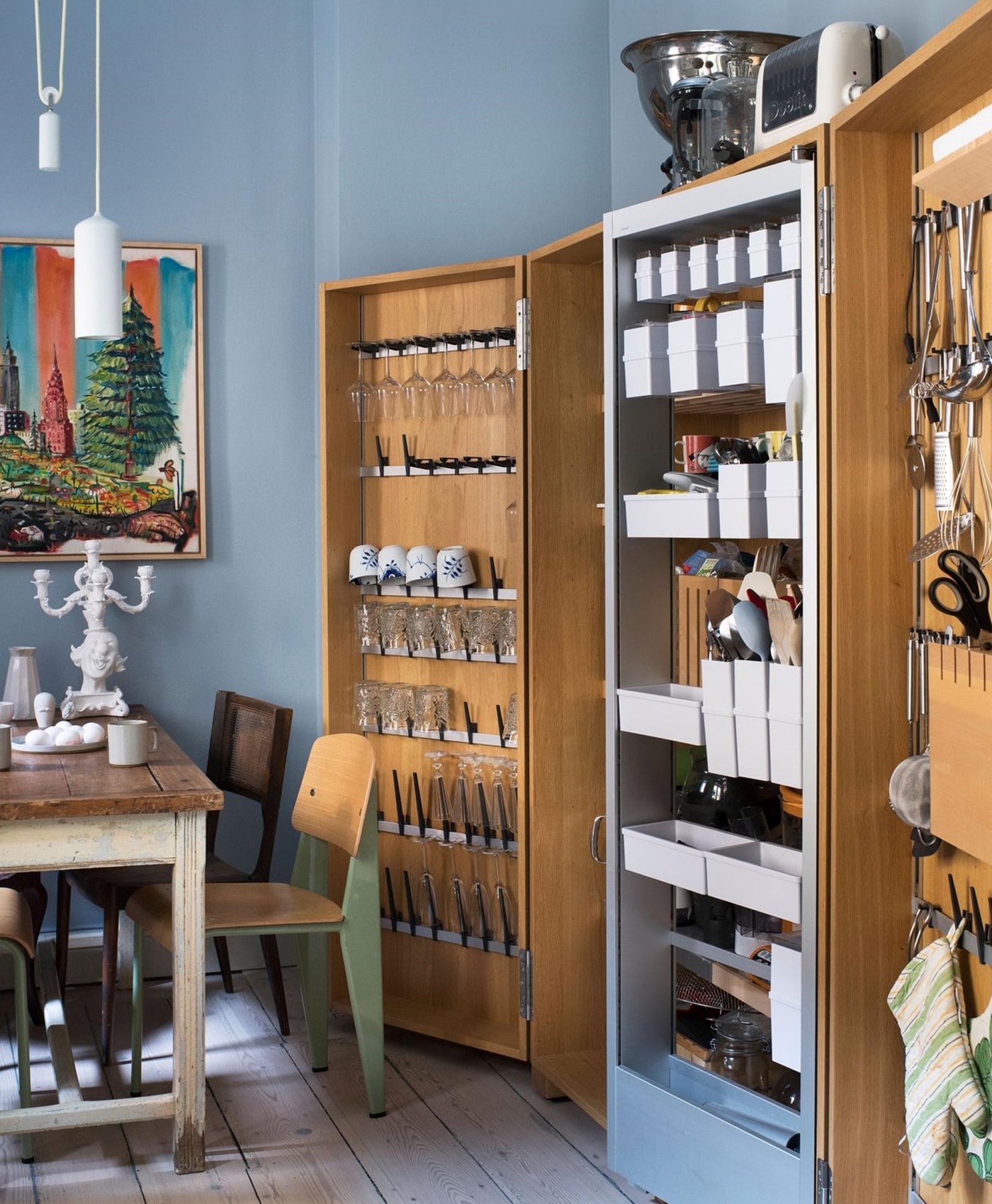
 Walls in Flanders Grey™ No.110, Floorboards in Earth Stain Chalk
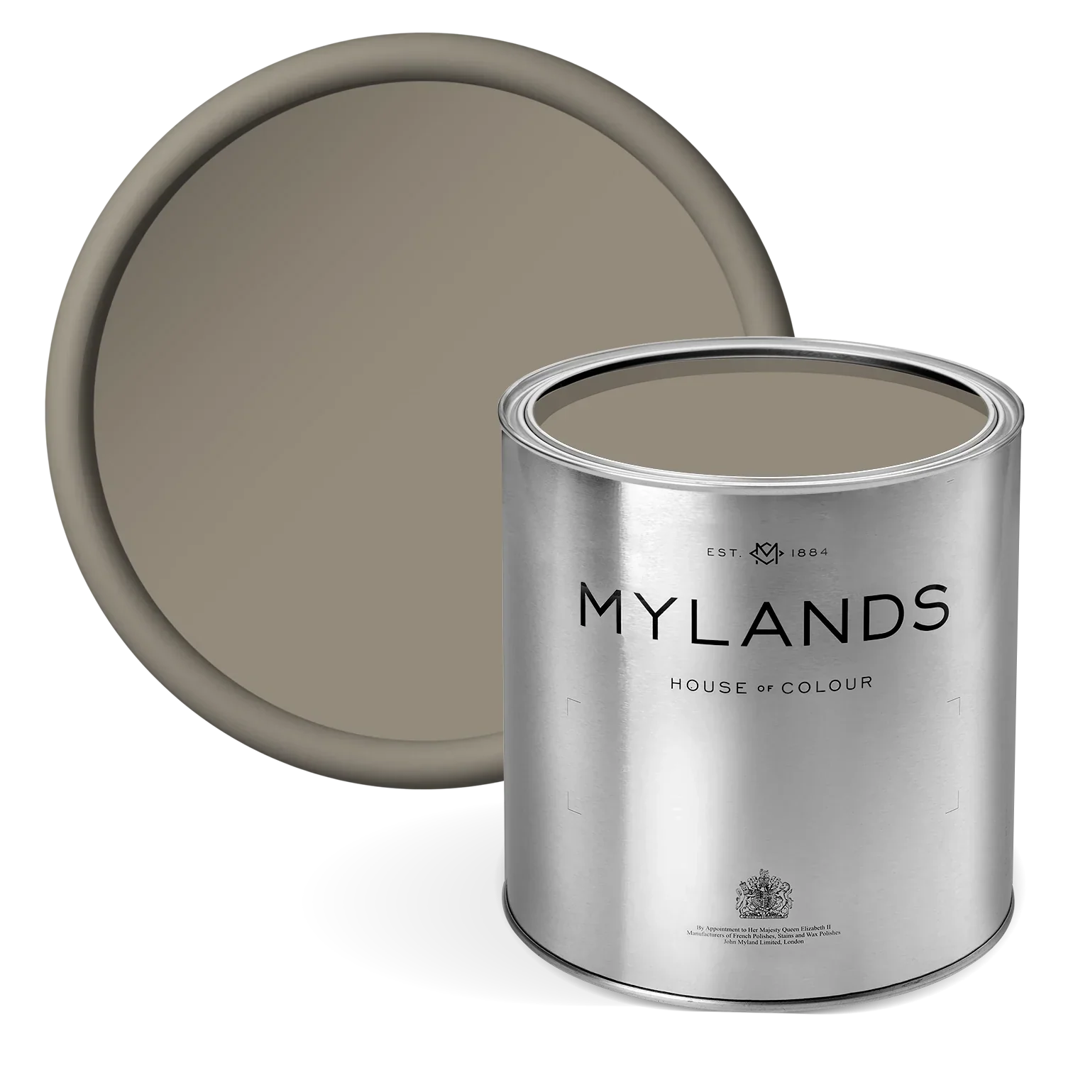
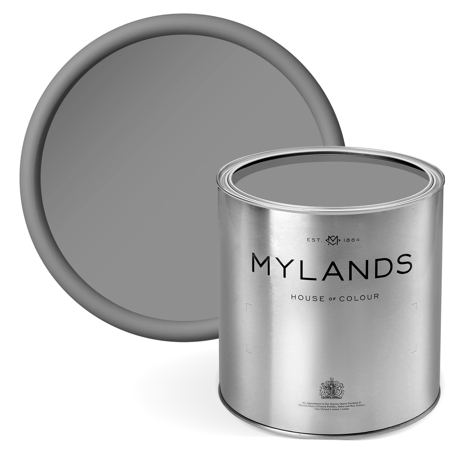
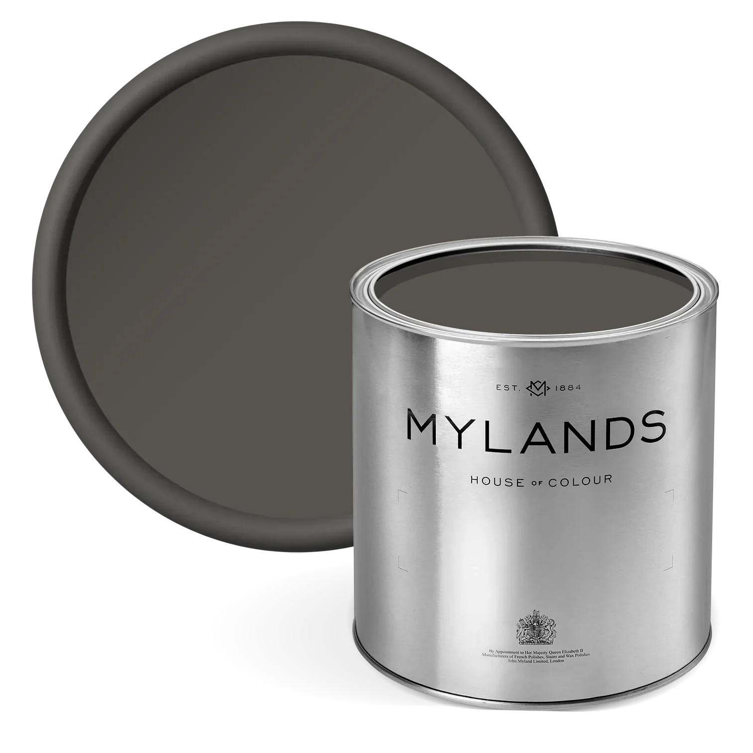
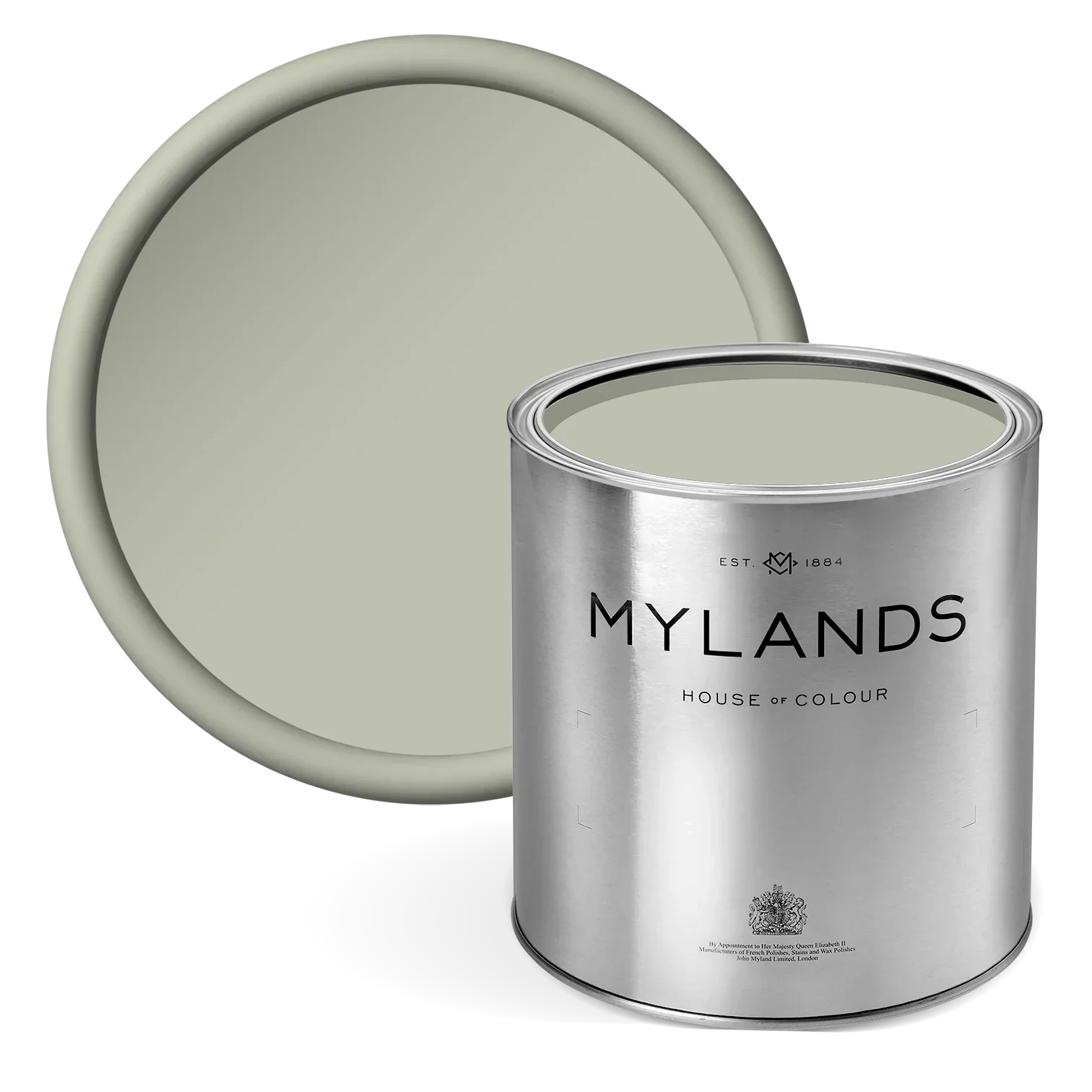
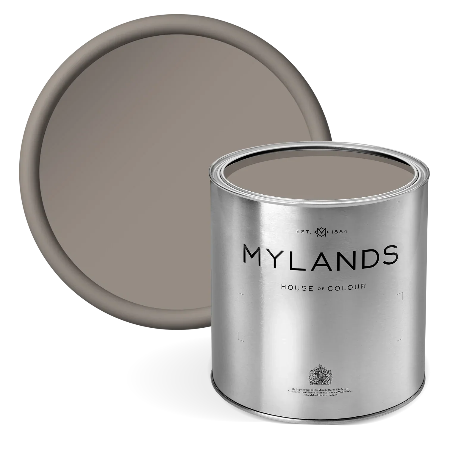
Flanders Grey™ No.110
Richer than Grosvenor Square™ No.109, this colour has its origins in the Low Countries, inspired by their historic stoneware. The olive-green grey exudes a natural, fresh elegance, with deep green, umber undertones that lend richness while maintaining a soft, sophisticated appearance. Perfect for both statement walls and refined accents, it brings a sense of calm and grounded luxury to any interior, harmonising beautifully with warm neutrals, rich woods, or contrasting jewel tones to create a timeless, layered effect.

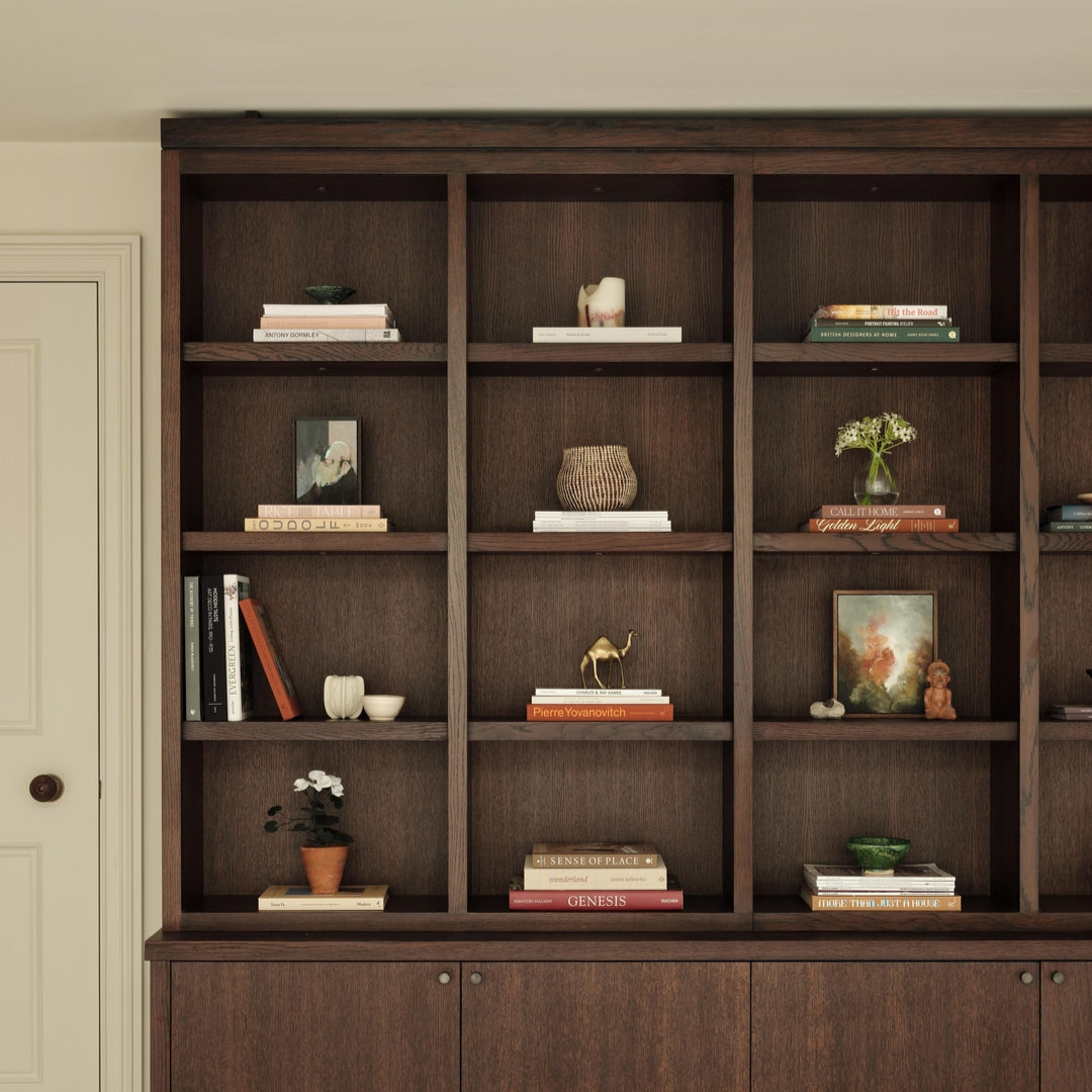
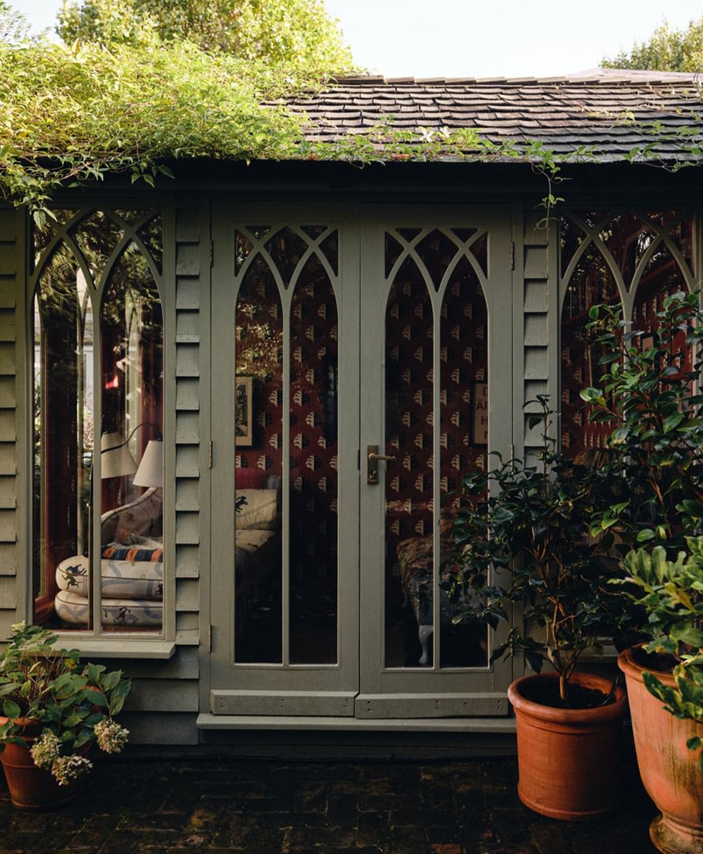
Left to Right: Walls in Lots Road™ No.24, Cabinetry in Temple Bar™ No.70
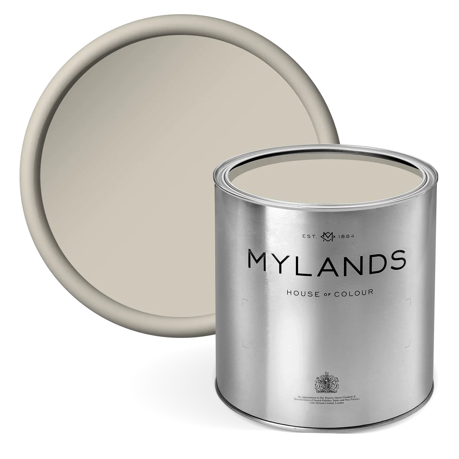
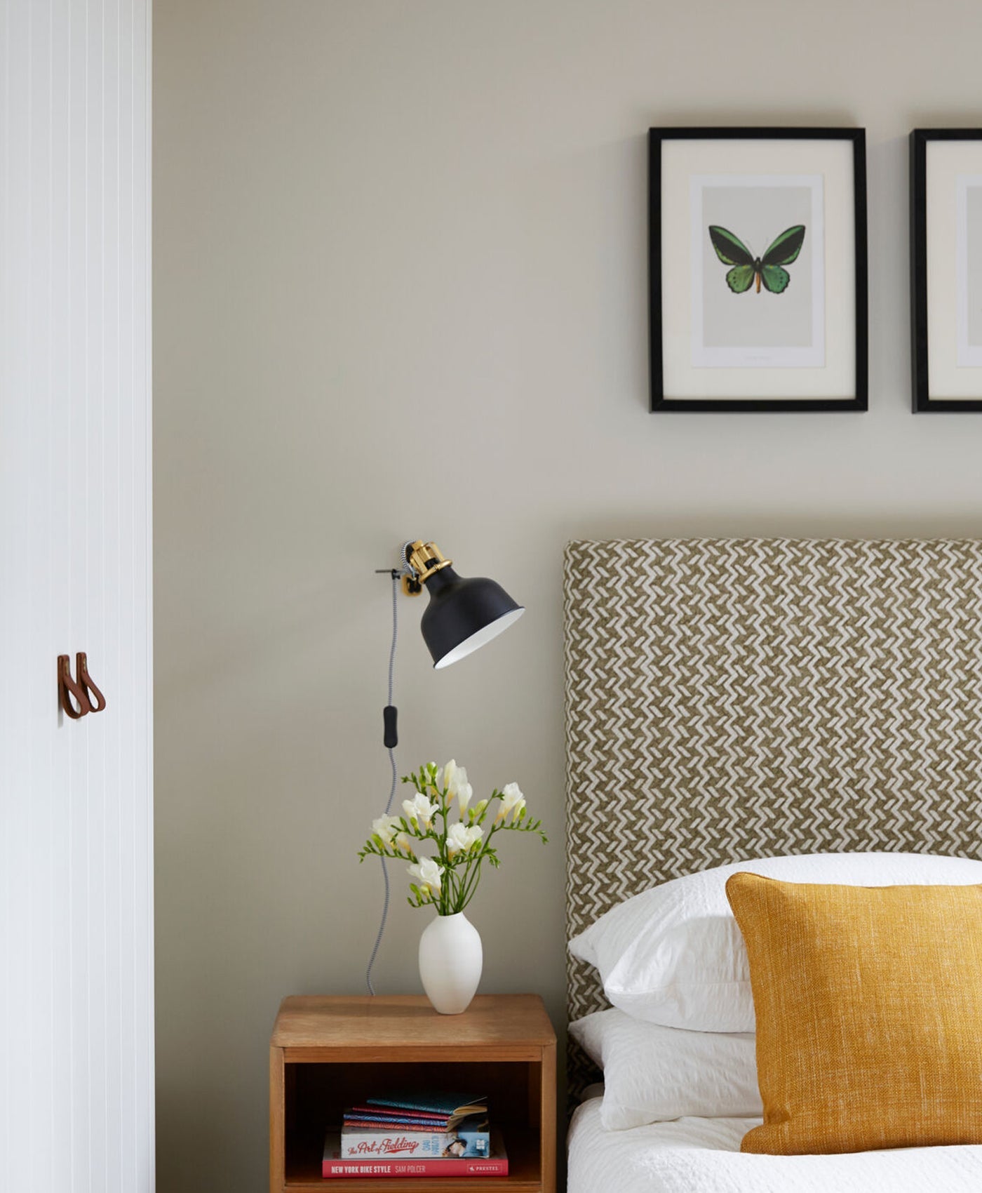
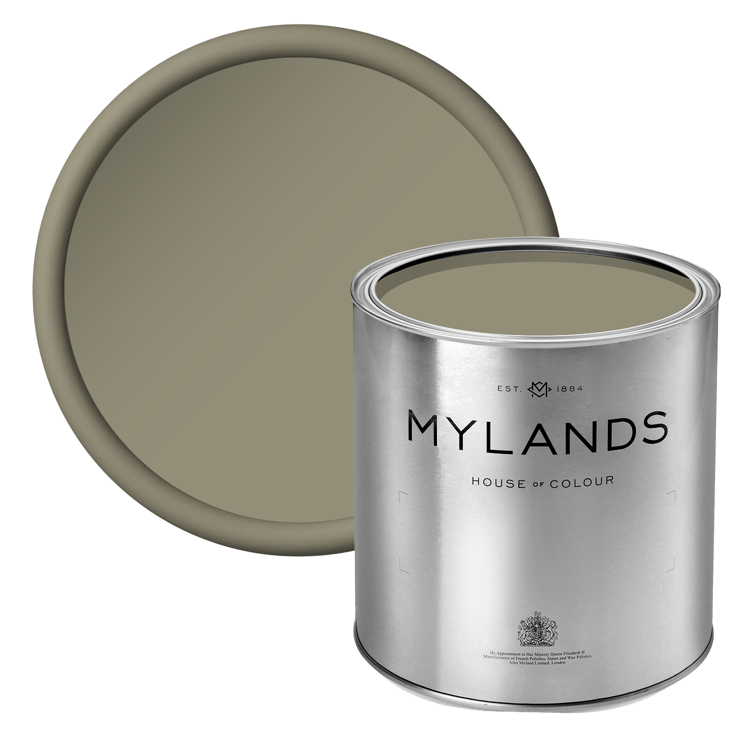
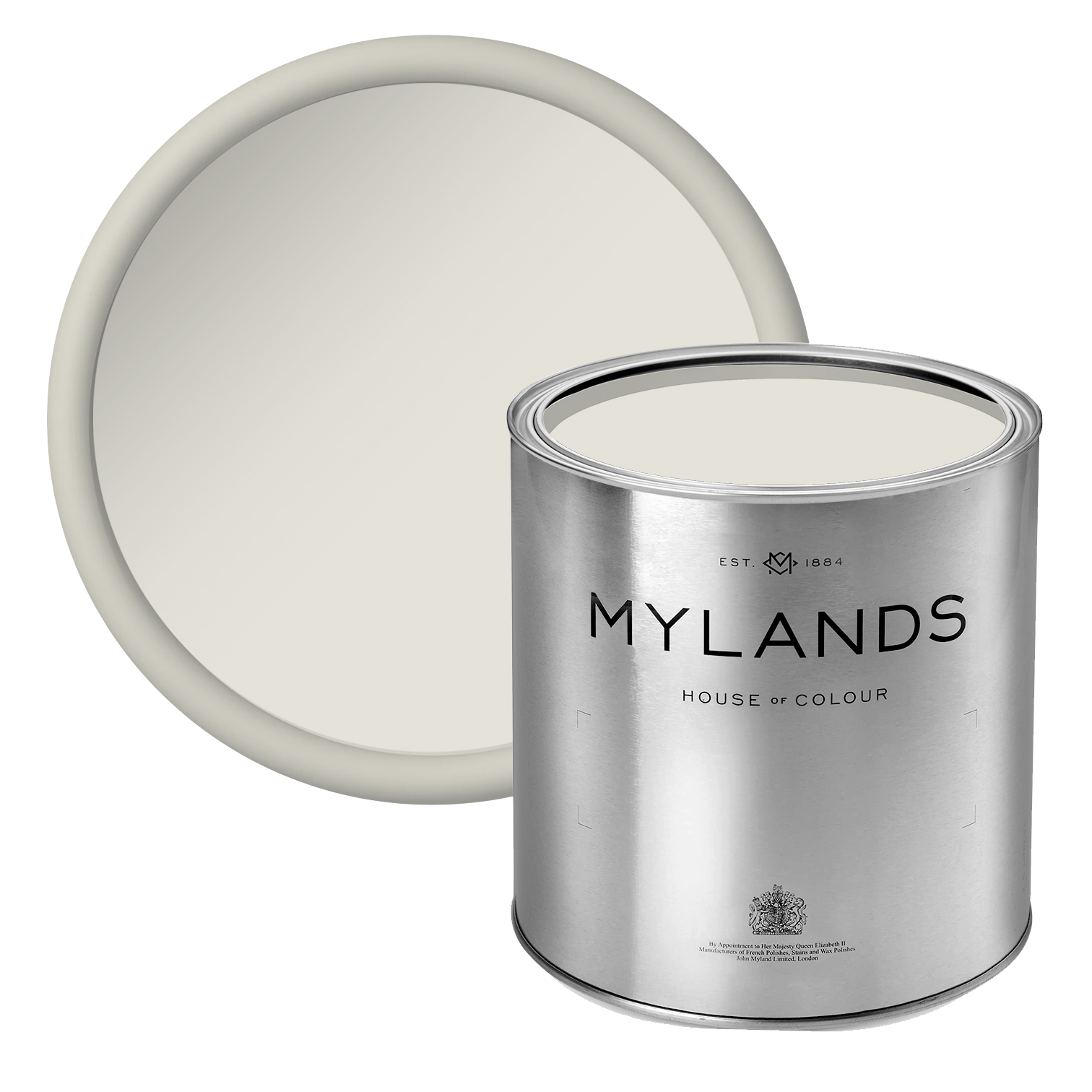
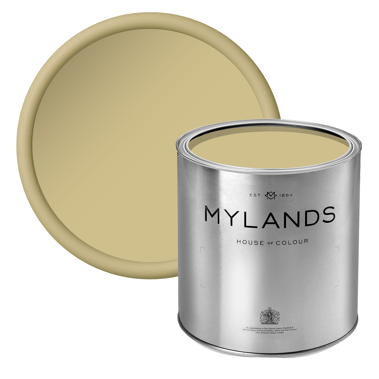
Lot's Road™ No.24
A warm neutral with a subtle hint of yellow ochre, this shade brings a gentle warmth to any space. On its own, it reads as a soft, bright neutral, while paired with accent colours, it transforms into a warming, versatile backdrop. Enhanced by delicate green and umber undertones, the paint evokes an organic, natural feel, adding understated charm and harmony to interiors.
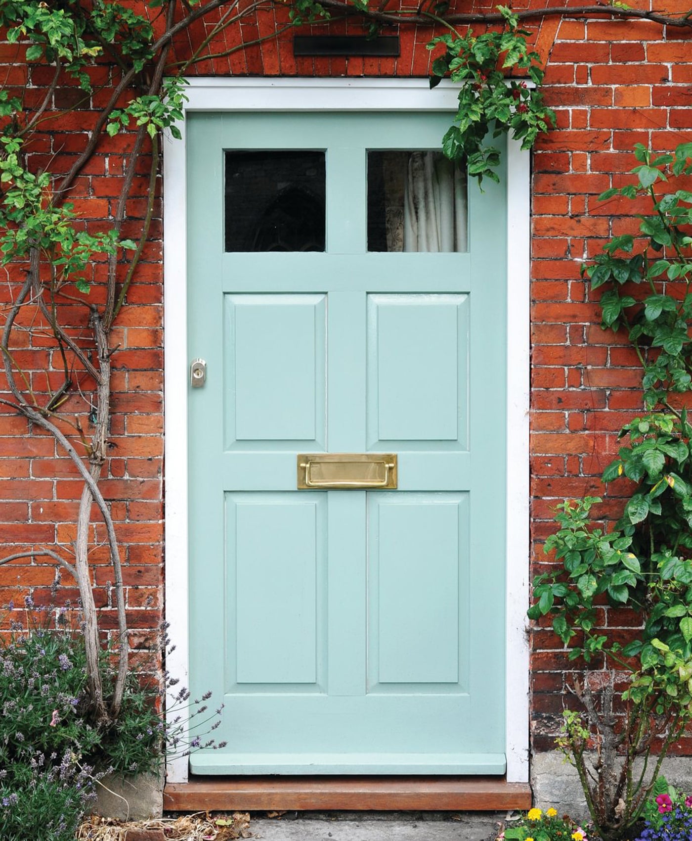
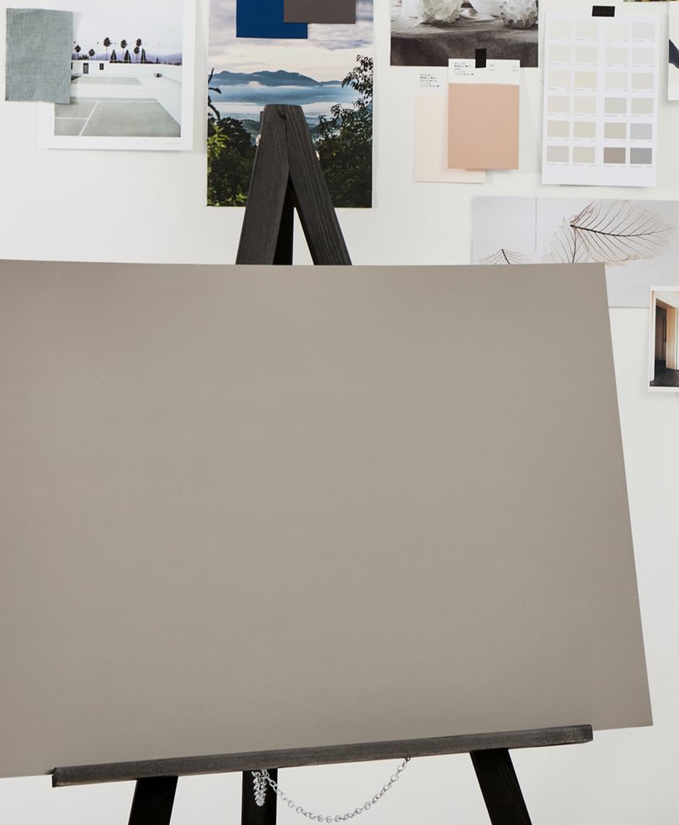
Temple Bar™ No.70
Inspired by the ancient stone gateway to the City of London, designed by Sir Christopher Wren and now reinstated in Paternoster Square, Temple Bar™ No.70 is a soft, chalky, warm-toned neutral. This mid-toned shade feels timeless and sophisticated, offering a subtle sense of light and airiness without appearing overly bright. Its understated elegance makes it a versatile choice for creating classic, refined interiors.
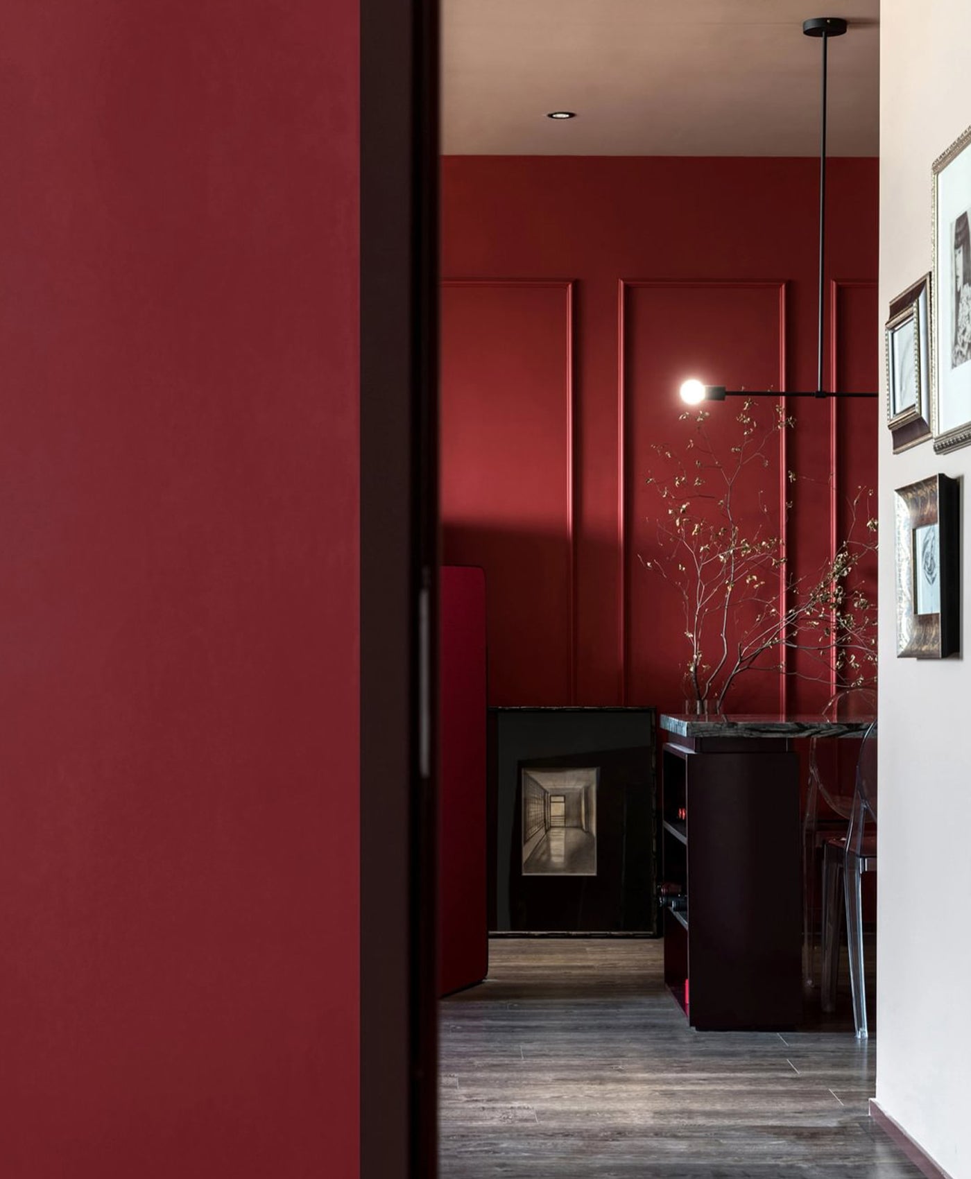
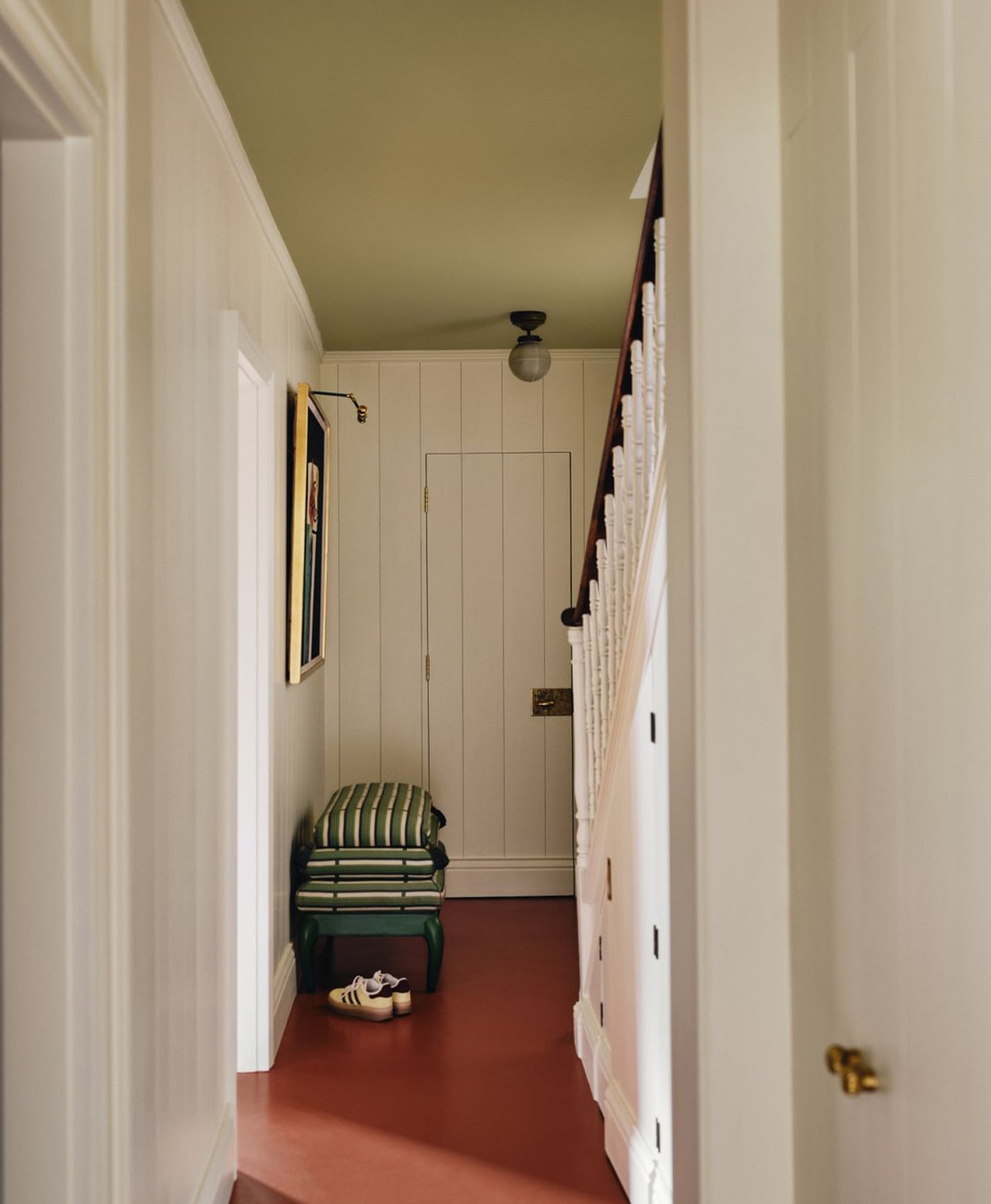
 Left to Right: Walls in Butter BH.21, Floor in Henna BH.18. Pillars in London Brick BH.07
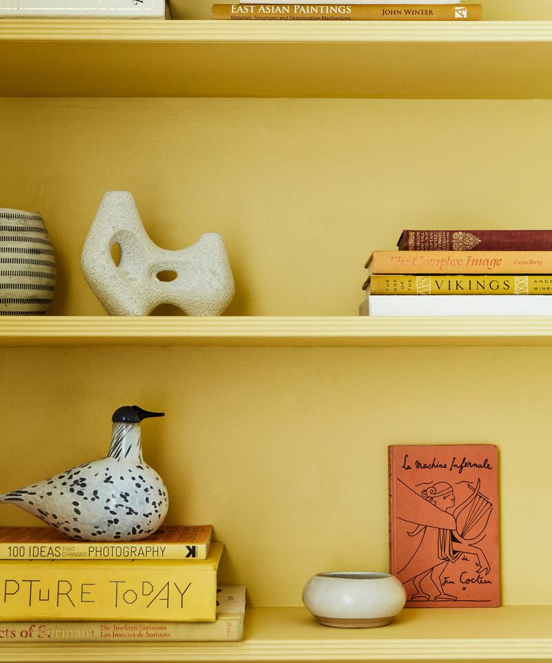
Butter BH.21
This soft, pale yellow exudes warmth and subtle radiance, evoking the rich, comforting glow of natural sunlight. Lighter and fresher than the real thing, yet sumptuous in tone, it brings a gentle elegance to any interior. A sophisticated alternative to white, it adds depth, character, and versatility.
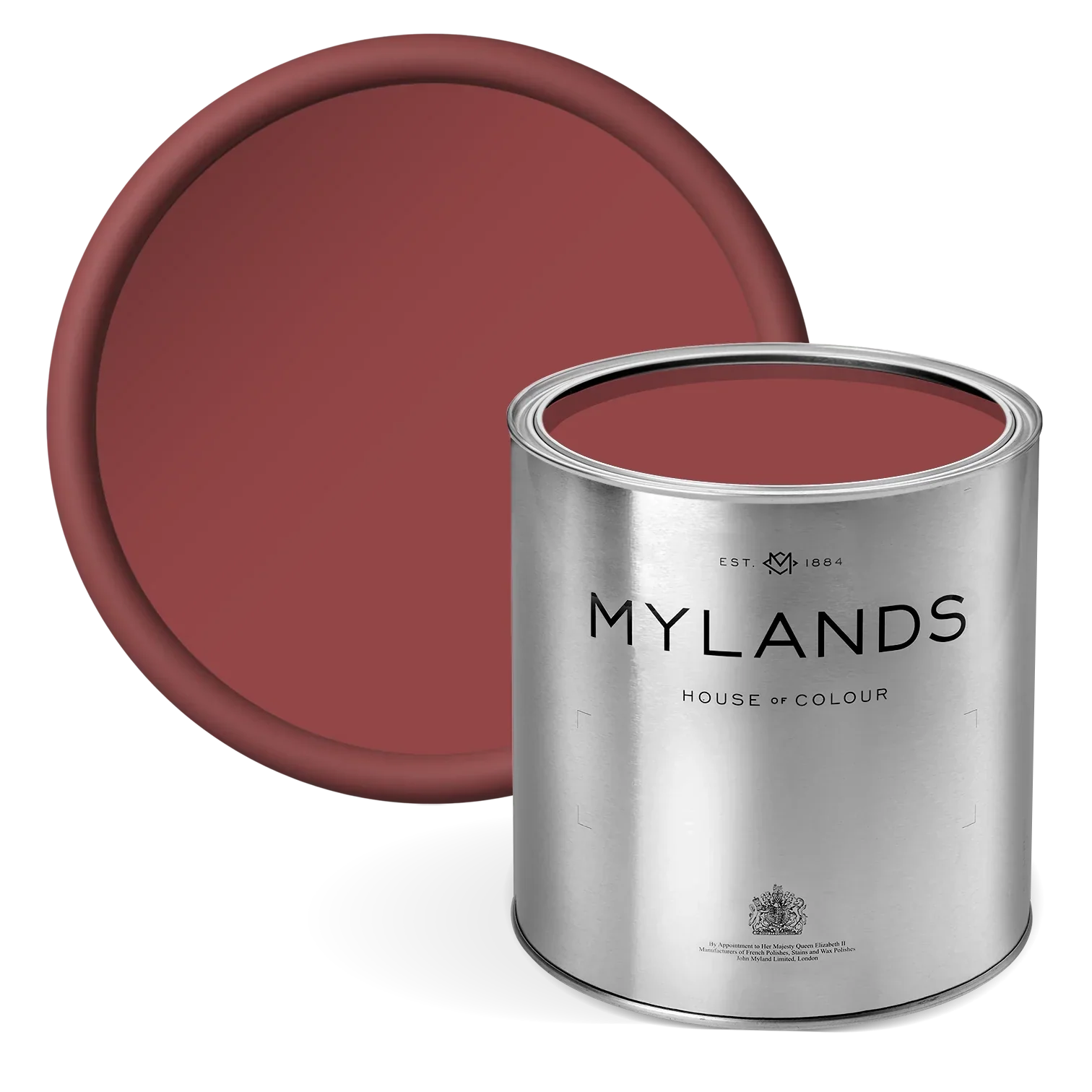
London Brick BH.07
Inspired by reclaimed London stock bricks, this refined brown offers a sophisticated alternative to traditional white rendering, with the added benefit of ageing gracefully over time. Beata spent considerable time perfecting this tone to complement the iconic London stock brick, used throughout the city for centuries.
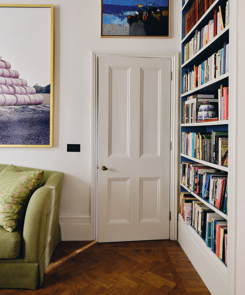
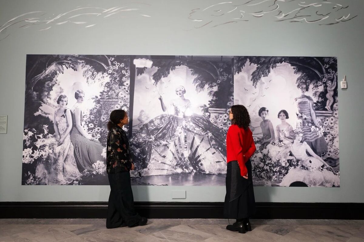
 Walls in Holland Park™ No.5, Cabinetry in Lot's Road™ No.24
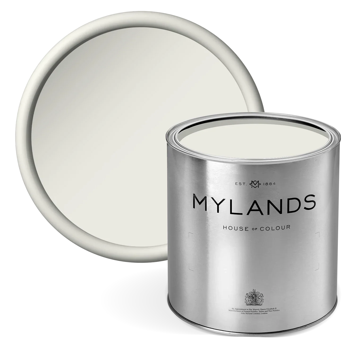
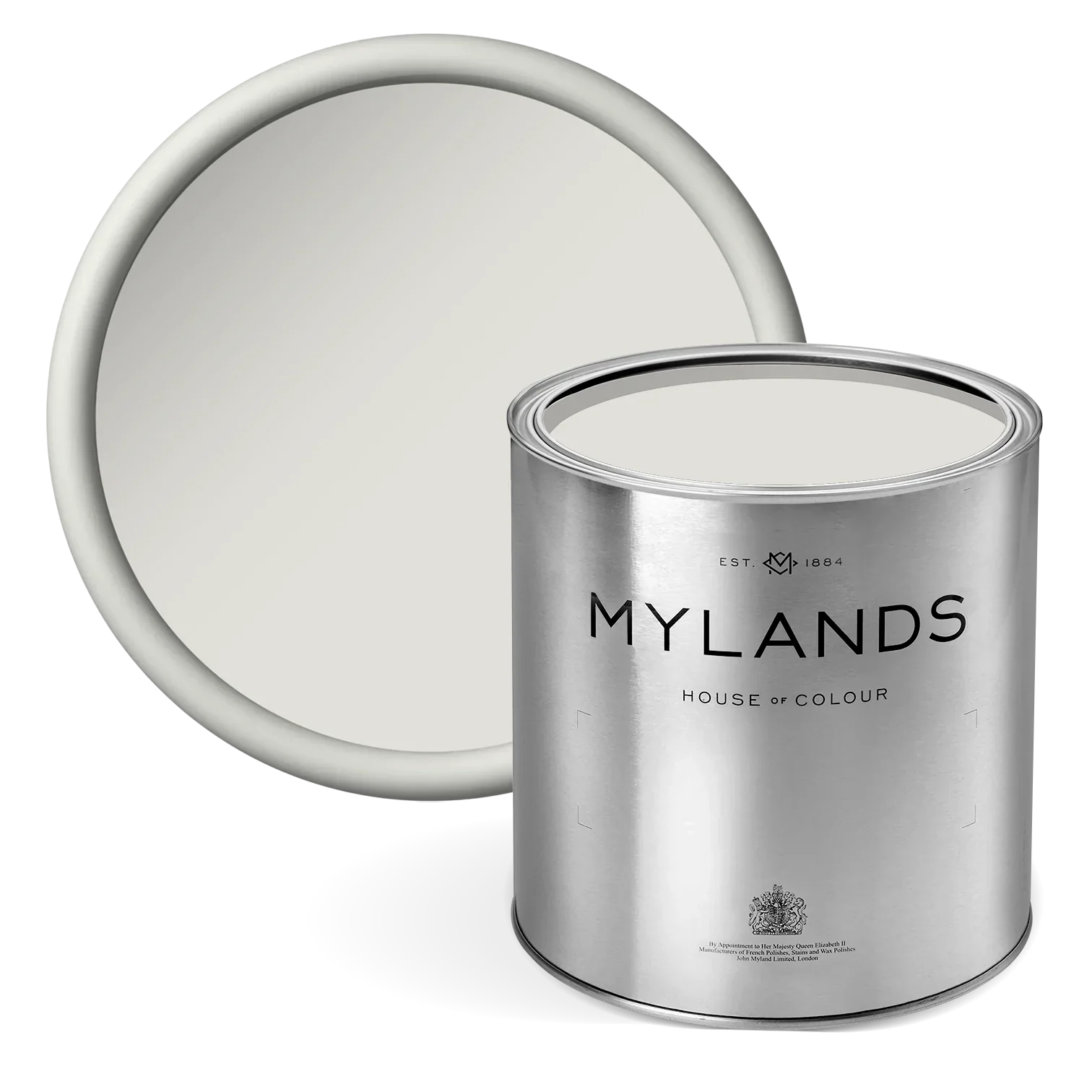
Holland Park™ No.5
This shade was originally created for a period property in the heart of Holland Park. A soft, warm-toned white with a delicate hint of yellow, it is highly adaptable and brings a clean, sunny warmth to any interior. Its subtle warmth makes it perfect for both traditional and contemporary spaces, creating an inviting and effortlessly elegant backdrop throughout the home.
