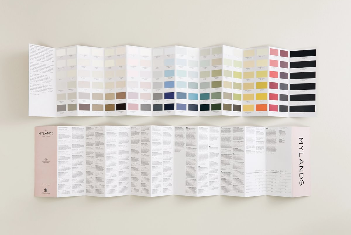
Red Interior Design
Red is a supremely versatile colour. Shades of red range from vibrant postbox red to warming terracotta to deep, dark maroon and many others in between. Your choice of red hue will transform your interior design and create different moods – from refined elegance to playful energy.
If you are wondering how to decide between the varied shades of red, think about how you want to make your room feel. Perhaps you want a comforting, cocooning bedroom environment, a sophisticated and refined living space or a bright, inviting entranceway. All of this, and more, is possible with red interior design schemes.
Create a warm welcome
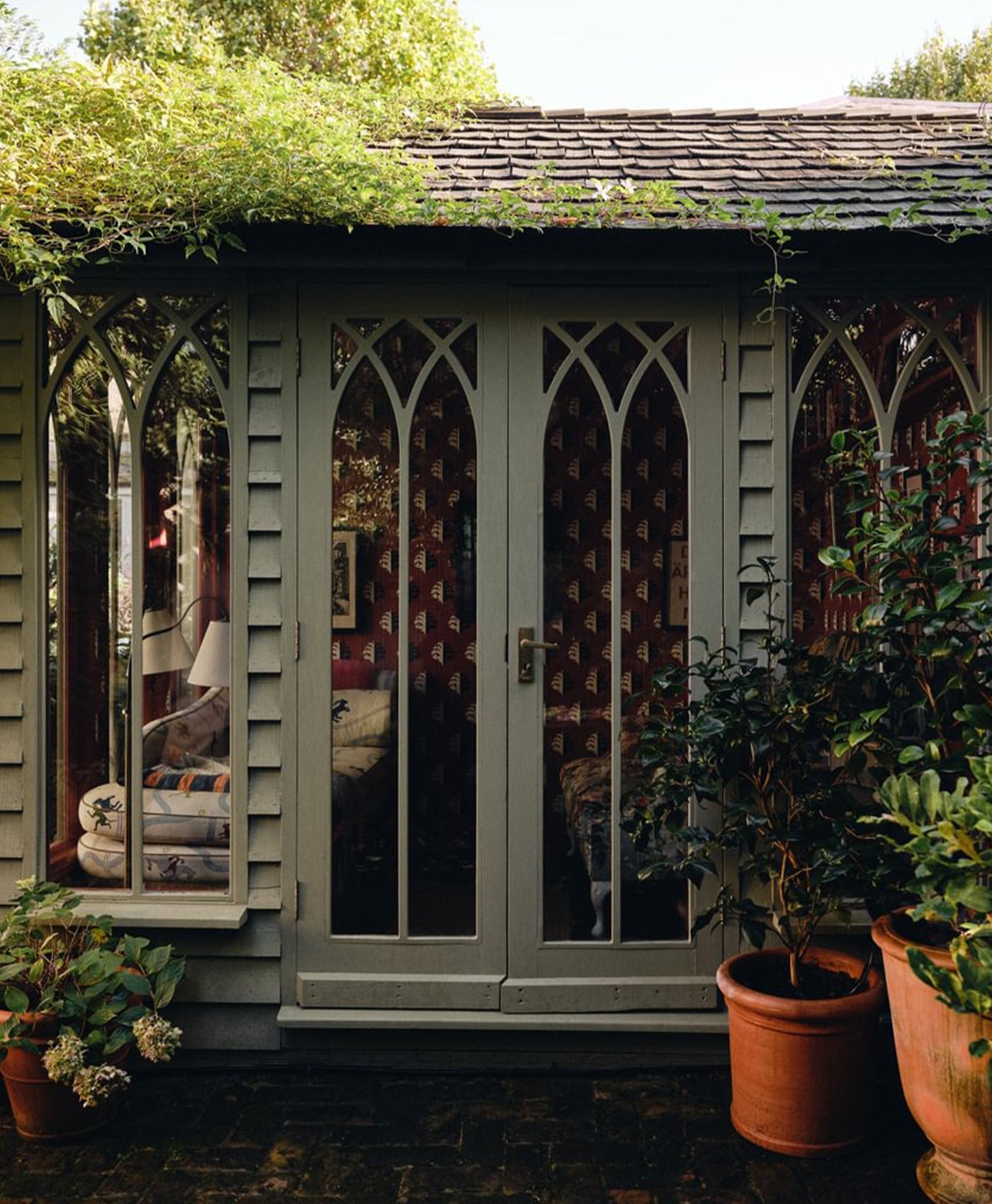
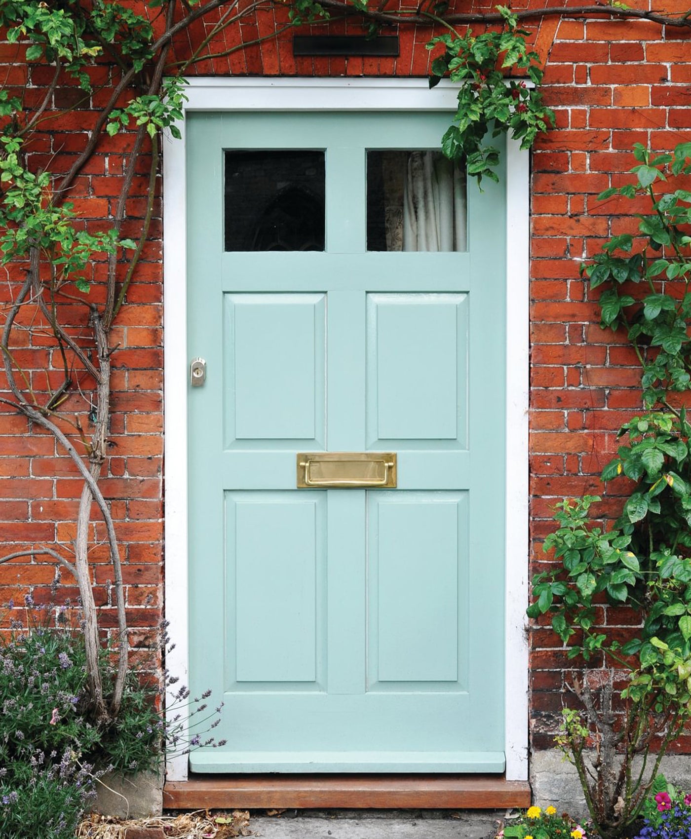
Make a strong first impression and add kerb appeal to your property with a red front door. It makes an impact from the get-go. It indicates that you like to make a statement and shows personality. Think of it like a statement red lipstick - a bold flourish that is forever in style.
In Chinese Feng Shui, a red front door invites wealth and good luck. In Scotland, it is a sign that the owners have paid off their mortgage. If good fortune appeals, consider a red front door.
A warm red entrance or hallway is very welcoming for guests or even for yourself when you return home. An entirely red hallway may become very dark. Create balance with a deep red on the lower half of the wall and woodwork, and a light, neutral complementary colour above. Not only will this look great, it is also a practical design idea as the dark red colour will mask the inevitable scuffs that occur in high traffic hallways.

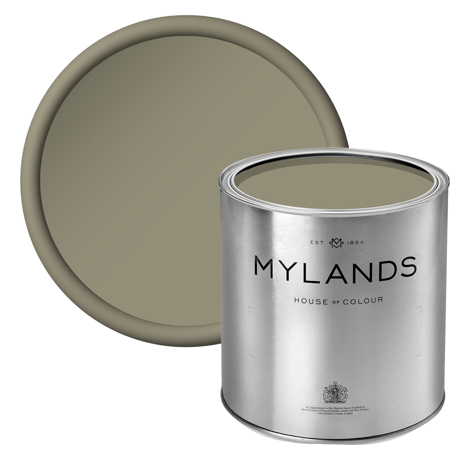
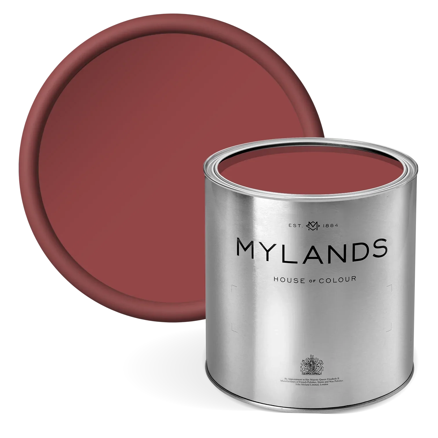
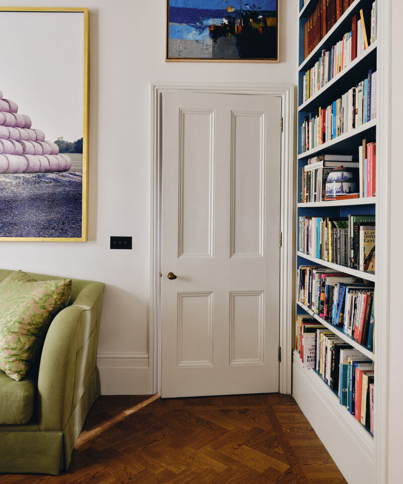
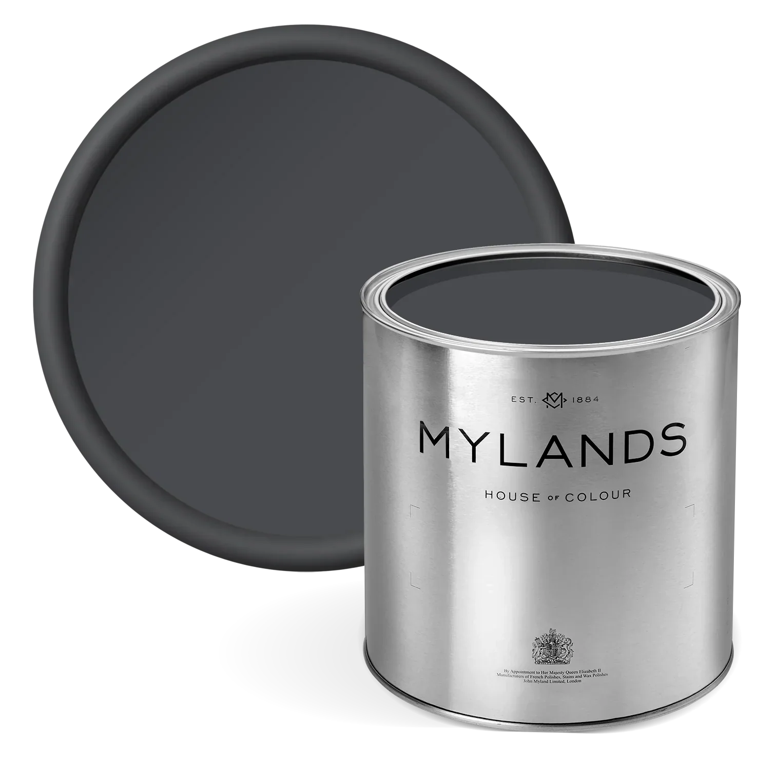
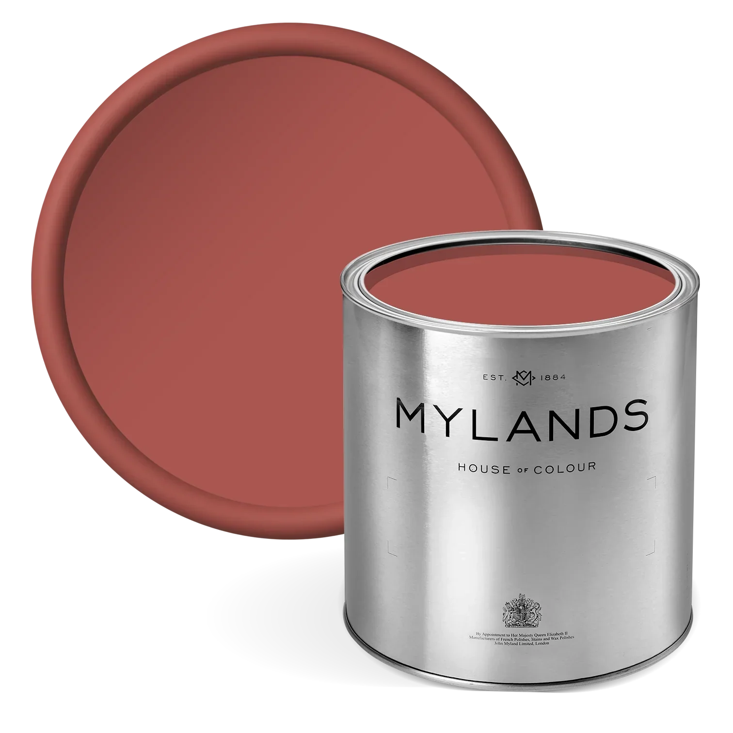
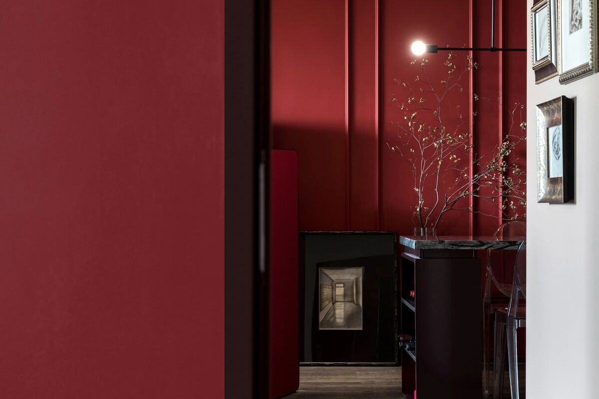
Door in Arts Club™ No.281

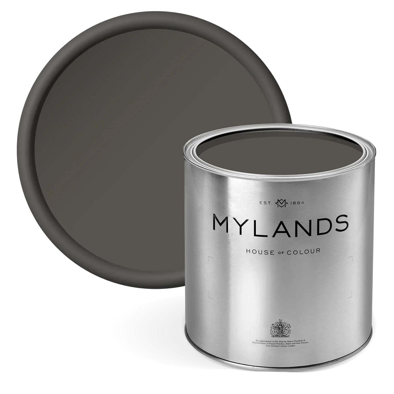
Door in Mortlake Red™ No. 290

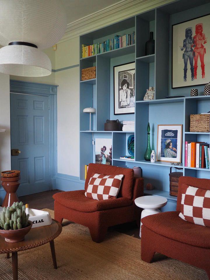
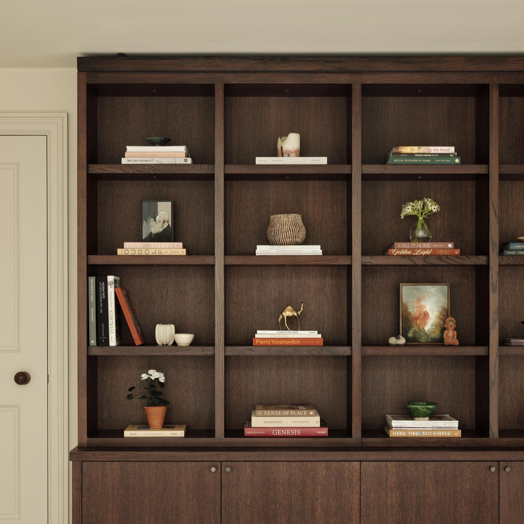
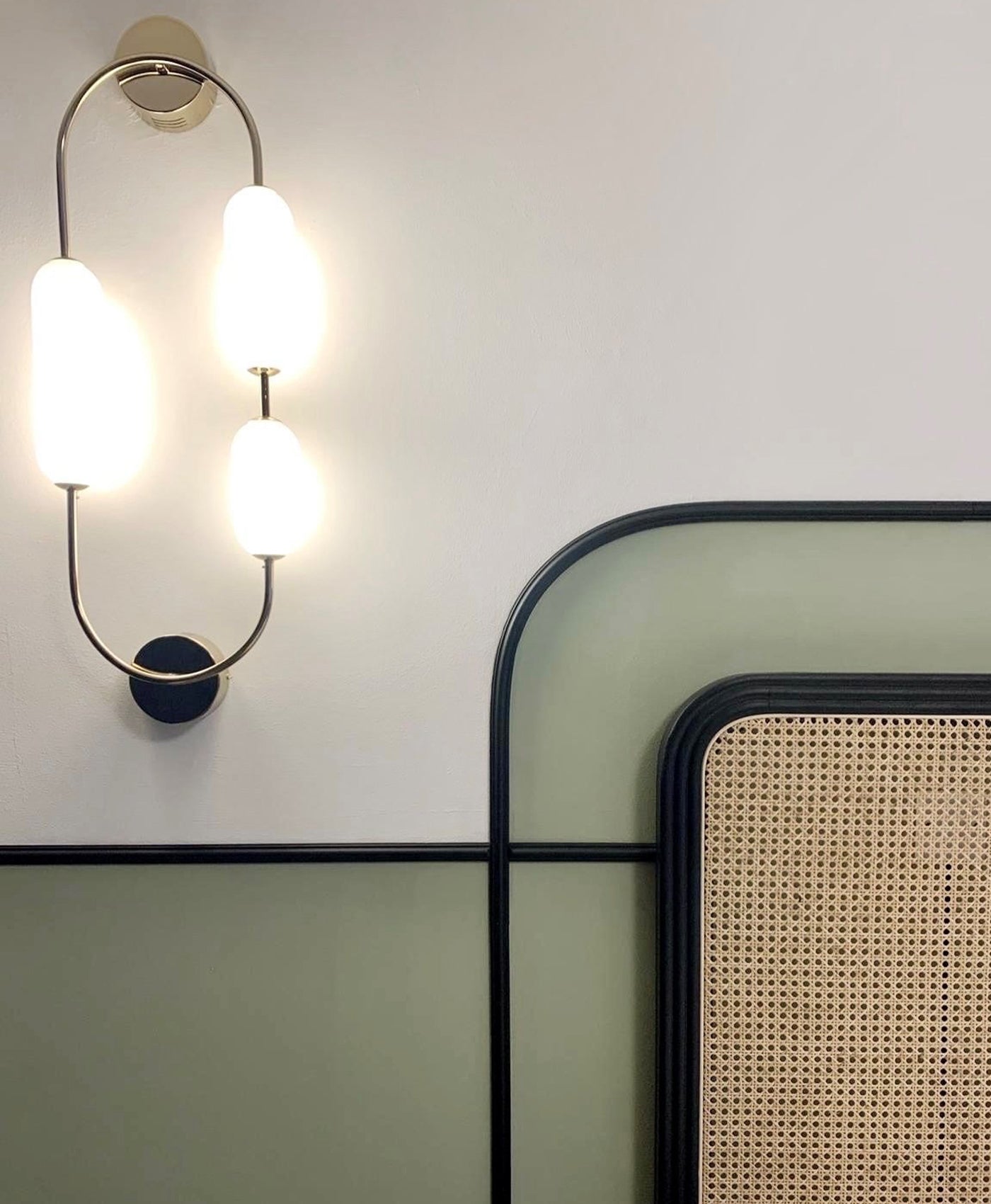
Bookshelf in Red Post Hill™ No.68 and Walls in Enamel Blue™ No.78.

Bed Frame in Red Post Hill™ No.68 and Walls in Enamel Blue™ No.78.
Inject playful energy
Primary red tones work well in children’s rooms, be that a bedroom or playroom. It is uplifting, fun and playful. It does not need to be all encompassing though. You could add dashes of red with an accent wall, on bookshelves or with red furniture.
In this child’s room, Mylands Red Post Hill™ No. 68 is used on the bedframe and bookshelves. The bright red shade is paired with Mylands Enamel Blue No. 78 for a cohesive and balanced look. You have the splash of vibrant red that is tempered by the calming blue. The red striped wardrobe is another striking and playful addition that creates a fun focal point. This same decor idea could be applied to blinds, curtains, textiles or bedding to great effect.
If you have a home gym, consider the addition of red colour there. It is another area in which you want an energy boost.
Make an enveloping environment

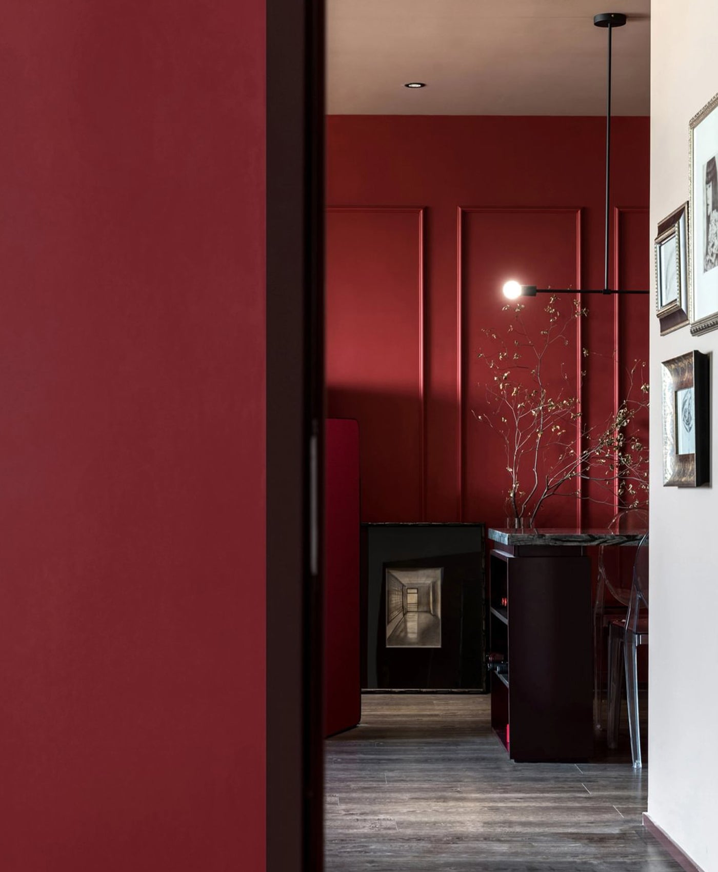
Walls in Arts Club™ No.281.
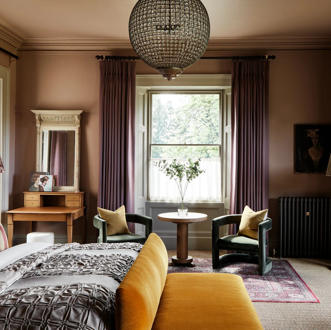
Red does not always have to be a vibrant, energetic, bold hue. It can be used for the reverse effect. Deep, dark reds are perfect for creating an enveloping environment. That feeling of being cocooned and comforted is perfect for a bedroom where you want to recharge and hibernate.
Darker red tones, such as burgundy and maroon are ideal for creating this sense of being enveloped when considered to colour drench a room. This cocooning interior design trend can also be applied to a snug living room or home cinema room.
Spice up your space

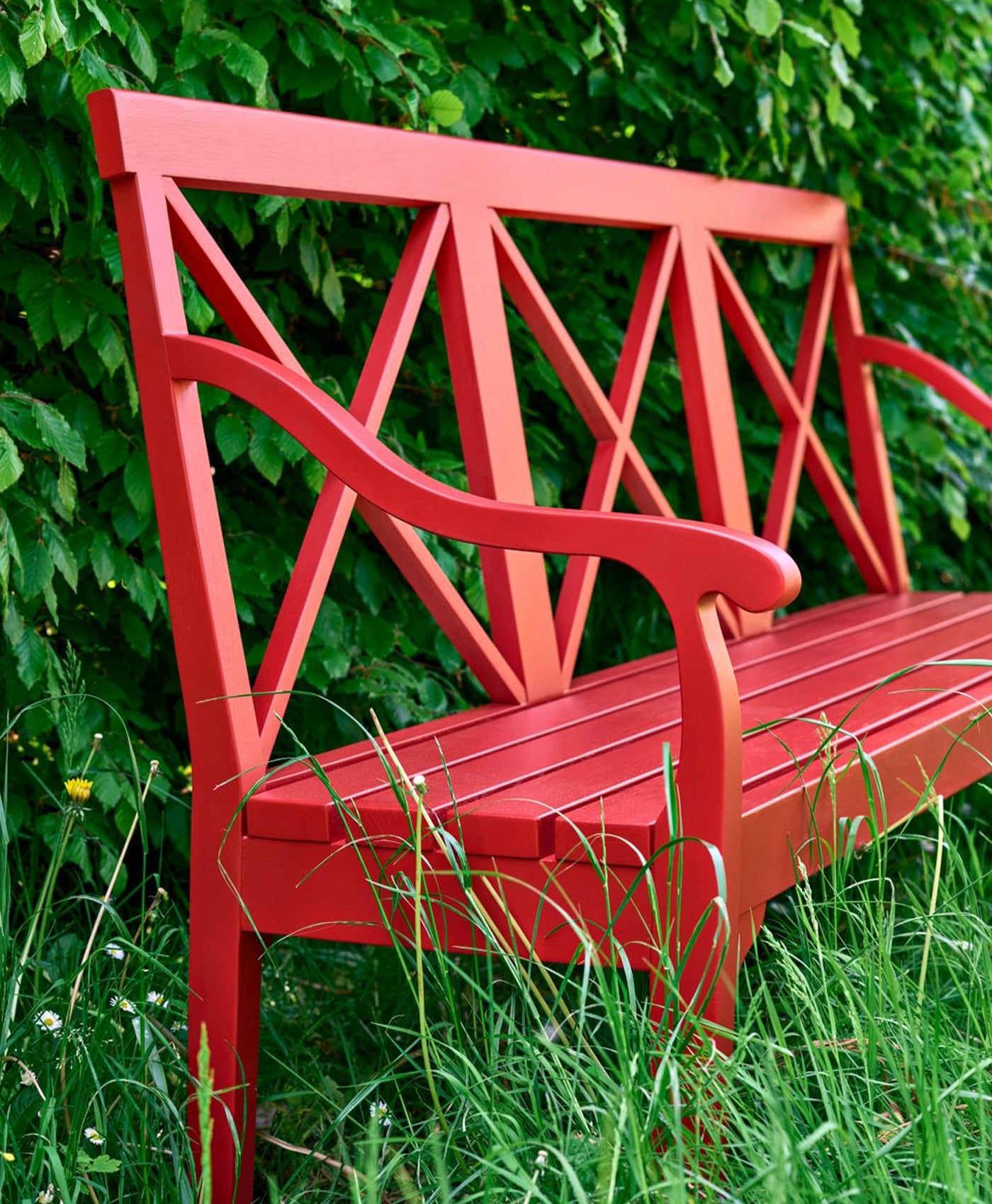
Woodwork in FTT-009™ - Bright Red.
Add some heat and spice to your kitchen by incorporating red into your interior design scheme. Elevate your look by combining deep red with metallic touches such as gold fittings and accessories. Sumptuous shades of red pair well with neutral tones such as grey and stone.
Go for a brighter, modern look by pairing brighter reds with white. You can add a pop of colour with a red accent wall, tiling or furniture. In this kitchen, the red feature tiles lift the otherwise neutral colour scheme with warmth and interest. A good analogy is to use red like seasoning in a kitchen - sprinkle some warmth or pack a punch.
Spread some joy
Does red make you smile? Is it a shade that you reach for in your wardrobe when you want to feel good? If you find yourself drawn to the colour red, do not be afraid to incorporate it into your home too. You want your living spaces to make you feel good, to make you smile and be joyful.
Reflect a strong personality in your living space with bold hues. Red walls make a statement and add drama, yet are still warm and inviting.
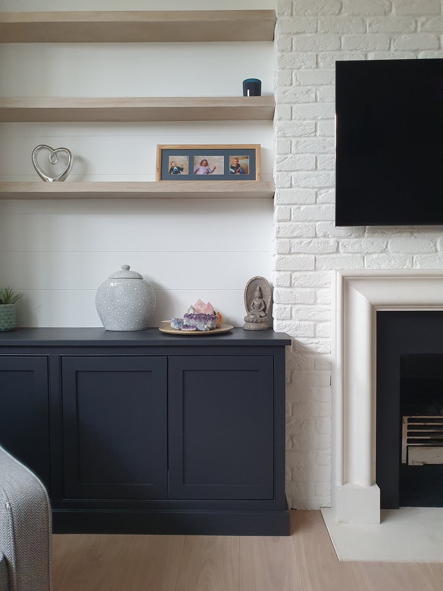
Direct attention to a focal point by painting it red. A warm red with a touch of orange is perfect for a cosy fireplace for example. Perhaps your furniture is the centrepiece. Highlight red in the upholstery by adding complementary soft furnishings like a throw or cushions. You will make your favourite armchair all the more appealing by so.

Walls in Red Post Hill™ No. 68.

Door and Woodwork in FTT-009™ - Bright Red.
Stimulate social interaction
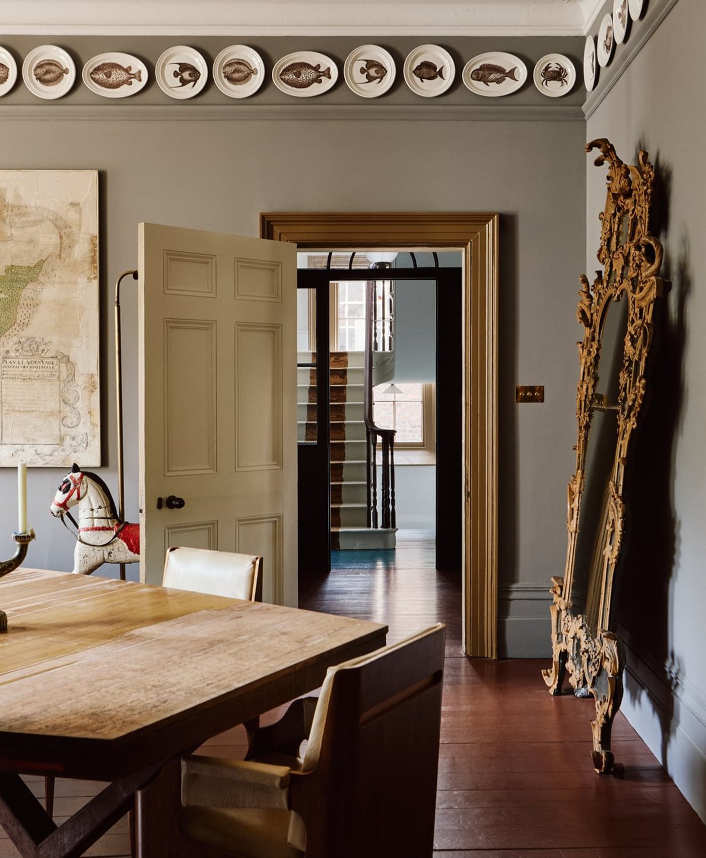
Red is a particularly popular colour in dining rooms. Why? Deep reds are warm and inviting - perfect for social spaces where you gather together with friends and family. Rich plum and berry shades are good choices, as well as burnt terracotta. In addition, sumptuous red shades bring the room closer together at night time, and they look amazing against candlelight.
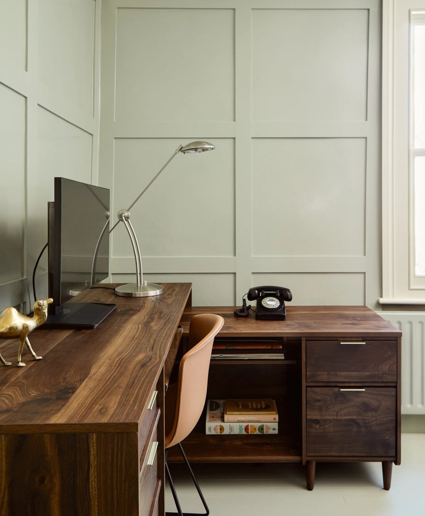
More vibrant reds bring energy and dynamism. This can stimulate conversation and encourage more social interaction which is ideal in entertaining spaces. Home offices also benefit from these attributes, stimulating you to bring dynamic energy and creative inspiration to your work.
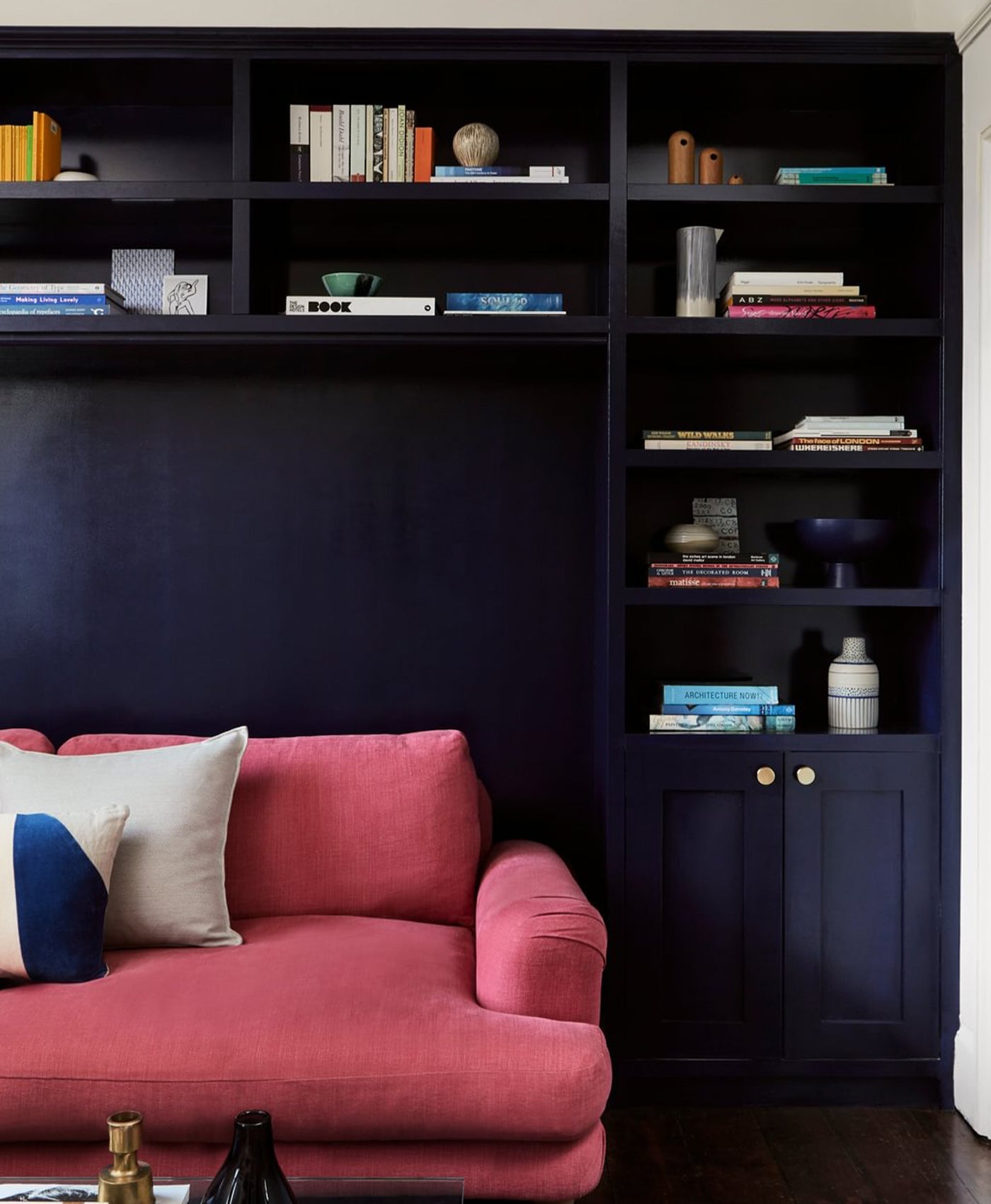
Design with refined elegance
If you love a high end look of refined elegance, and want to create an air of sophistication, then darker red tones work better than bright reds. This style is more serious than playful, more traditional than relaxed. Burgundy and maroon tones fit this interior design trend well. Combined with complementary colours like grey, white or gold, it creates a grown-up and sophisticated air.
“A deep, dramatic red like Arts Club™ No. 28 is sophisticated and intense, but also warm and welcoming, which makes it a great choice for a living room or dining room” - Dominic Myland, CEO
Red also works as a wonderful backdrop to artwork. It helps to direct attention to that focal point whilst ensuring that the artwork is the star. That is why it is the colour of choice at London galleries including Dulwich Picture Gallery and the National Portrait Gallery.